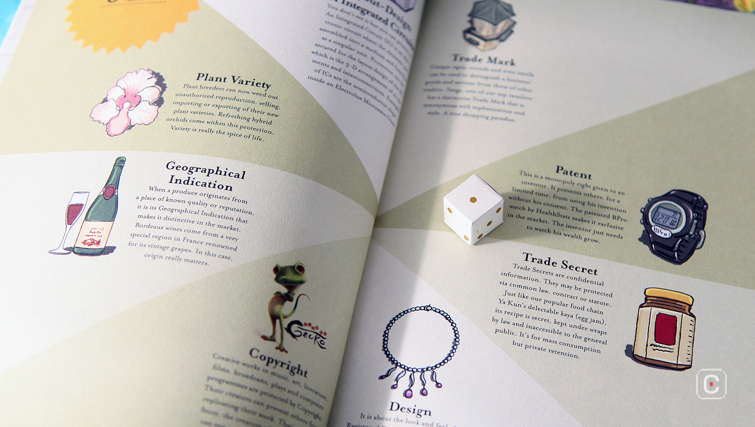
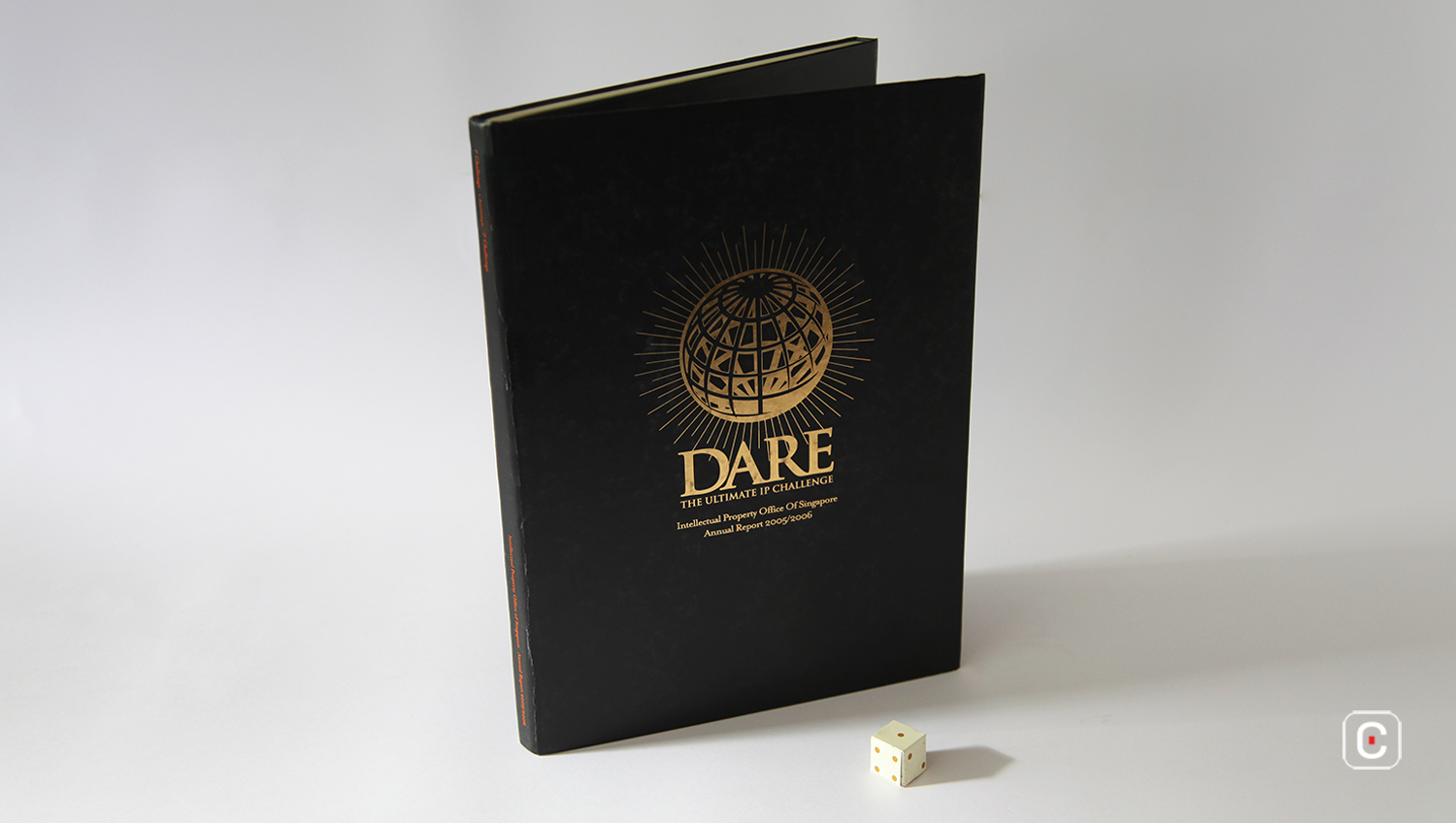
Although the cover design offers no hints, the premise of this report – an illustrated board game, complete with playing pieces – is beautifully executed.
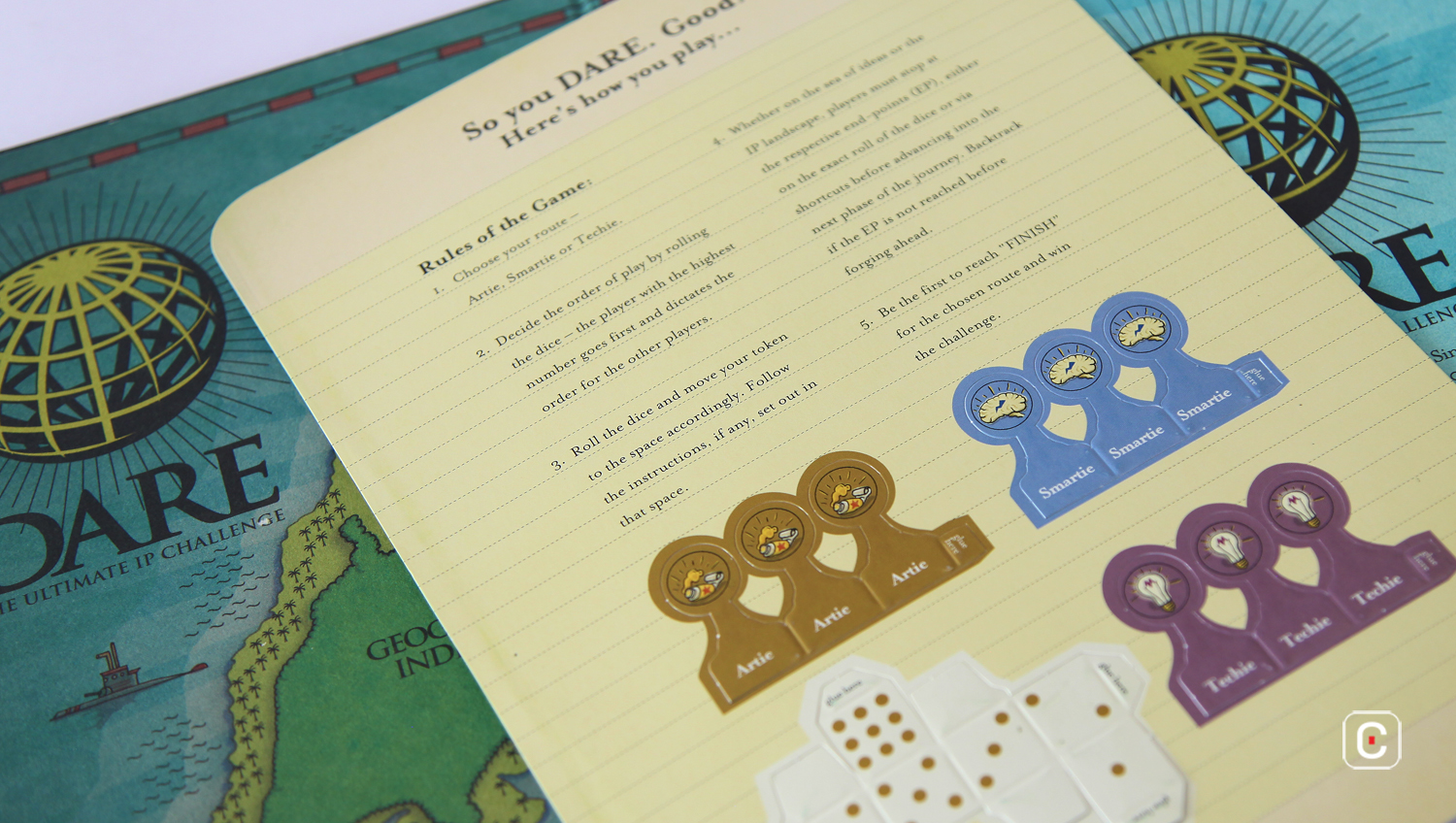
A card sheet with perforated paying pieces greets you when you open the board. Under this lies the report which contains, amongst the required information, rules of play and tips.
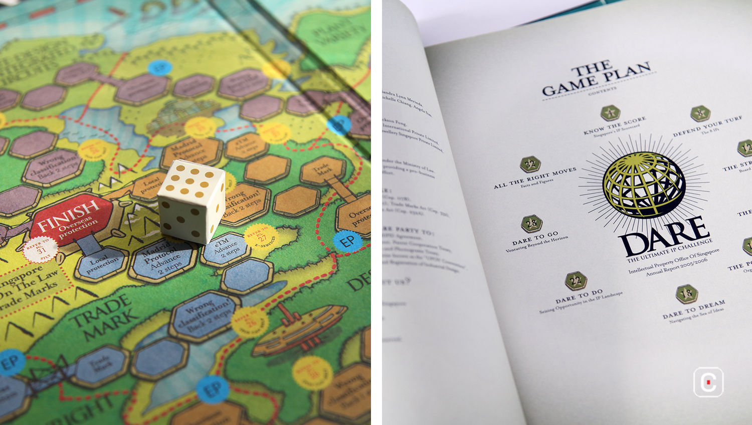
The visual language of the illustrations carries through from the board game to the pages of the report. A weathered effect is liberally applied to the cream, uncoated paper stock of each page, including the accounts section, which is a nice touch. The overall effect is reminiscent of the main prop in the 1995 film, Jumanji and creates an inviting, slightly mysterious feel to the report.
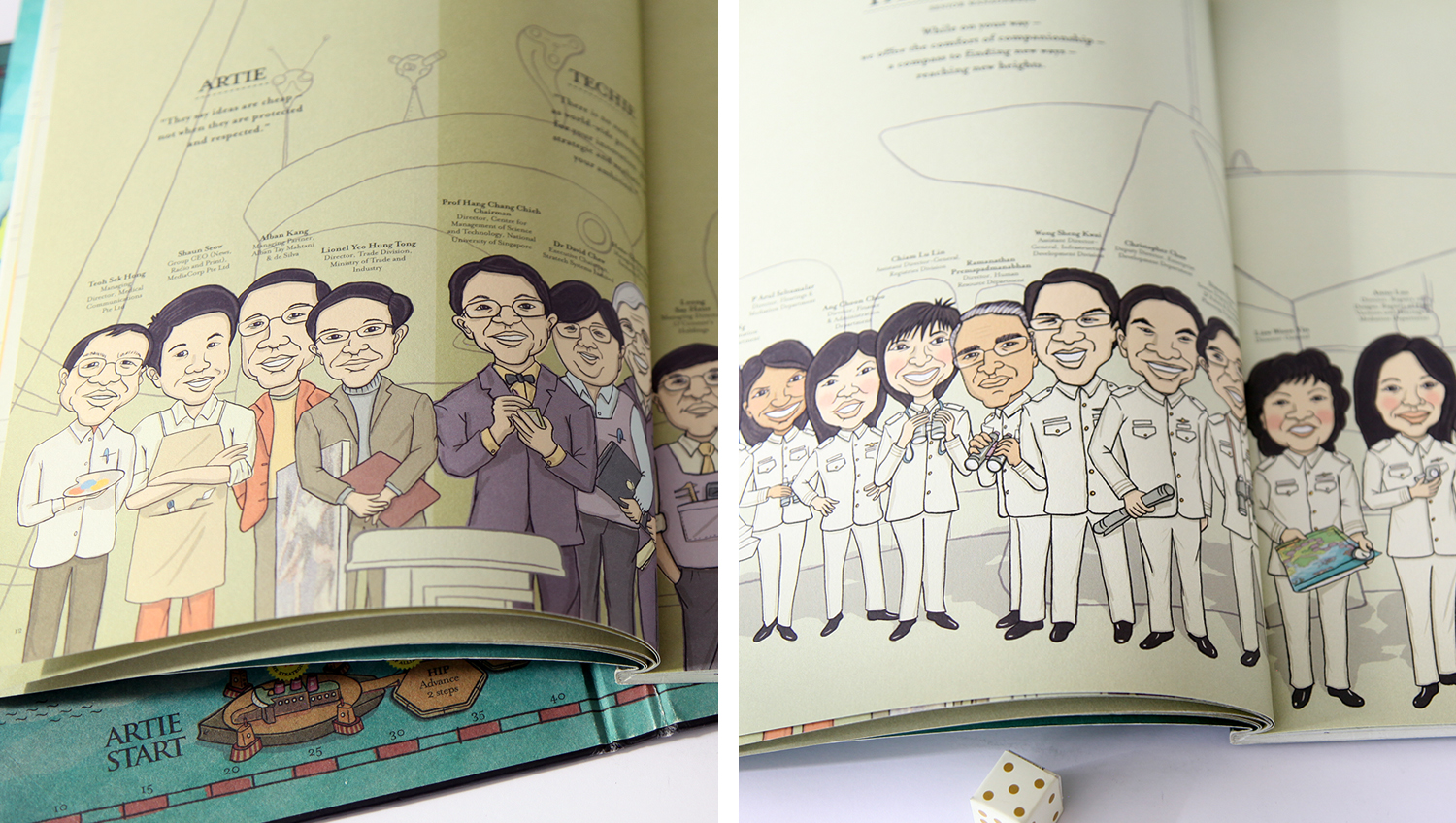
The type treatment complements this – there’s not a sans serif in sight. Instead, a formal, sturdy serif typeface is made use of to good effect.
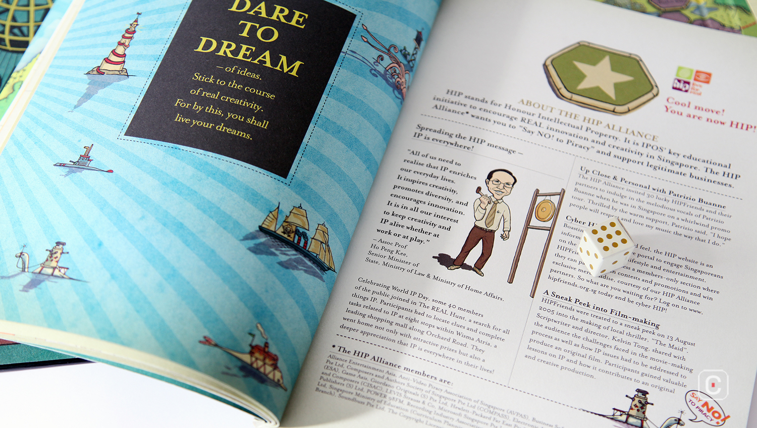
Each section of the book opens with a full bleed image – a detail from the board game. This serves as a gentle reminder that when you finish the report you have a game to play, on a mysterious island…
