
For its 2016 Annual Report, multinational aeronautics giant Airbus pulled out all the stops. The result was a challenging and captivating digital report that drew on text, image and video to tell a compelling story of the company’s myriad achievements in the preceding year.
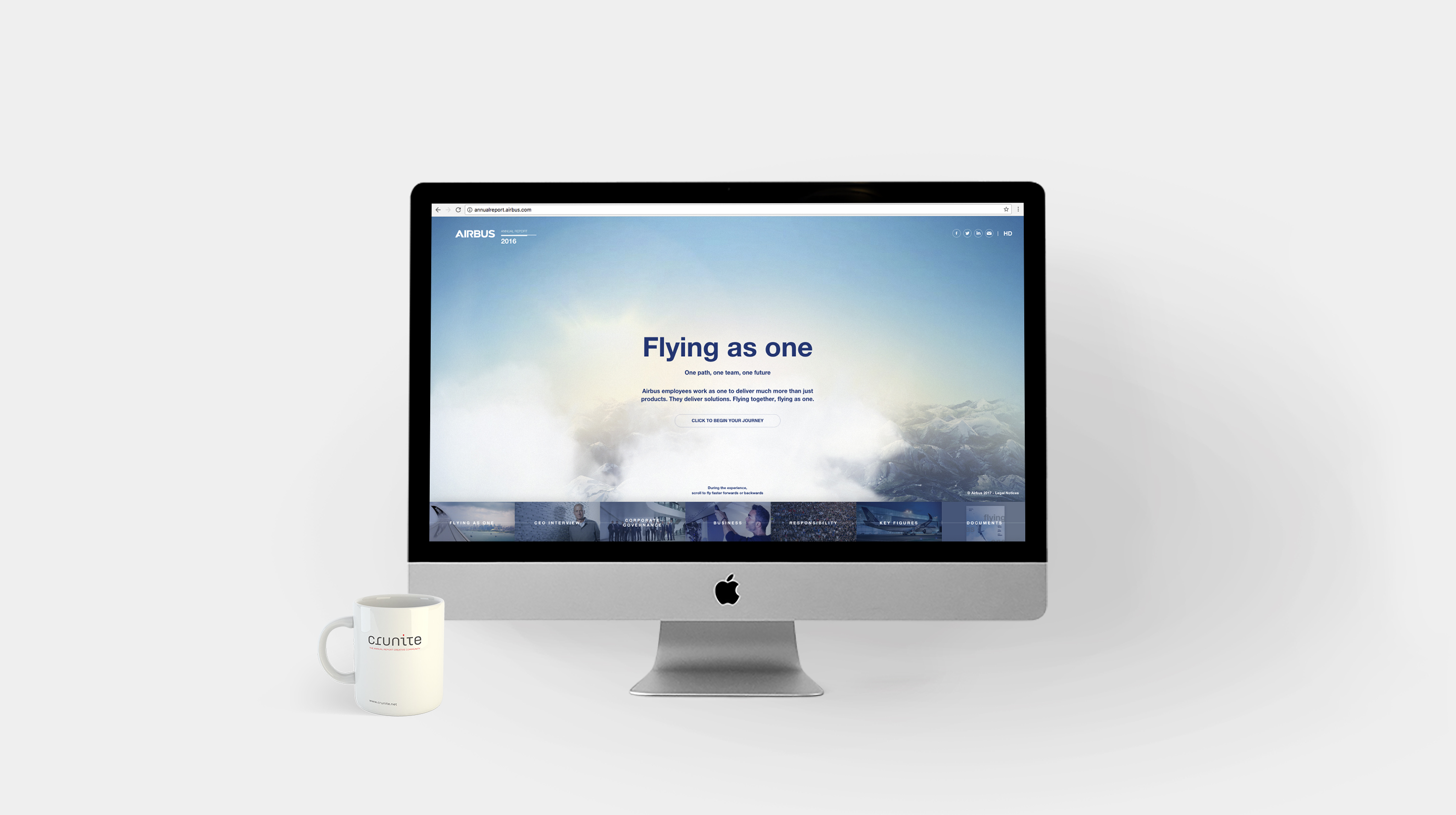
On first viewing the report, the reader is shown an intriguing sky-scape, in front of which the report’s theme of ‘Flying as One’ is boldly displayed. A click on the ‘begin button’ begins a demonstration that very much feels like a flight stimulator, albeit a relaxing one through slowly drifting clouds. From here, the path diverges. A click forward takes the reader through the contents of the report. A click to the right, titled ‘Flight View’, opens up a table of contents, presented creatively as the trajectory of a flight. All clicks, and thereby transitions, are accompanied by a sonic ‘whoosh’- which mimics a plane taking off.
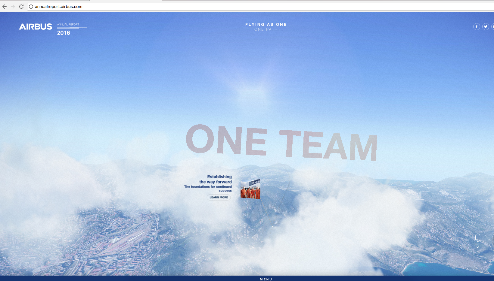
The well thought-out details, down to the very smallest, adds to the charm of the report; however much like a novice pilot taking to the skies; the navigation of the report requires some getting used to.
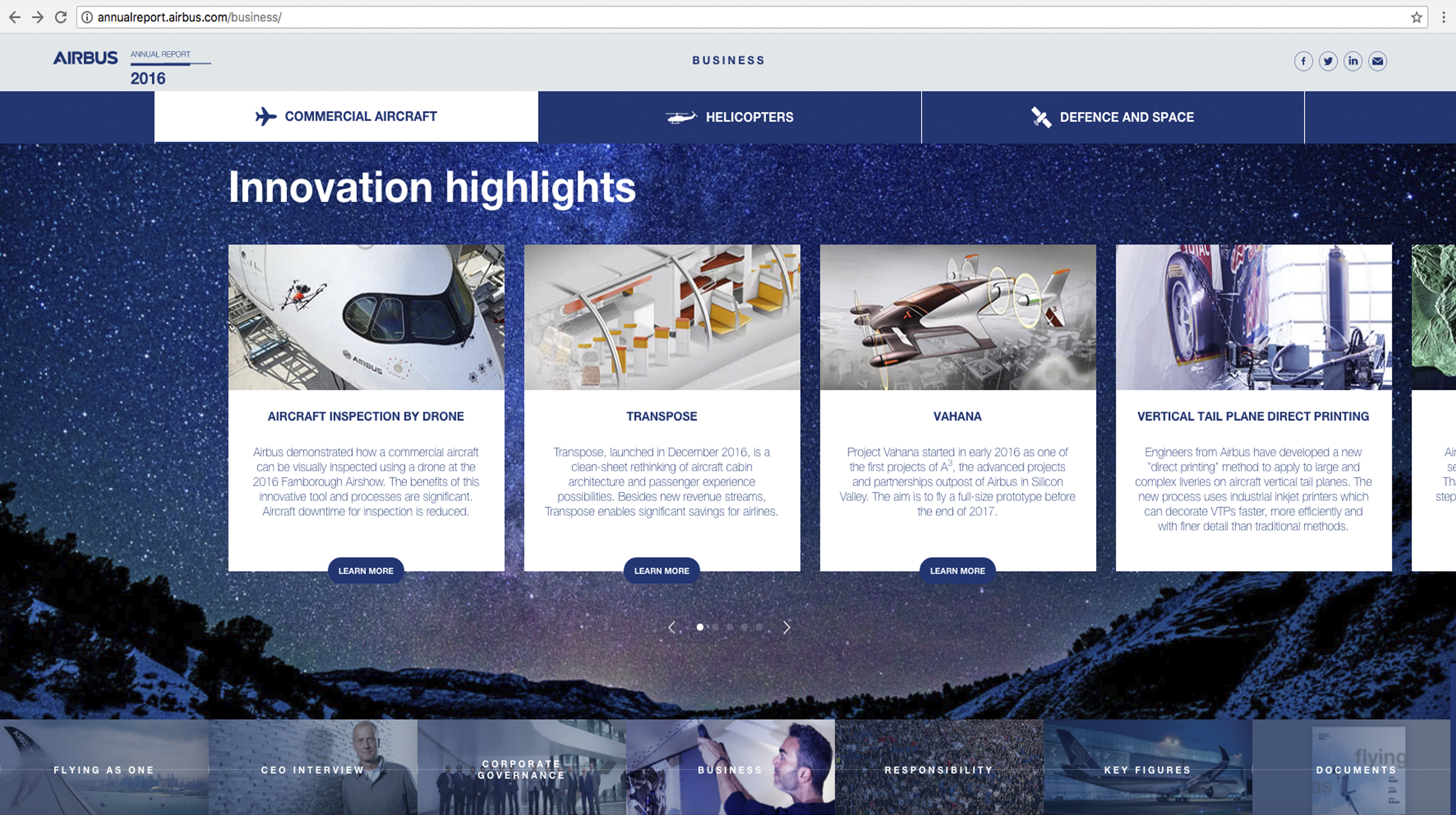
Despite the captivating special effects that are peppered throughout the report, the photographs featured border on the generic. The report makes up for this with a good selection of video that breaks the monotony of reading a simple textual report. An attractive video showcases the company’s highlights of 2016, with dynamic background music serving to drive the point. However, the video, much like its cohorts featured throughout the report, feels too long, and its similarly heavy focus on content feels repetitive after some time. This is exacerbated by the fact that none of the videos indicate their length or duration.
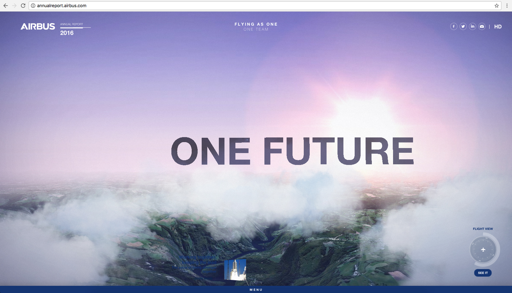
Of note are the pie charts showing the groups’ relative distribution of products, where the figures are encircled by a small, moving aircraft.
The English version of the HTML report uses straightforward language to convey its message. Of importance is the CEO’s address, which utilises an informal question and answer format, and is answered in the first person.
The HTML report also features a prominent section on the sustainable business practices of the report. Key personnel provide information on pertinent topics through video, and a navigable slideshow at the bottom features more information on the company’s environmental footprint. The latter of these is further mapped to the UN’s Sustainable Development Goals.
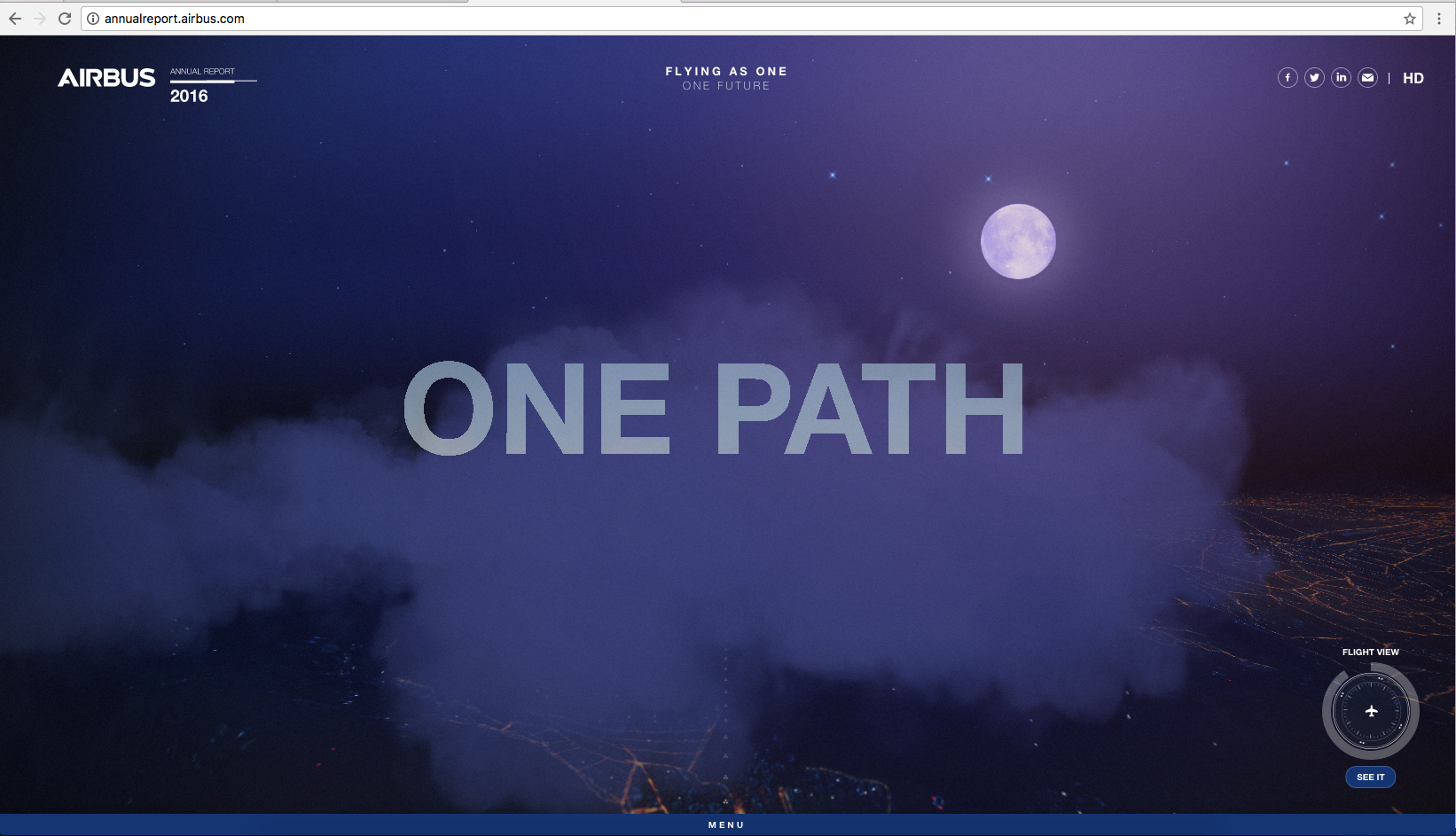
Finally, the HTML report is available as a fully-downloadable printed report. This is ingeniously presented in a ‘curated’ format, where the reader is given the choice of selecting material to incorporate into the downloadable PDF file. The report is available in English, French, German and Spanish, as a testimony to the report’s multinational operations.
The PDF report mirrors its HTML version, but it also brings out features that would have been eclipsed in the online version. Of note are photographs and graphics; which without the interactive distractions of the HTML report; take more prominent place in the reader’s eye throughout the publication.
Back
