Annual report illustrations – a combination of techniques, colour palettes, shading styles, and strokes – complement and enhance the communications of a company. Through the annual reports featured in this Quick Read, we celebrate the potency of annual report illustrations.
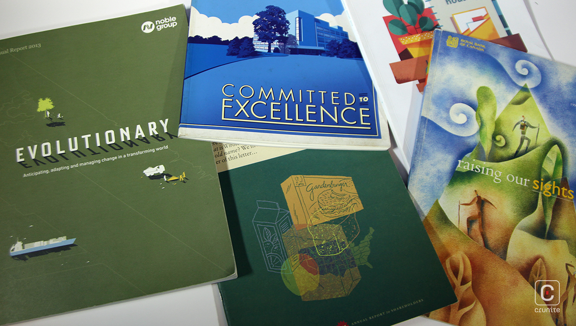
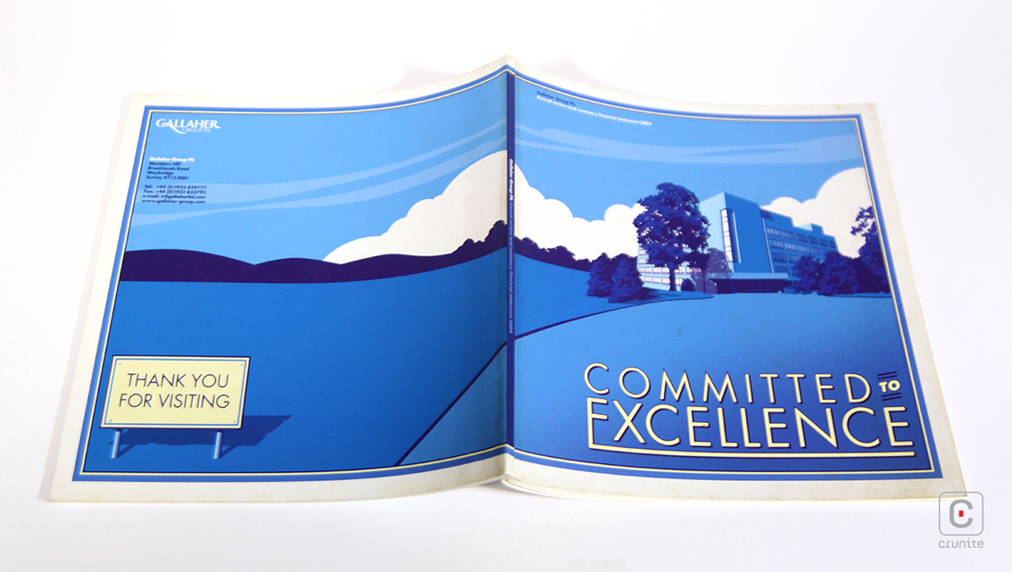
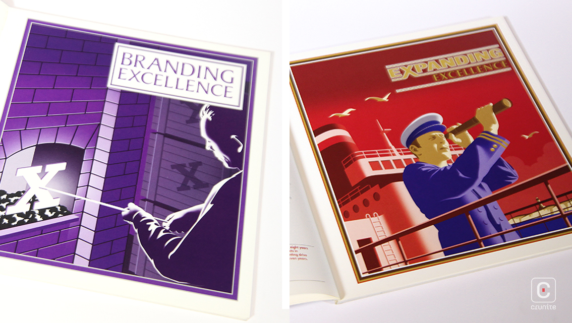
GALLAHER GROUP PLC (2004) Illustrations throughout this report revolve around the word ‘excellence’. Illustrator Laurence Whiteley has used a vector graphic style to produce clean, clear and well-defined artwork, which is also creatively applied to the images of the board of directors.

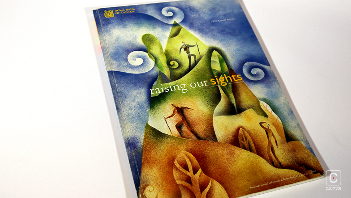
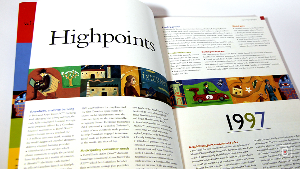
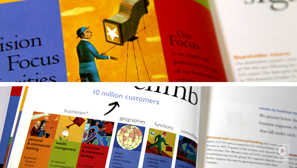
ROYAL BANK OF CANADA (1997) The cover of this report, illustrated by Linda Frichtel, presents a combination of acrylic or oil pastels on a textured background. The art in the inner pages represent diverse styles from realistic to abstract while the use of bright colours make for a vibrant read.
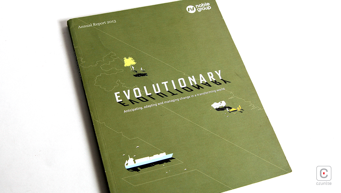
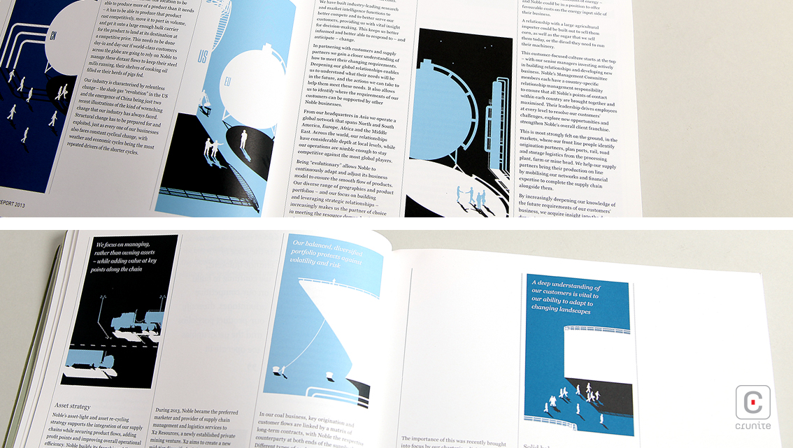
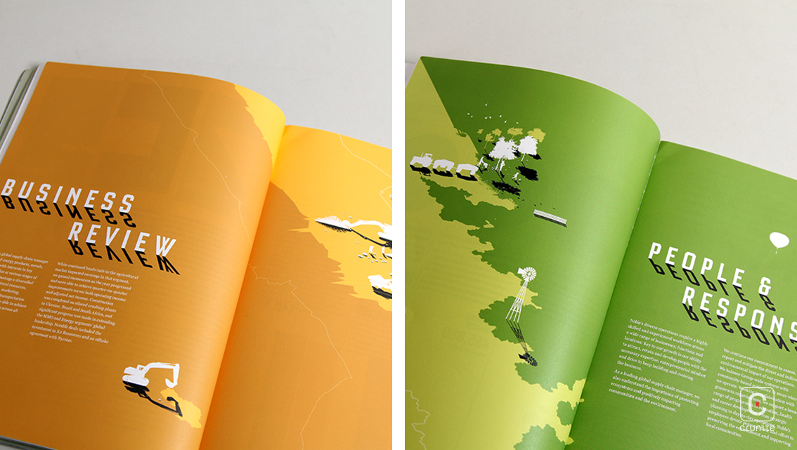
NOBLE GROUP (2013) The illustrations in this annual report are both minimal and miniscule on an oversized report, most likely for effect. The illustrations are straightforward with unusual angled shadows. Each section is of a different hue, with mostly duo-toned drawings.
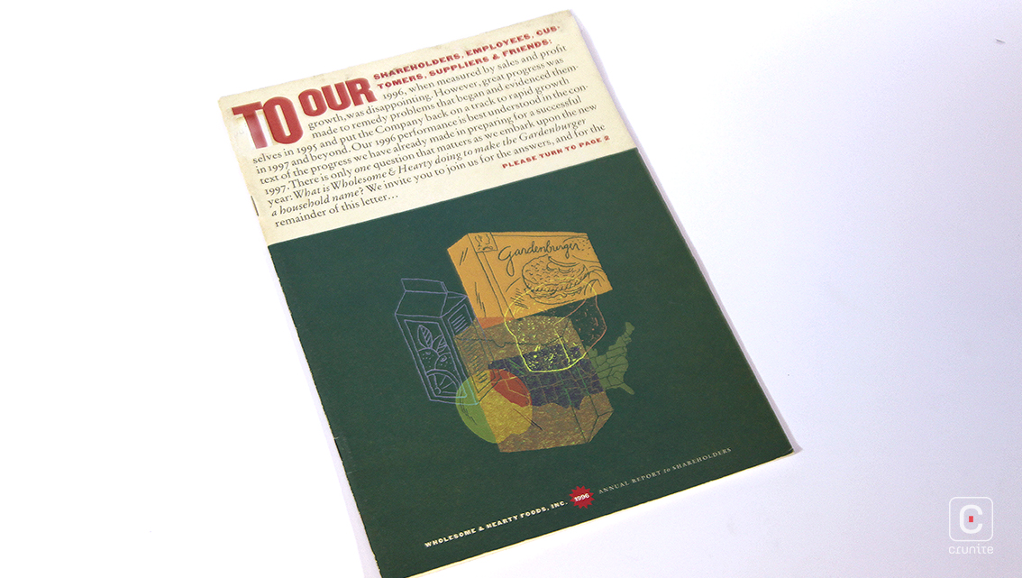
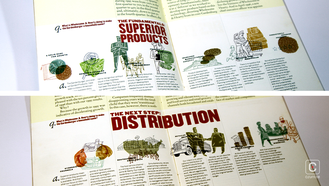
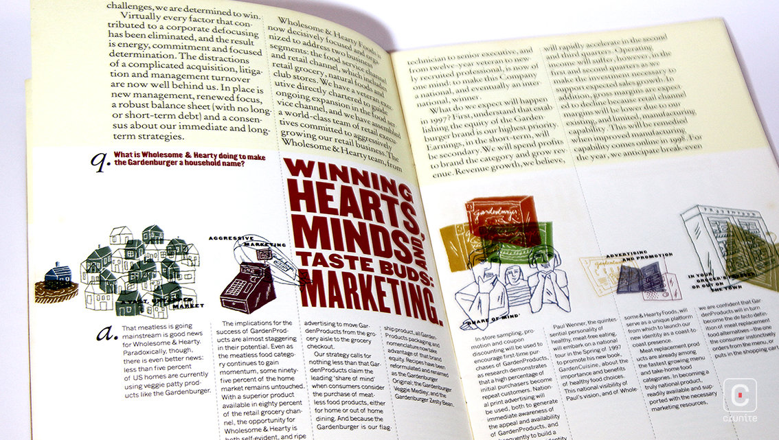
WHOLESOME & HEARTY FOODS, INC (1996) Probably the simplest of the lot, these illustrations are basic and candid, and come in a soothing palette of colours. Interestingly, they all overlap, creating a sense of flow and connection between the illustrations.
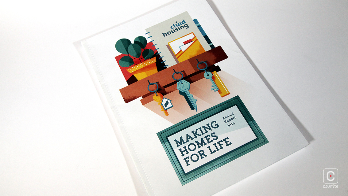
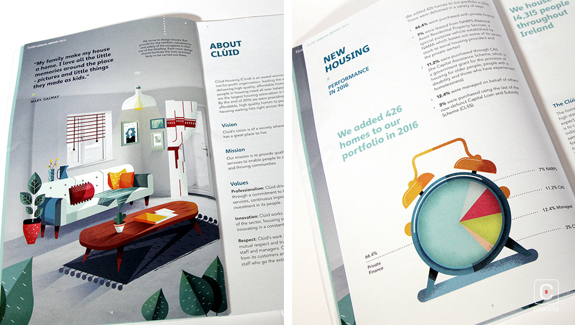
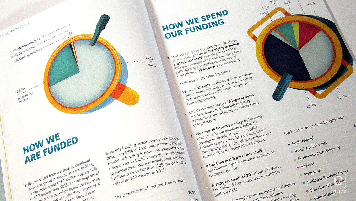
CLÚID HOUSING (2016) These illustrations by Maïté Franchi are warm and colourful, with speckled shadowing in each drawing to create a sense of depth. A special feature of these vivid illustrations is that they have been incorporated into greyscale photographs on full bleed pages. The infographics have also been cooked up using the same illlustration style.
