
The Neue Zürcher Zeitung (New Journal of Zürich) is a Swiss-German newspaper of record that dates to 1780. One of the oldest newspapers still in existence, its current circulation is just over 100,000 copies and it remains a potent force in many Germanic-speaking nations.
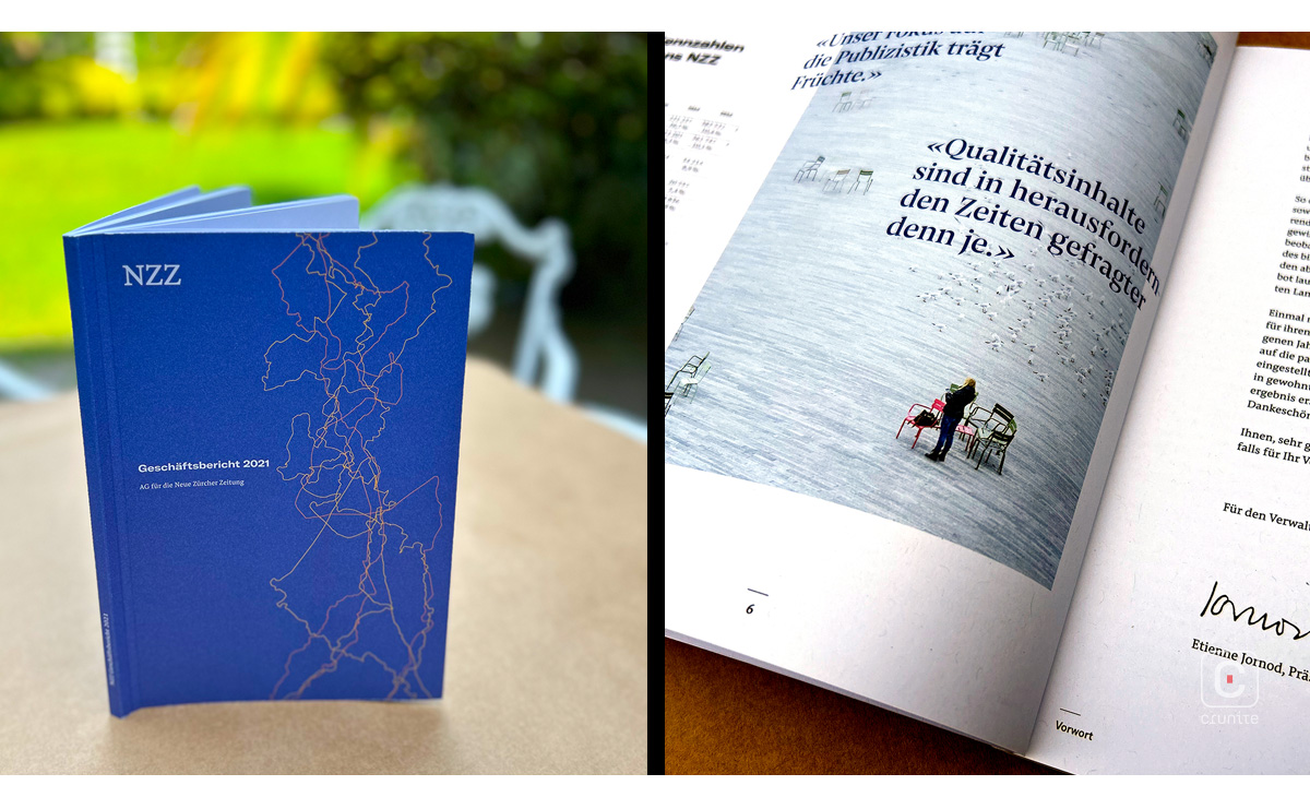
Annual report design tends toward the lavish, but here, in keeping with a newspaper’s approach to disseminating information, the NZZ report is a thing of simple beauty. A soft, white, uncoated paper stock is used throughout and the two carefully balanced typefaces allow for easy navigation. The 2-column page grid is likewise simple and functional. It also pulls off the rare trick of keeping the type size consistent between the financial reporting and the rest of the report.
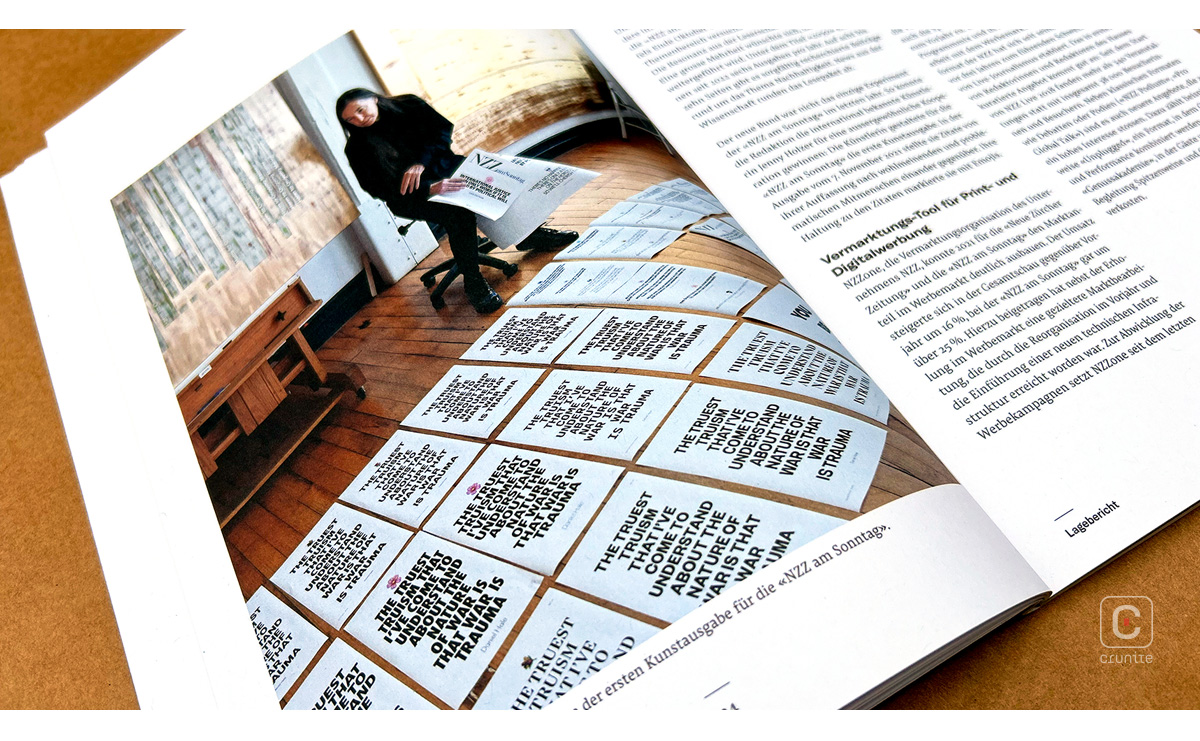
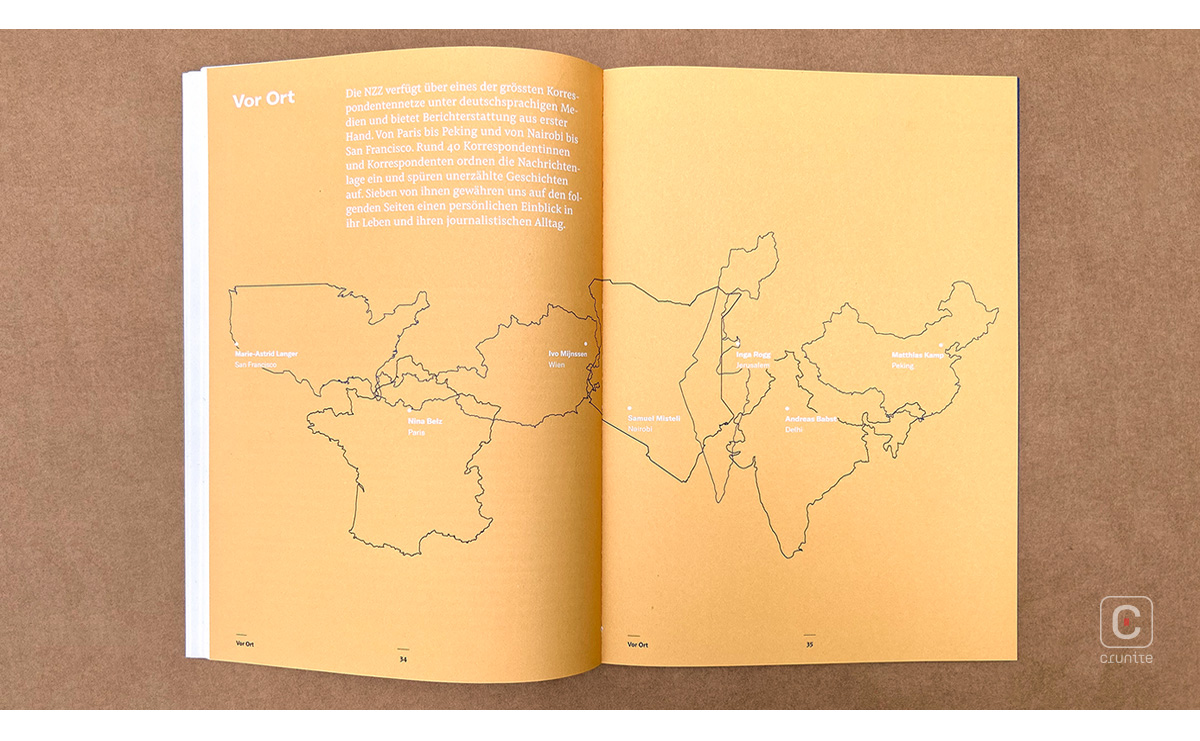
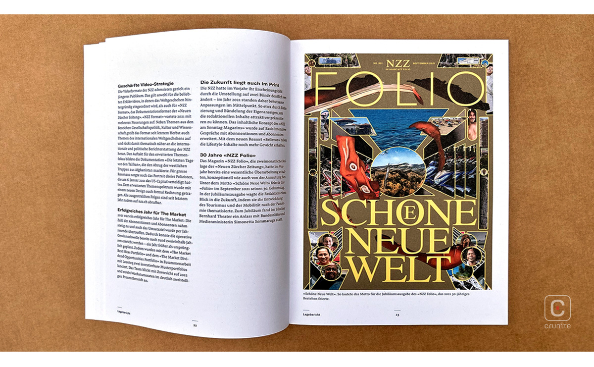
Around sixteen photographers and photographic agencies contributed to the report and the consistency in the images suggests thoughtful, and probably quite complex coordination. The portraits of journalists that sit in the middle of the book are particularly well composed and presented.
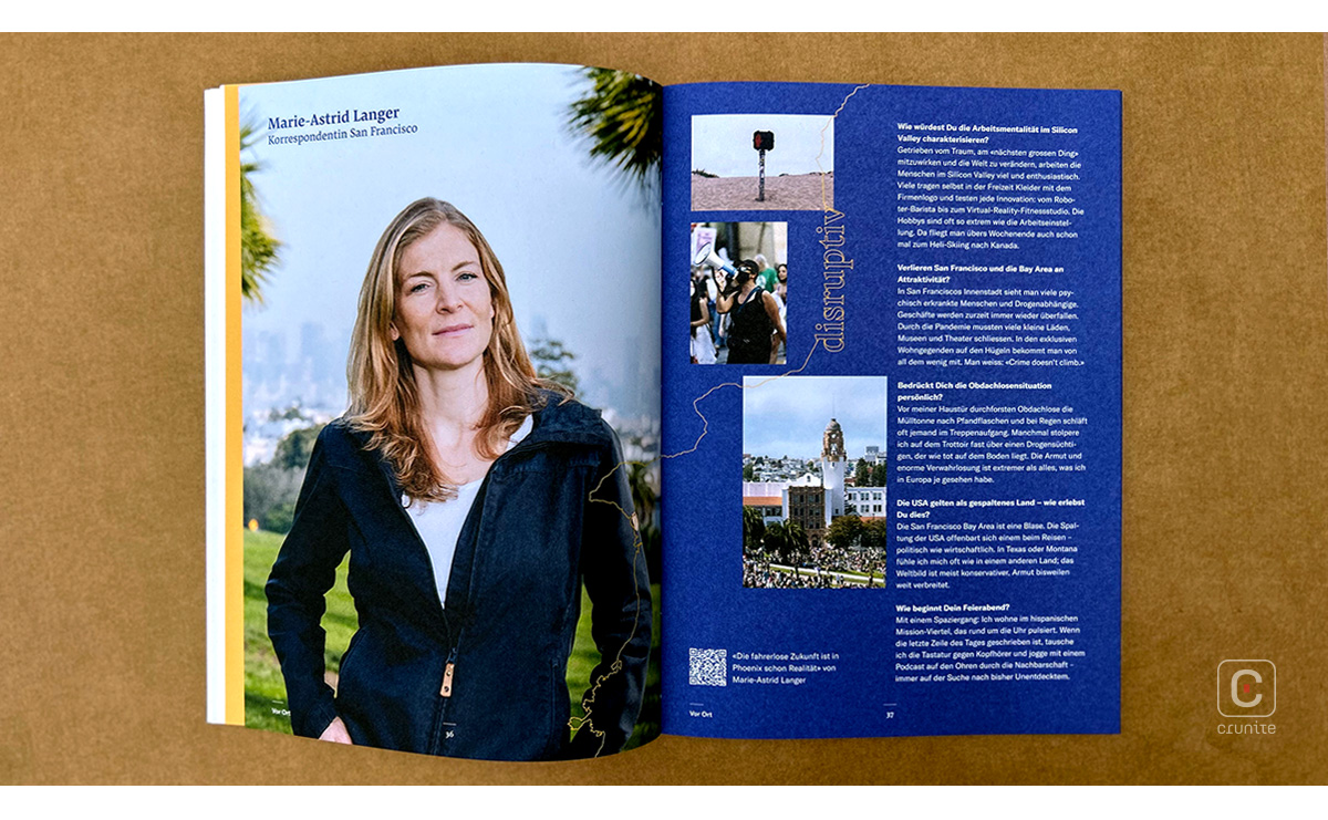
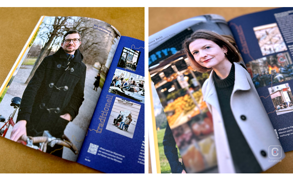
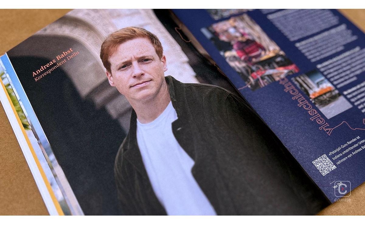
The binding solution is particularly elegant. Separating the book-block from the spine of the cover allows for a lay-flat opening – not something you often see in a perfect-bound book. It’s an intriguing choice because while the binding won’t last very long, with an annual report, you don’t need it to. It’s a clever way of embracing the essence of an annual report.
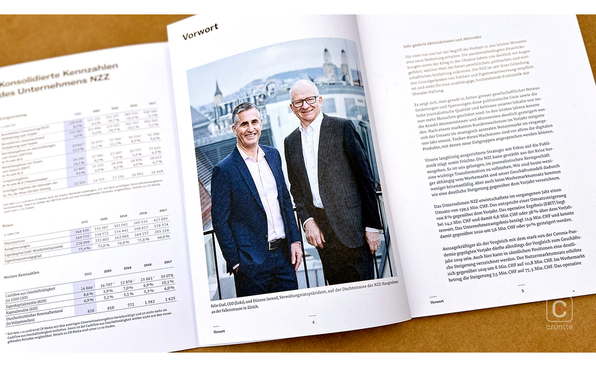
The simplicity and effectiveness of the design should not be underestimated. In a world of exuberant, colourful, gimmick-laden reports, this one quietly stands out.
Back
