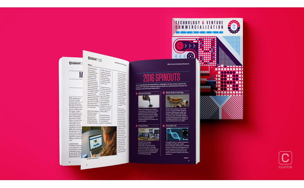
The Center for Technology and Venture Commercialization at the University of Utah spearheads all aspects of invention management and provides services such as patent prosecution, licensing, startup formation and support, and early-stage funding.

The design of their annual report for 2016 is nothing short of visually dynamic. The cover page itself uniquely spells out the word ‘synergy’ (you may not see this at first glance!), giving the reader a taste of what is to come.
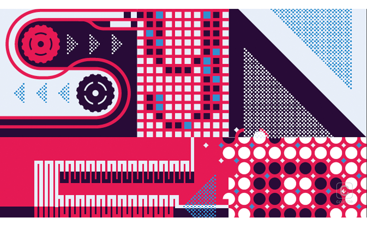
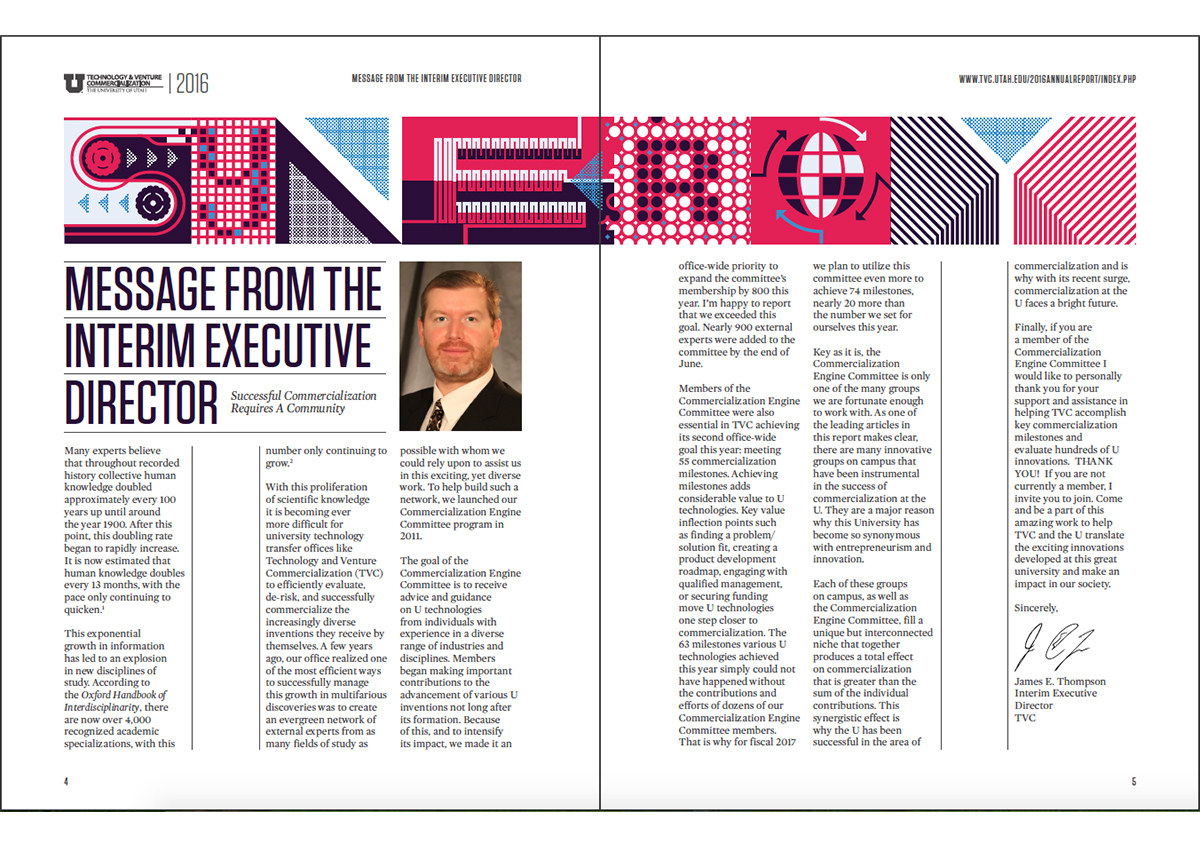
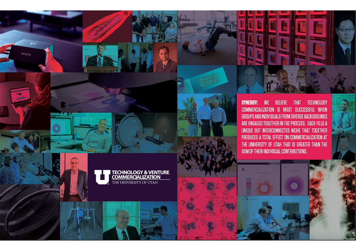
The colour palette of blue, red and black is striking, and used intensely in various areas of the report, allowing key elements to stand out. It also provides a welcome change from the default white background in most reports. Even the photographs mostly match these hues, adding to the energetic vibe of the report.
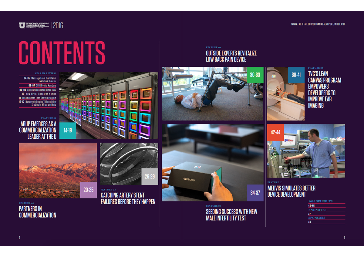
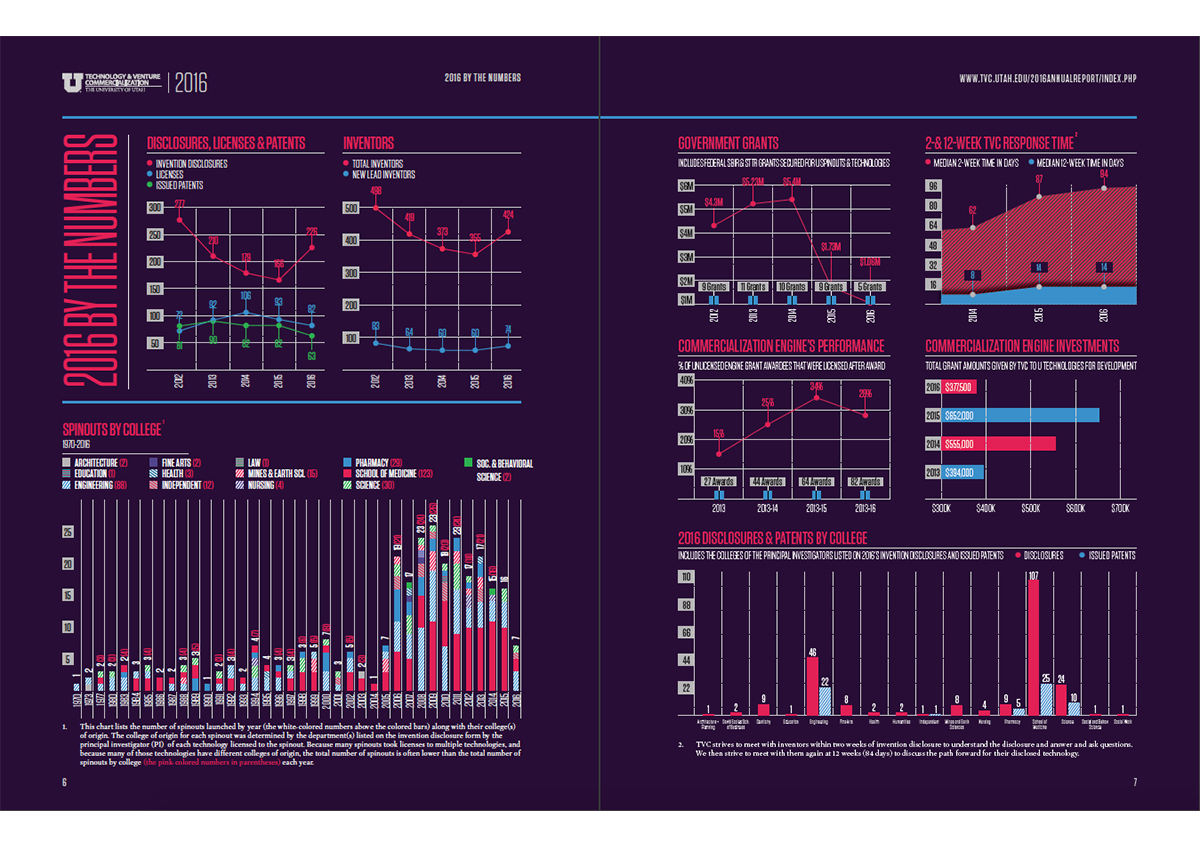
A double spread titled ‘2016 by Numbers’ is filled with eye-catching graphs that, at first, may look overwhelming, but each graph is well annotated, making it easy to glean important information.
Text sections are composed in narrow columns; an unusual format, but one that results in less congested pages. These sections have also been balanced out with photographs.
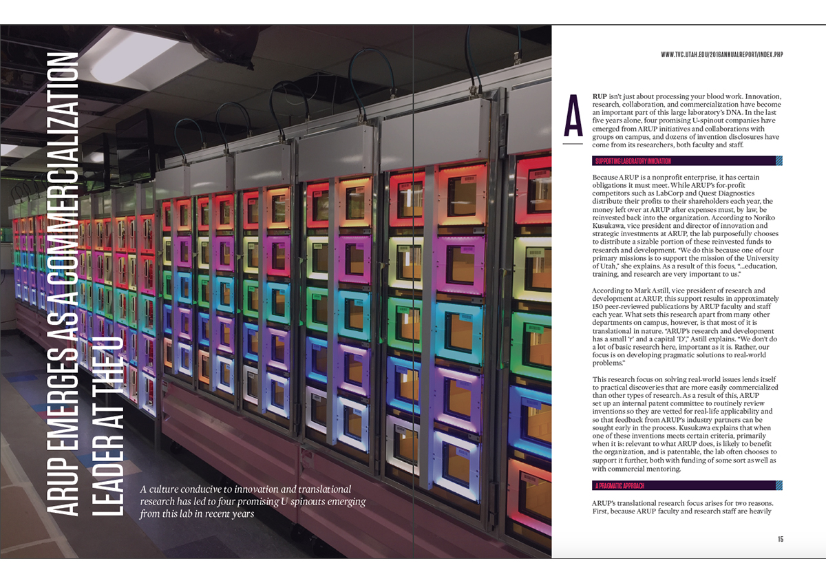
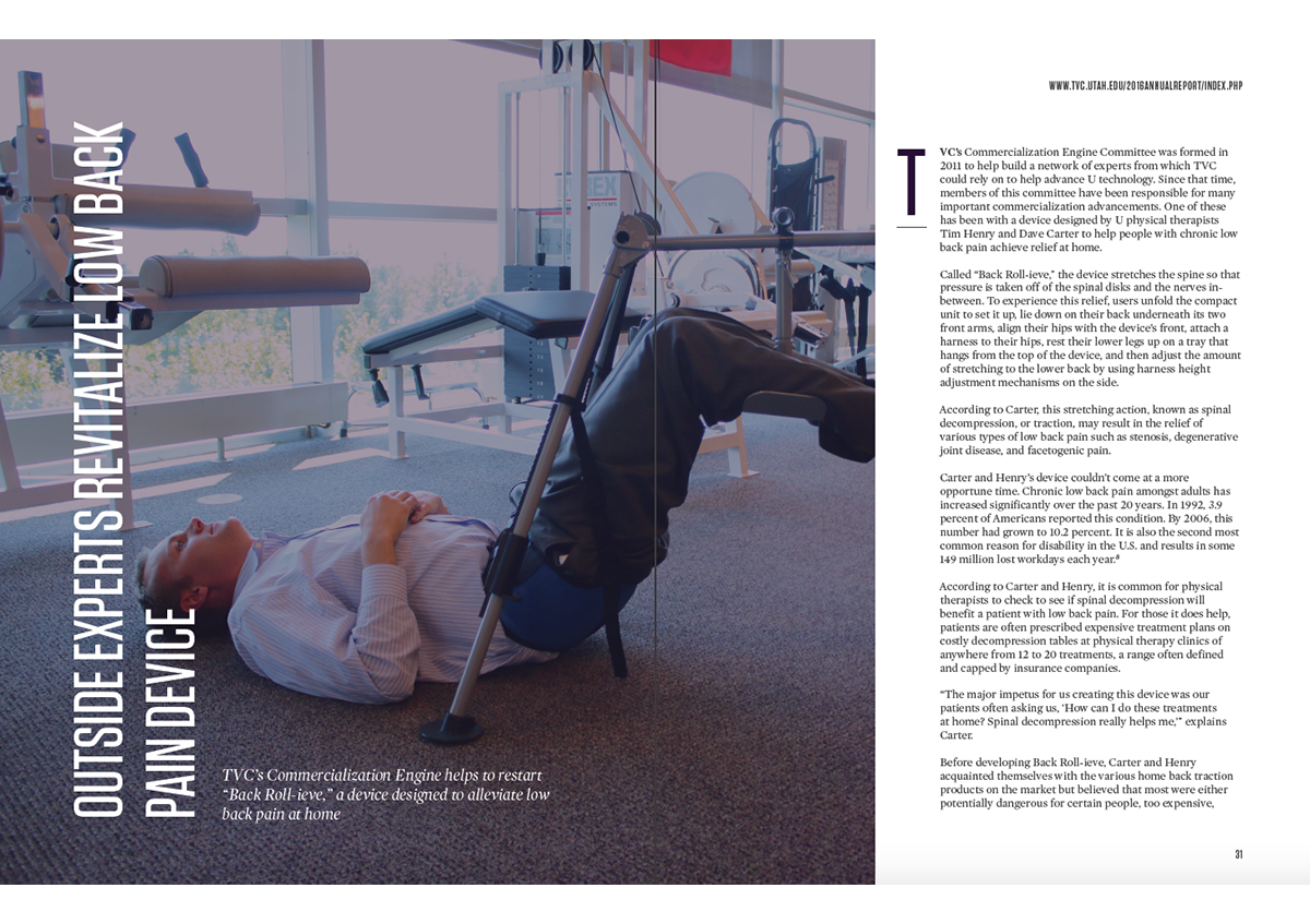
Section separators contain large full bleed images that extend onto the next page, adding an extra splash of colour and further reprieve from too much text. The report closes with a list of ‘2016 spinouts’; showcasing the newest creations of the university, ranging from medicine to communication technology.
