
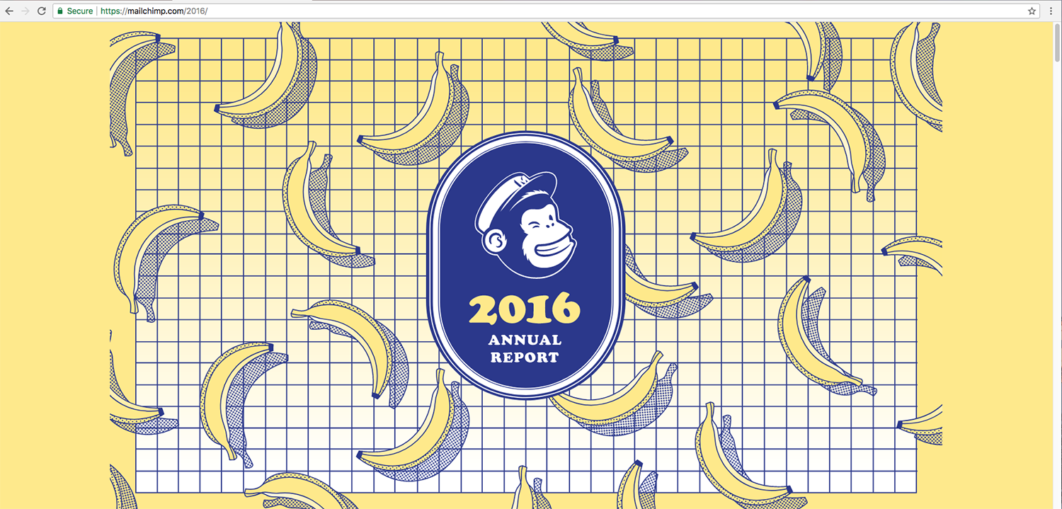
Continuous studies have shown that the average netizen has a very short attention span. It did not take much convincing for email marketing service MailChimp to exploit this fact. The end result was an HTML report that seemed perfect for millennials.
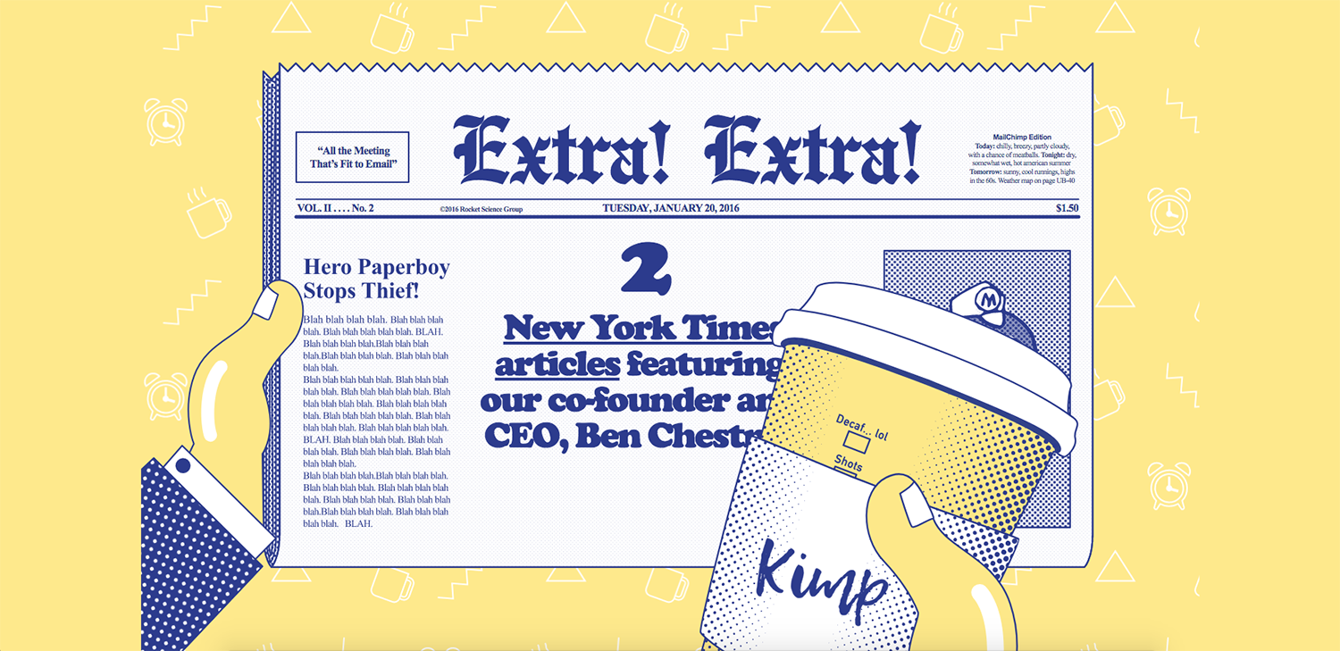
At first glance, the graphics that appear on the report are simple and resemble iconic animation, mostly presented in svg format. Illustrations are similarly executed in clean lines. The report avoids sinking into the territory of infantilism and kitsch with its clever use of humour – MailChimp is very much in-the-know in terms of today’s trends and is willing to play with these.
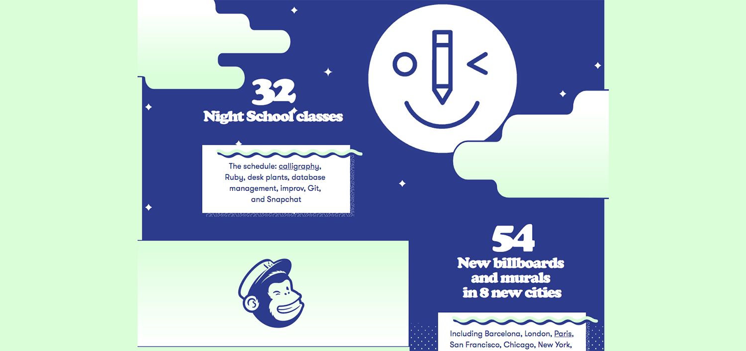
The report uses an interesting colour scheme, tied to the movement of the content (when scrolling down). The colour palette combines three colours at a time. Blue and white are the default, and the colours move from yellow to mint, to red, then blue to pink and to finally lilac as the report progresses.
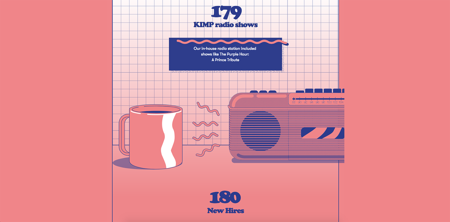
The endless scrolling funtionality has been employed in this report. Hyperlinks are embedded throughout the web-page and any click conveniently opens into a new window.
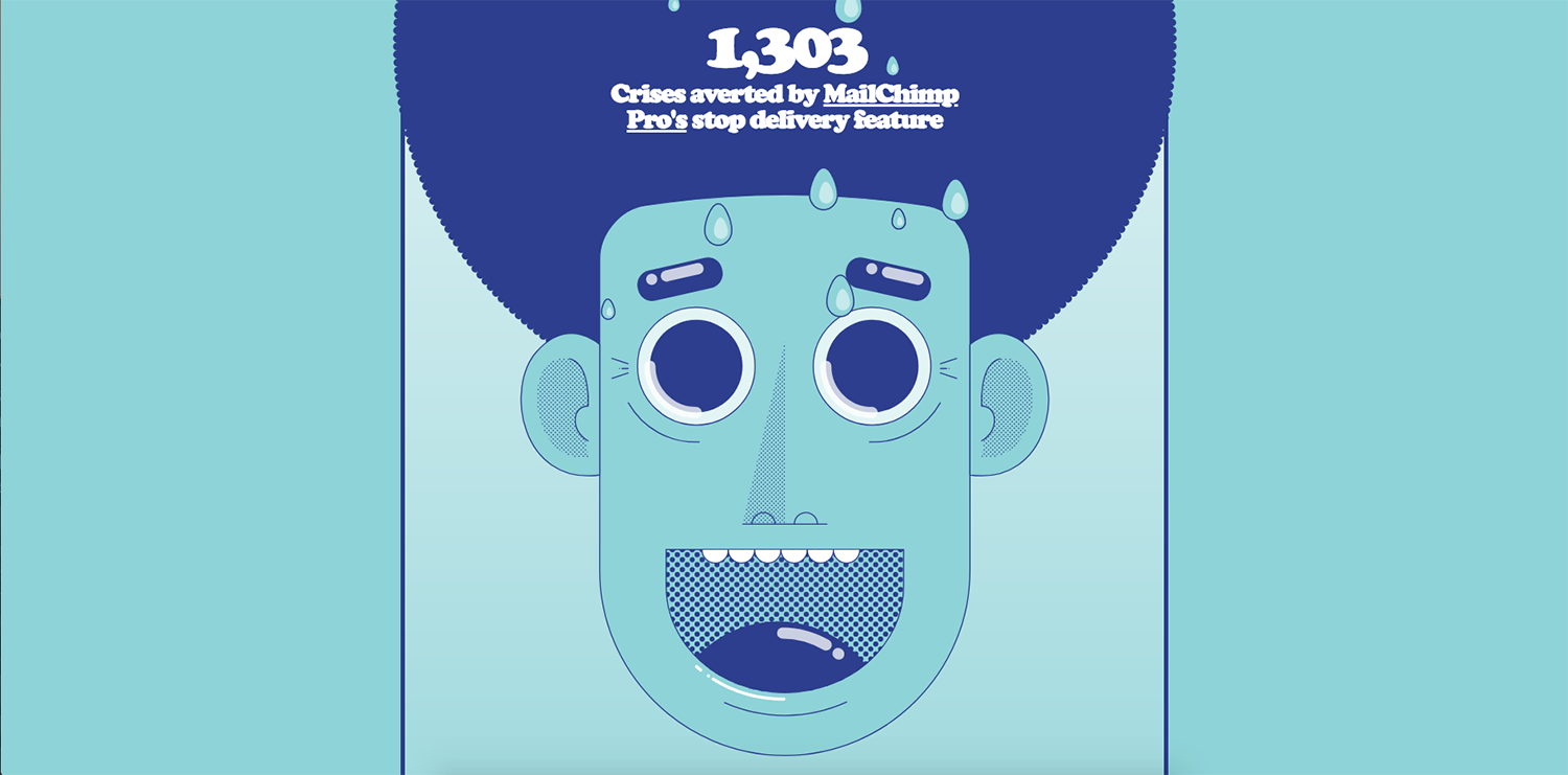
Using a mix of serif (Cooper Black) and sans-serif typefaces throughout, almost always rendered in a large size, the report allows for eye-catching nuggets of information.
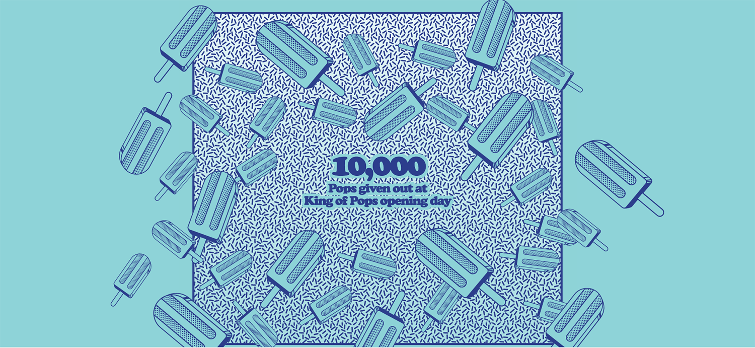
Humour is also an integral part of this report. Textual humour comes in the form of exaggeration and drollery (“224,640 hours spent by our support team helping customers – that’s almost 26 years”). Visual humour comes out through the many quirky illustrations peppered throughout the report.
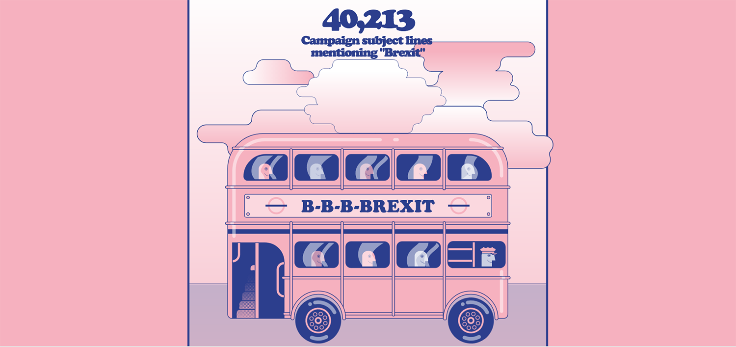
The MailChimp report is certainly an unusual one. It conveys the early 2000s aesthetic of the World Wide Web through its illustrations, colours, and animations. Such a theme, while catering to millennials and the technologically savvy, may however risk confusing the average reader in its use of design and presentation.
Back
