BioNTech SE is a German biotechnology company that makes, among other things, patient-specific, mRNA-based immunotherapies for treating cancer.
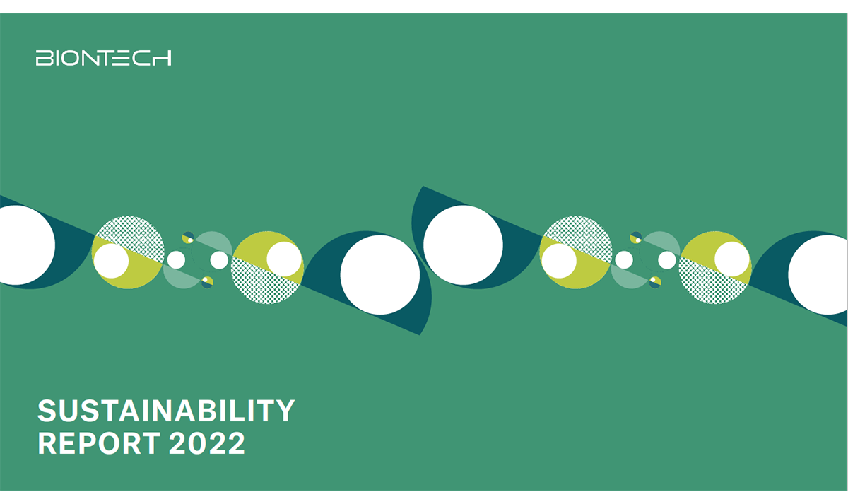
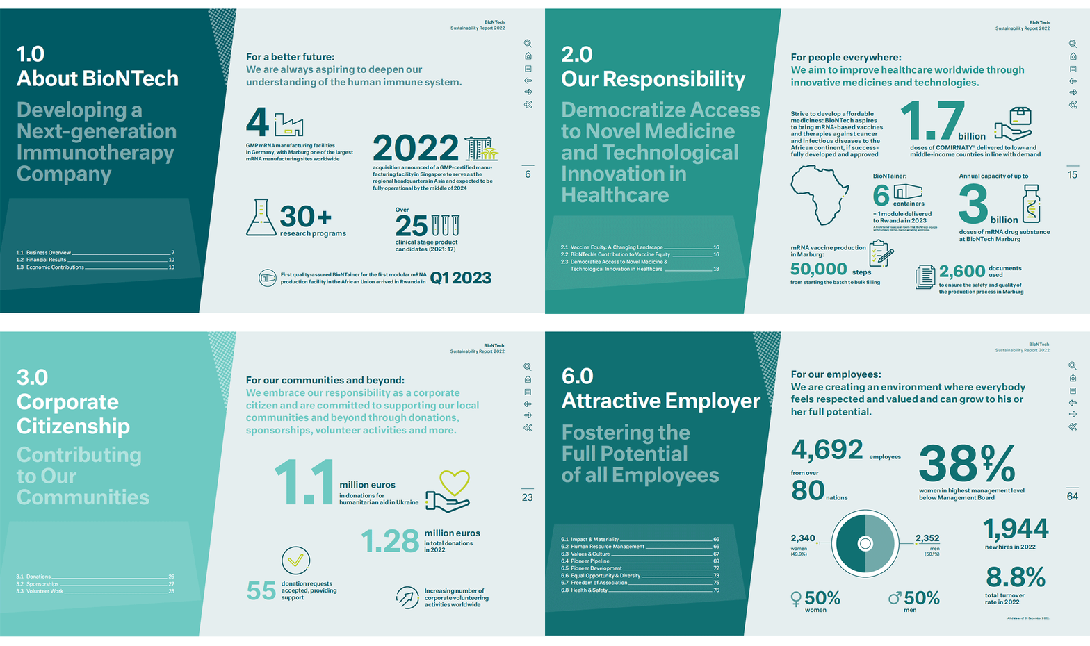
Their 2022 sustainability report, designed by HGB Hamburger, is built almost entirely from a palette of green. It’s worth noting this is not, technically, a monochromatic report – about five individual greens are used; colour photographs and logos appear in the report; and black is used in the construction of the illustrated portraits. And yet, the effect is certainly one of a skillfully built monochrome design.
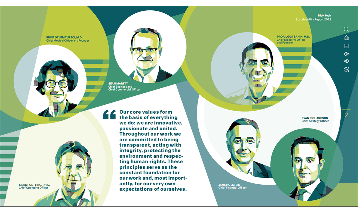
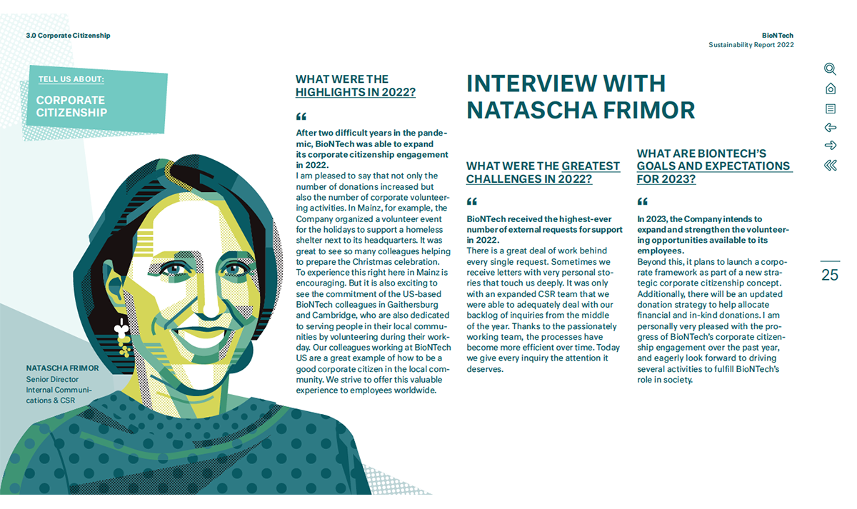
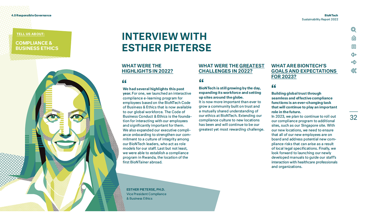
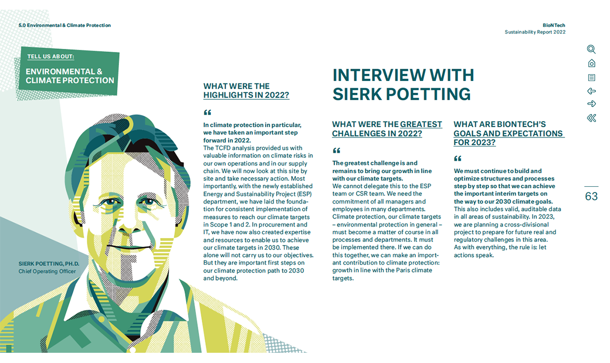
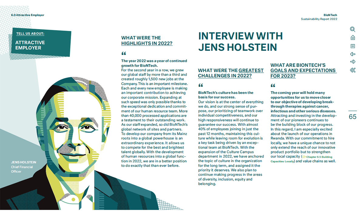
The excellent, lively portraits of company staff are by Serbian artist, Aleksandar Savić. These display a fine grasp of portraiture and Savić brings his subjects alive with geometric shapes and crisp line work, using the full range of green available to him along with a dash of black. These are some of the best illustrated corporate portraits we have featured on Crunite and they are worth studying.
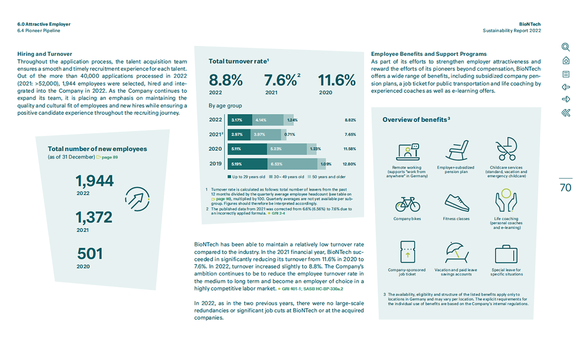
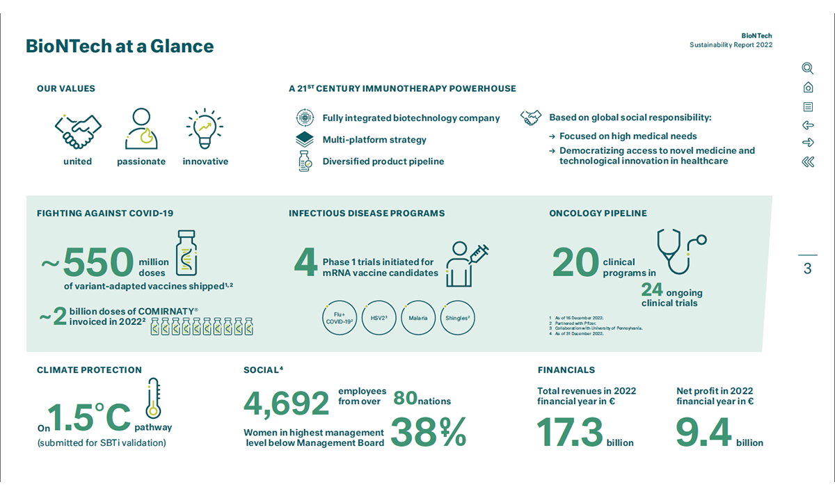
Icons and charts are handled well and are easy to read. Admittedly, these are easier to create with multiple greens using multiple tones, than with a true monochrome palette. It’s a shame the finely detailed icons on p.20 were not the model for iconography throughout the whole report – the set is beautifully drawn, but that level of detail does not appear again in the report.
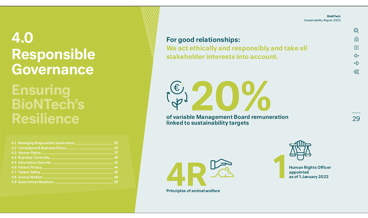
BioNTech’s report benefits from a useful navigation bar that appears on the right edge of each page of the pdf. The bar allows the reader to move back and forth a page at a time as well as to jump to the last read page (useful when hopping between sections). It links directly to the Contents page and includes a search function. HGB Hamburger have built a robust, well-constructed report while working within the limits of narrow colour range.
