The Zumtobel Group is an Austrian company that makes lighting, lighting systems and components. They have an unusual approach to annual reports. Each year they invite professional artists in a variety of fields to create their reports and seem to insist on non-traditional design.
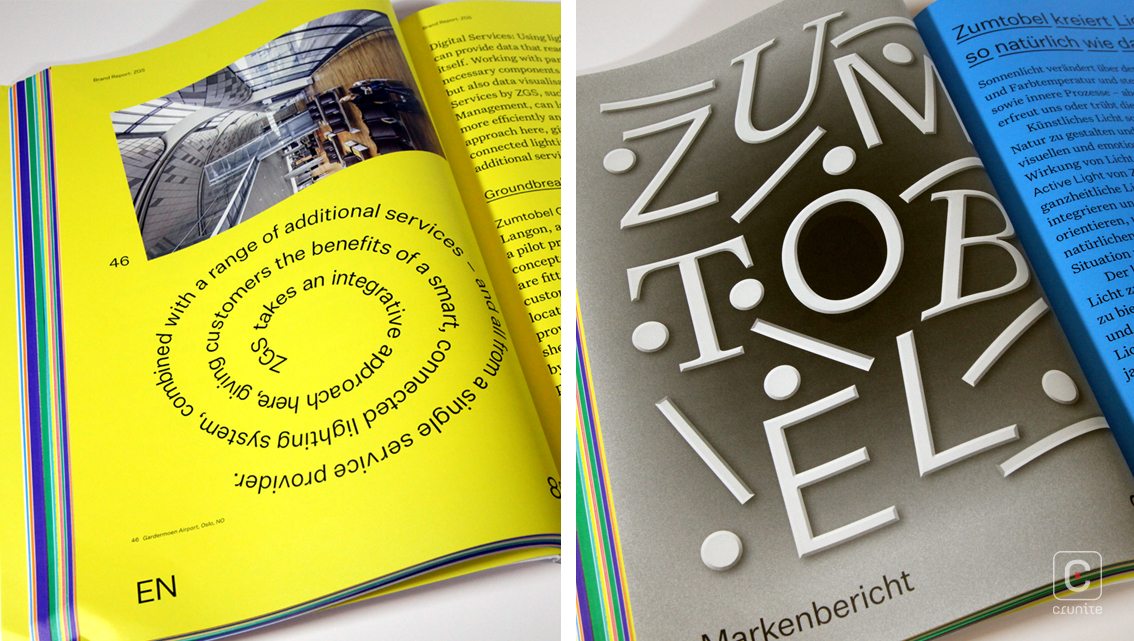
Their 2015/16 report for instance concentrated on the quality of sunshine during the ‘blue hour’ of dawn and dusk. The collaborators were an architect and a photographer and the report worked like an extended photo essay with a surprising narrative thrust. Zumtobel’s 2017/18 could not be more different.
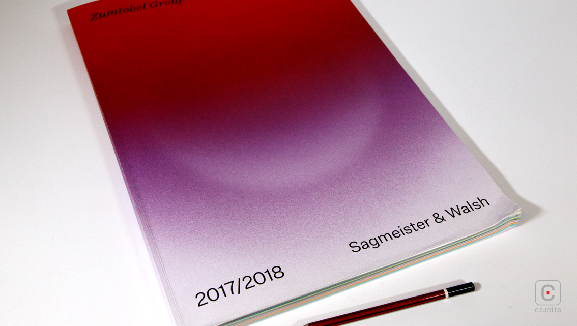
For the 2017/18 report Zumtobel commissioned rock stars of the design community, Sagmeister & Walsh to create their report.
This 194-page report contains maybe 25 pages that are white. The rest are printed in richly saturated colour, coded by section to ease navigation. The paper selection allows for the colour to have depth and the reproduction quality of the photography is pin-sharp.
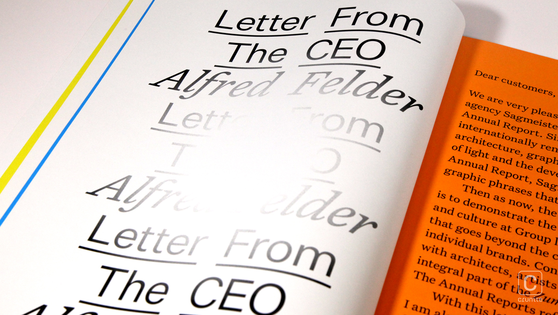
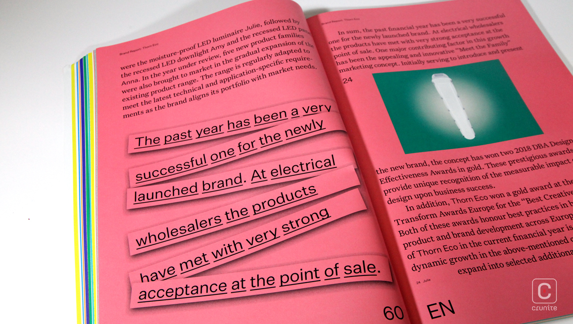
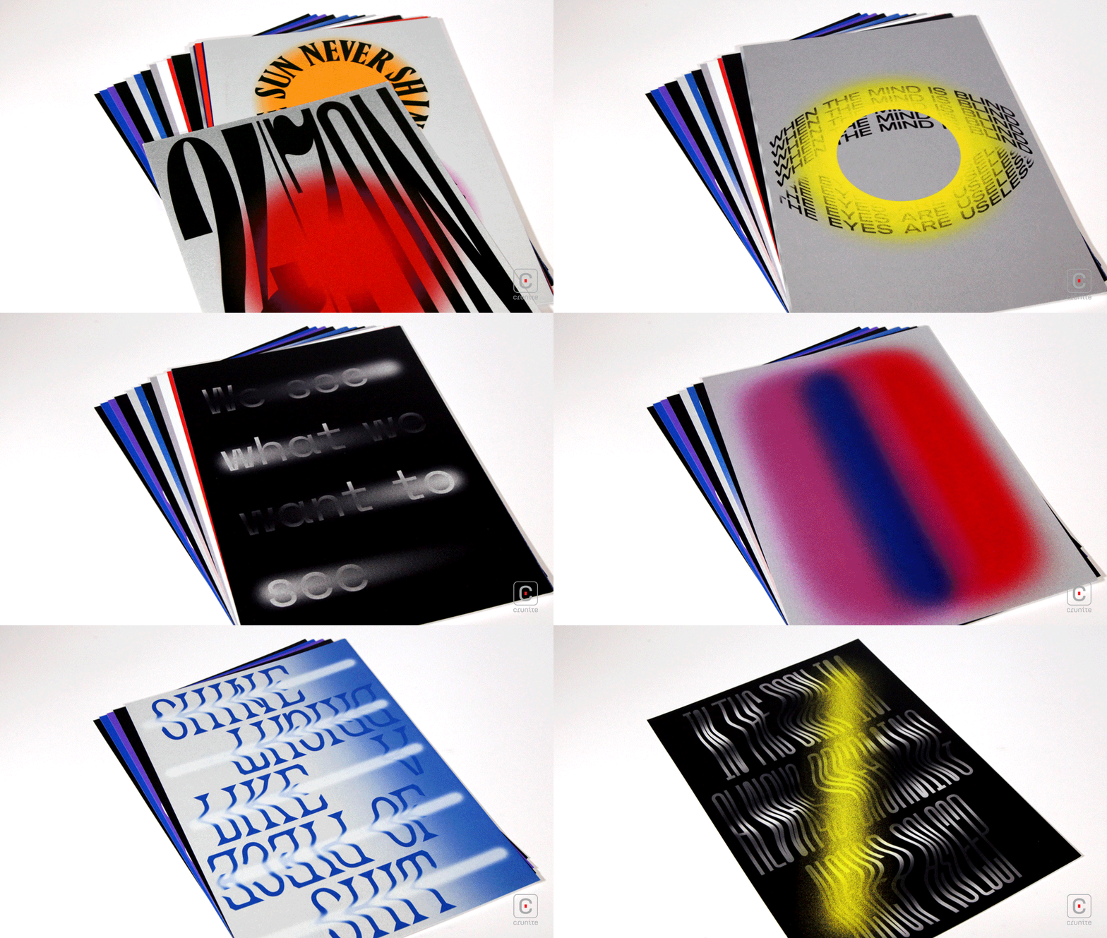
The collection of art prints is a series of typographic treatments by Sagmeister & Walsh in response to the subject of the client’s work – light. These are less impressive than the report, both in their use of colour and in their relevance to the rest of the report but this is a minor quibble.
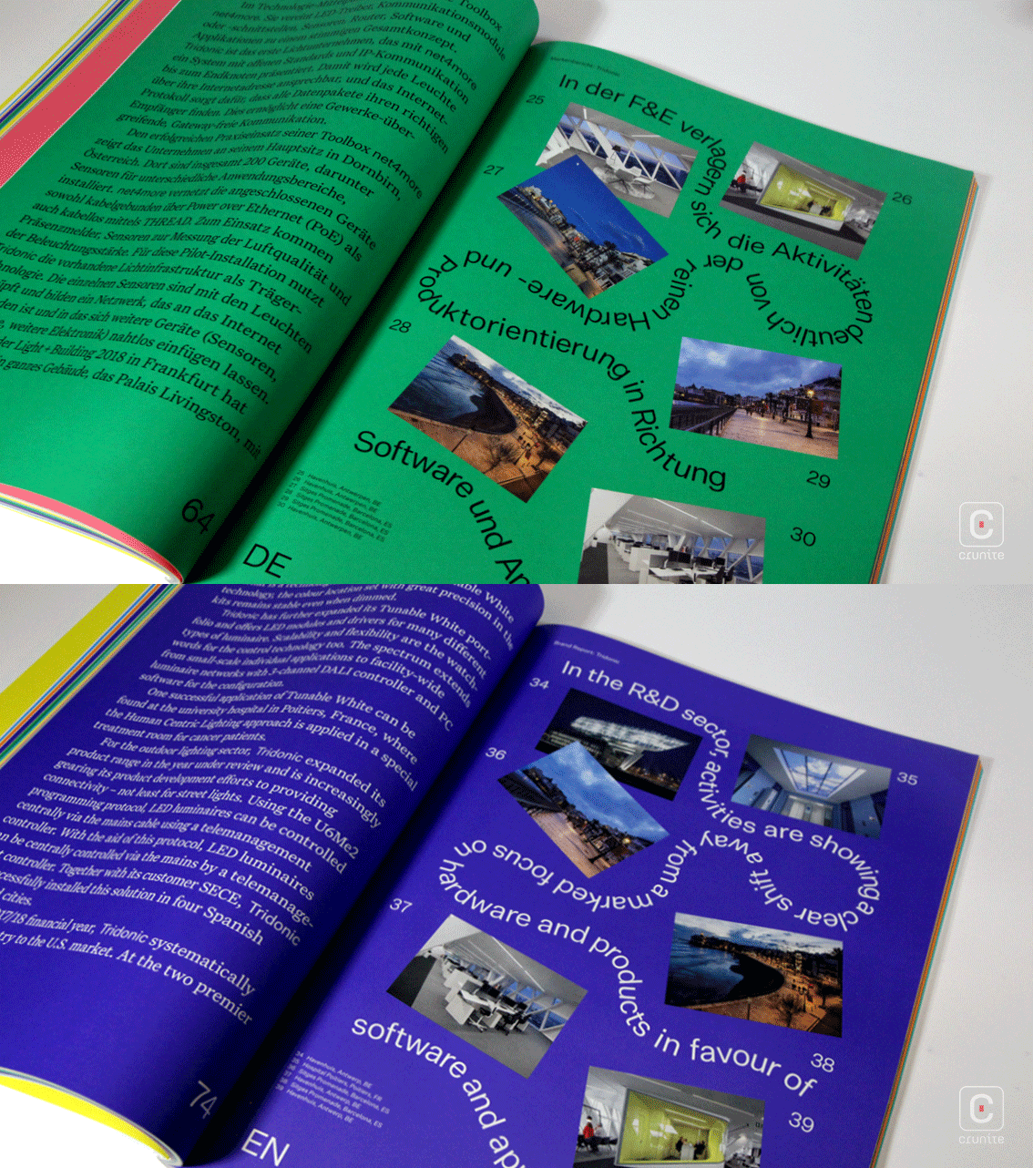
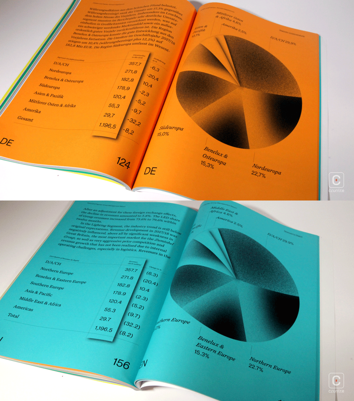
Infographics, when they make an appearance, are enormous – sometimes a single pie chart will occupy an entire page. For the most part they are created using an astonishingly fine gradient of black to white, overlaid on the brightly coloured pages. This is a visually startling report that confirms Sagmeister & Walsh as giants in the design community and also, Zumtobel’s fearless approach to annual reports.
