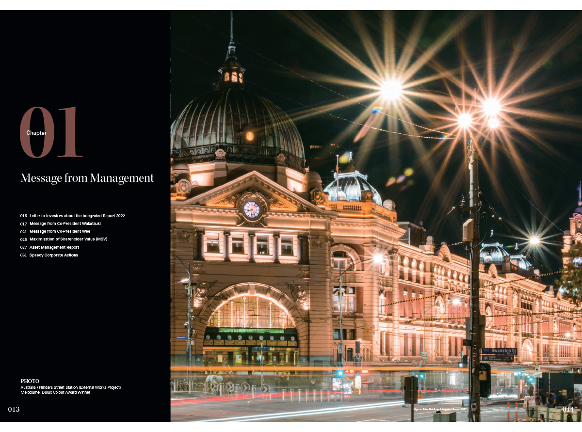
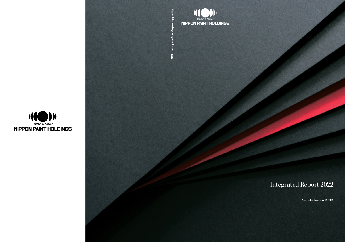
Nippon Paint Holdings is a 142-year-old manufacturing company that makes paints and paint products. They are the world’s fourth largest such firm and their 2020 integrated report casts them, suitably, as a giant in the field. It does this mainly through the use of photography, but also via the sheer density of information per page.
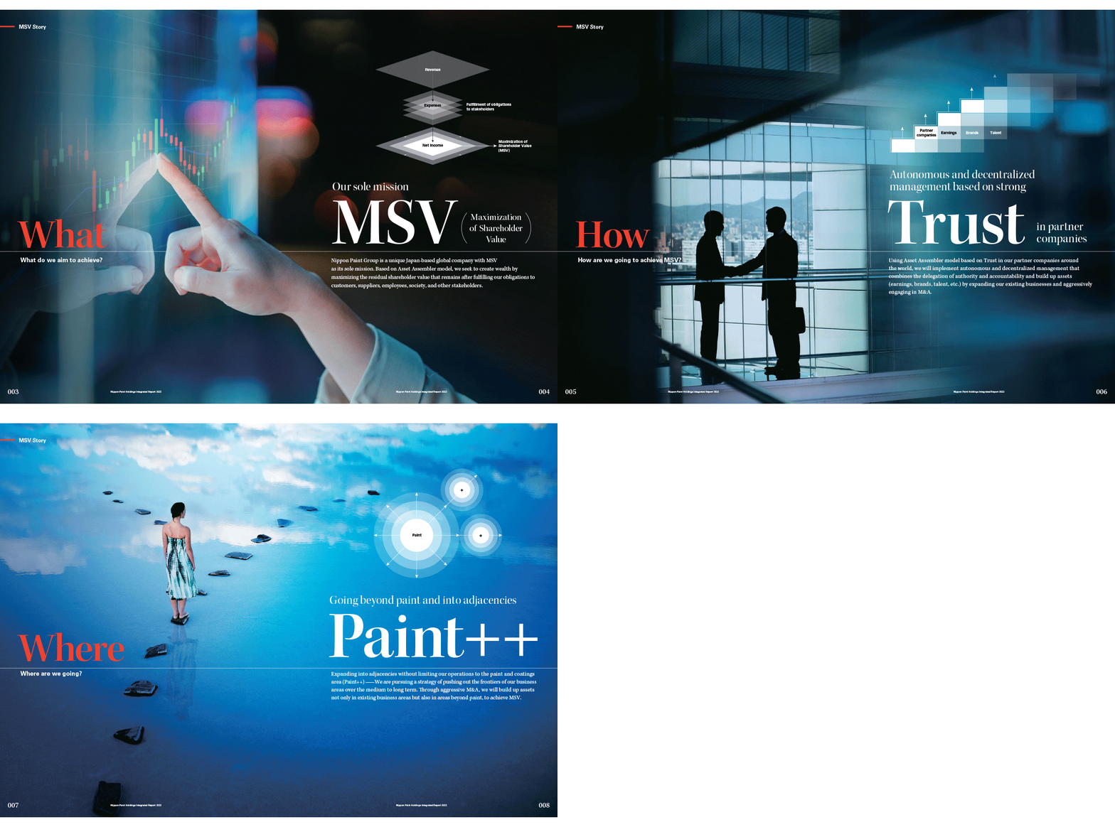
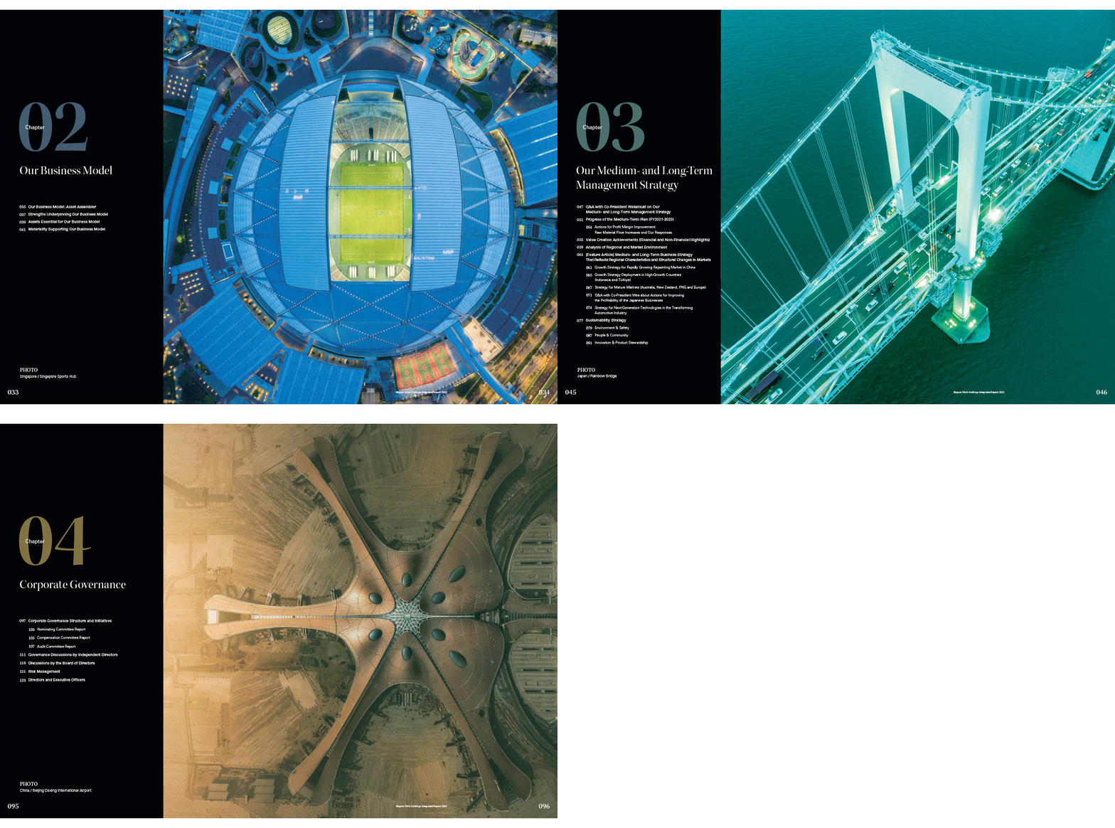
The use of photography is varied. It includes everything from motion-blurred images reminiscent of news magazines, to highly photoshopped images that are almost digital paintings. Included in this range are a number of key, aerial images that are striking in their scale – the aerial photograph of Beijing Daxing International Airport is particularly good. It shows the company’s position in major markets and also the scale at which it operates, as the airport is a huge project, occupying about 7.5 million square feet.
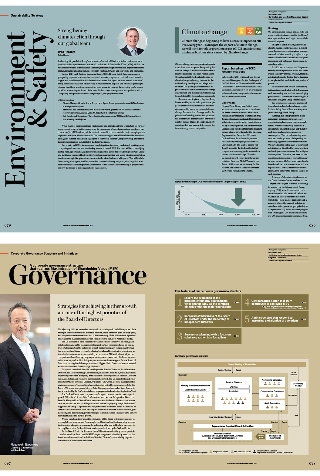
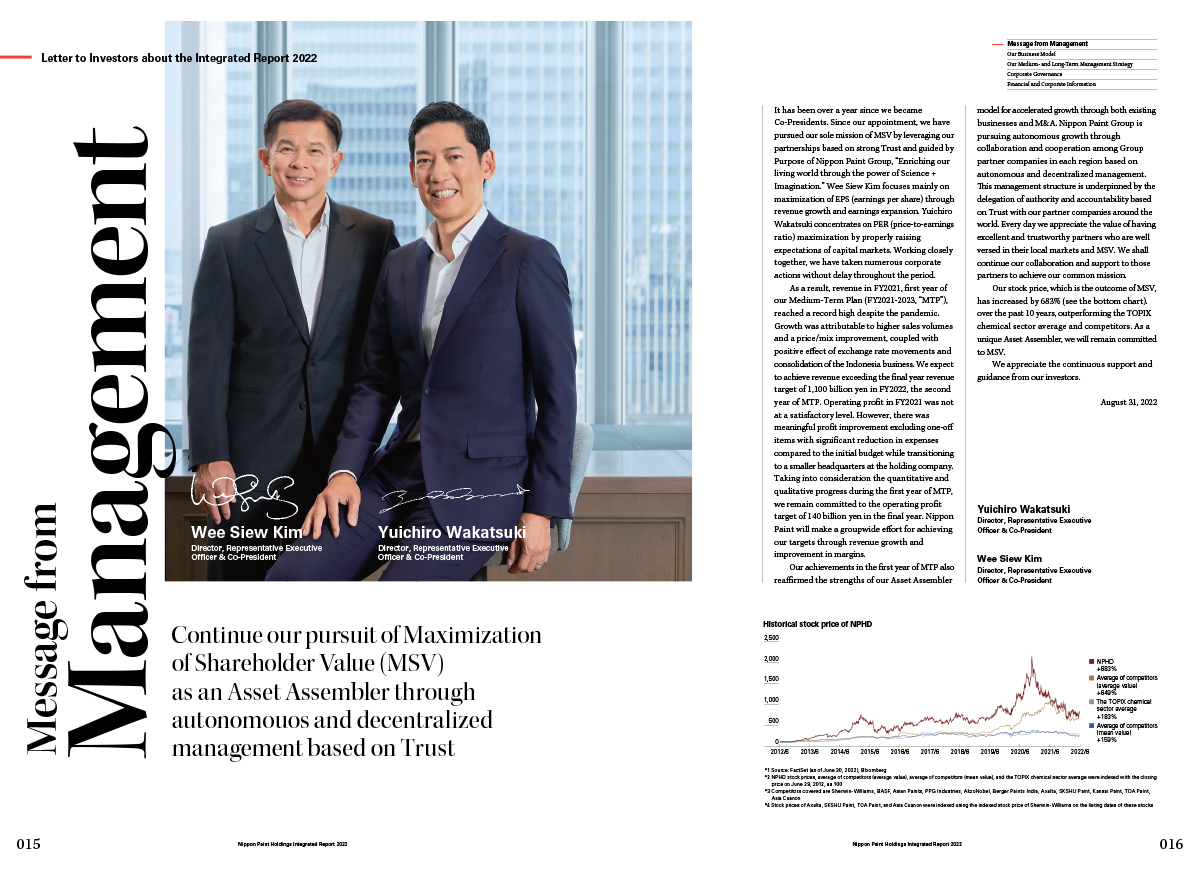
Page grids, for the most part, suggest news or finance magazines, complete with tightly set, ragged-right text in a three-column layout, with titles rotated through 90 degrees for dramatic effect. The report also pulls off the clever trick of relying heavily on a serif typeface but not coming across as old fashioned.
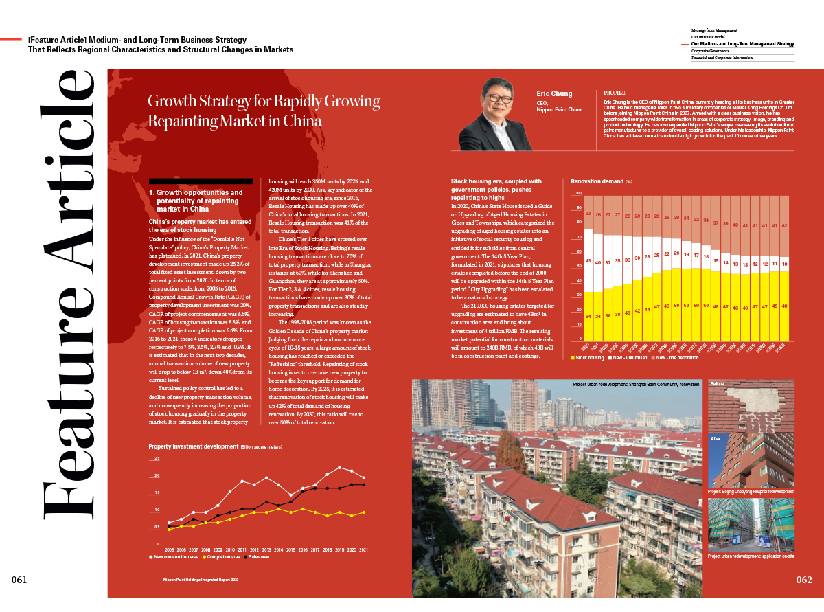
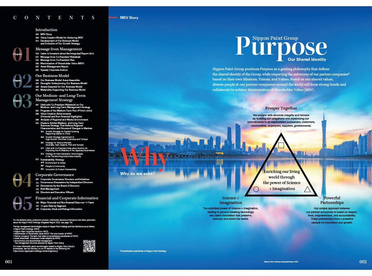
Pages often feature a solid background of rich, soothing tones (white pages are in fact, in the minority here). Negative space is used sparingly. Charts, graphs and other infographics appear with high frequency and very often in high density. This is not often executed well in annual reports, but is handled quite skillfully here. Additionally, it very much creates the sense of a busy, complex business. An array of navigation icons accompany the graphics, decked out in full colour and drawing attention to themselves by doing so.
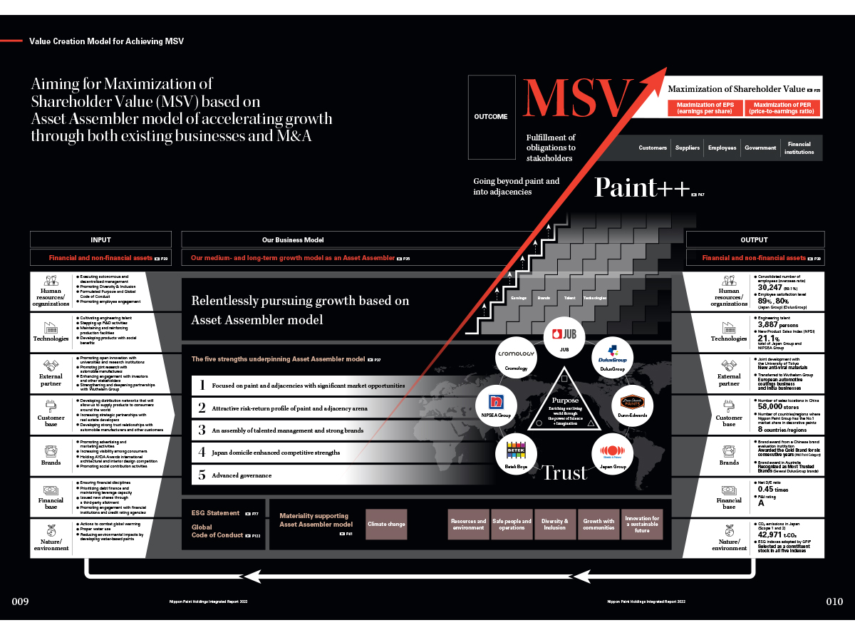
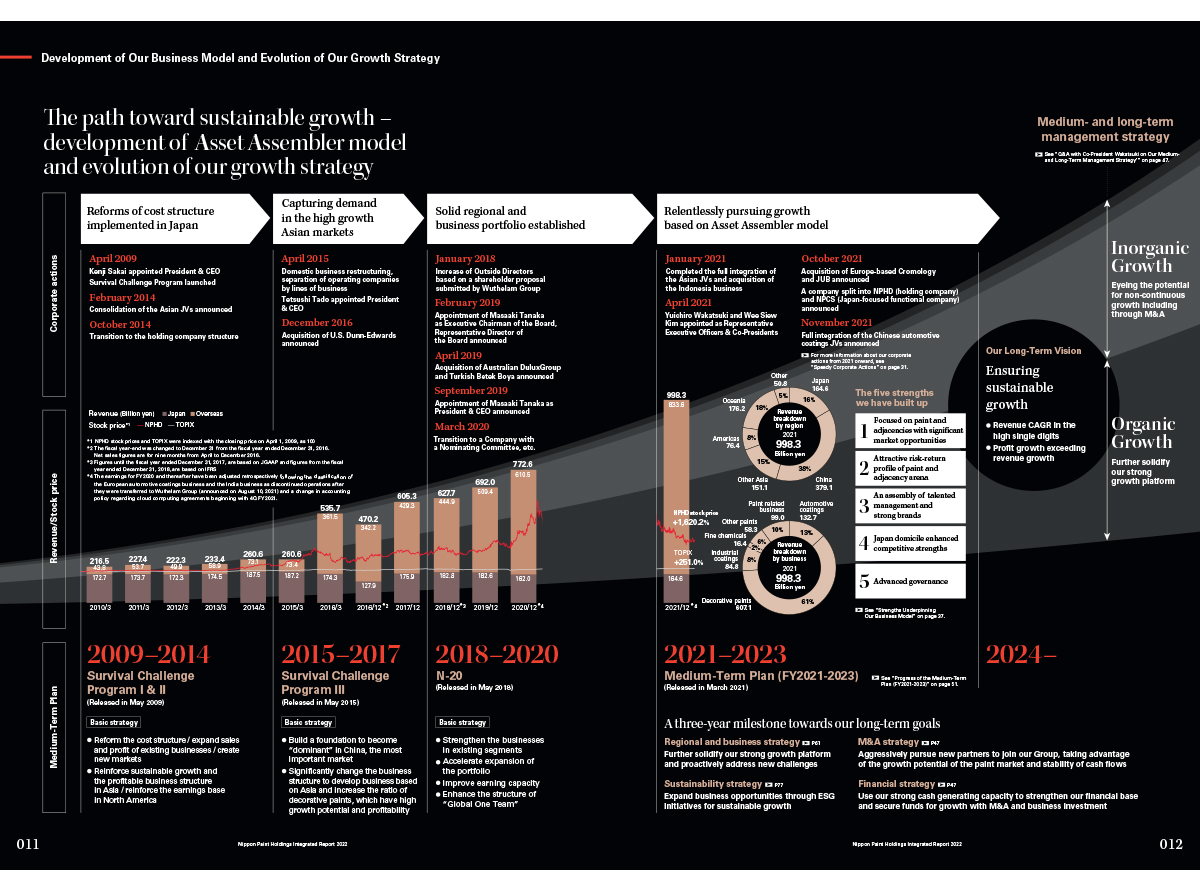
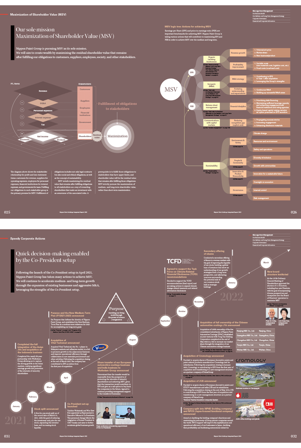
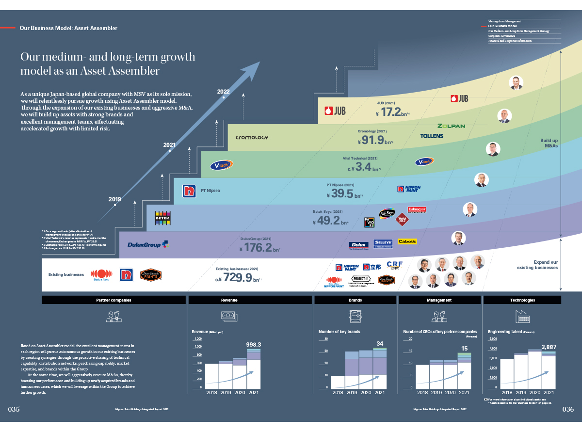
This is an unusual approach to designing a report, and one that works by relying on an unexpected combination of design elements and the confidence not to pander to trends.
