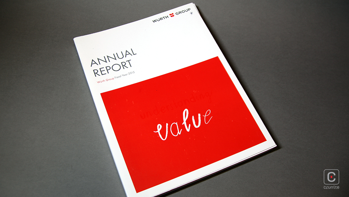
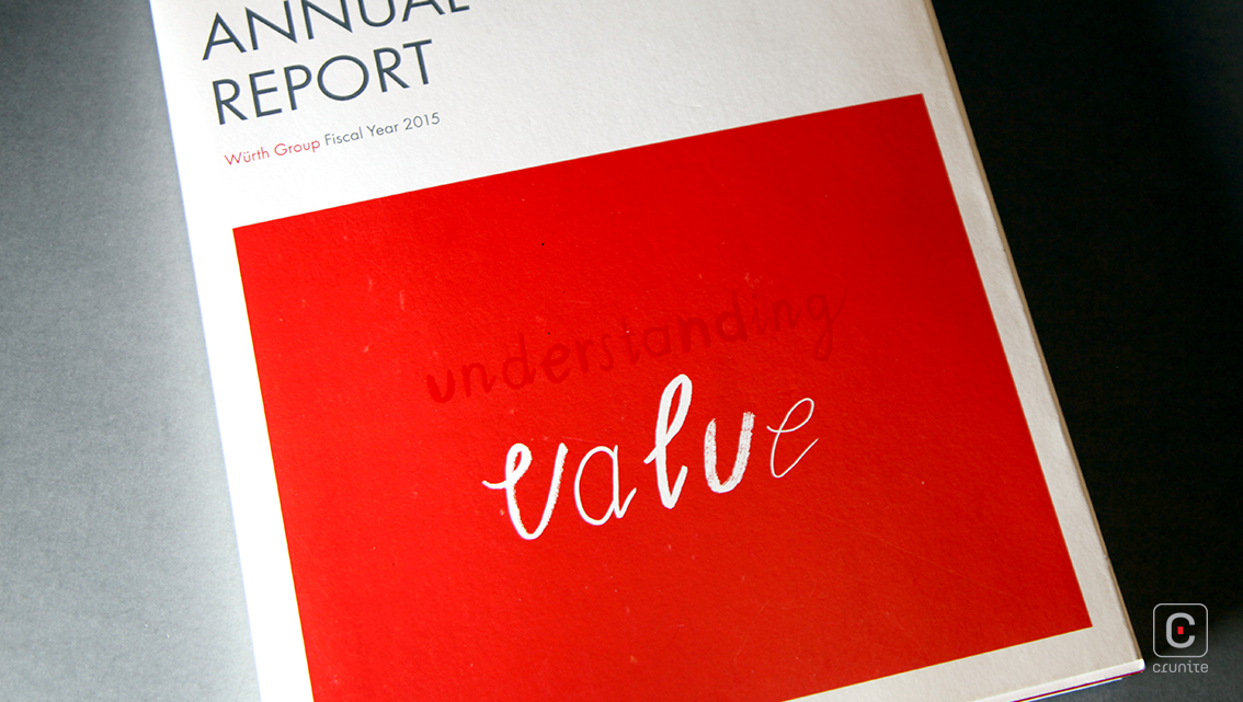
In 2015, the Wurth Group share its financial worth using an illustrative language. The annual report primarily depicts the story of its first product –the screw– the tale of which is told and retold over doodles, text and the fusion of red with white. The front cover is dominated by a block of red, on which the word ‘understanding’ appears with a spot varnish. Below this, ‘value’ is scribbled using a brush stroke font, introducing the theme for the rest of the report.
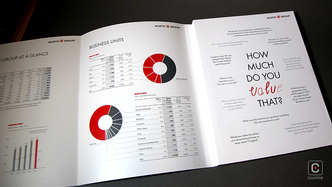
True to its nature as a producer of assembly and fastening materials, the Wurth Group retains a professional air throughout its annual report, especially beyond pages 1-18. The initial pages are devoted to a play of sketches along with a brush stroke font, not unlike the one on the front cover. It makes the reader anticipate a lighthearted approach before gradually transitioning to the integral elements of a standard annual report. The doodles are interwoven with tales about values and philosophical quotes.
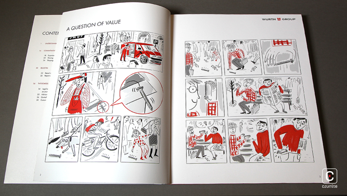
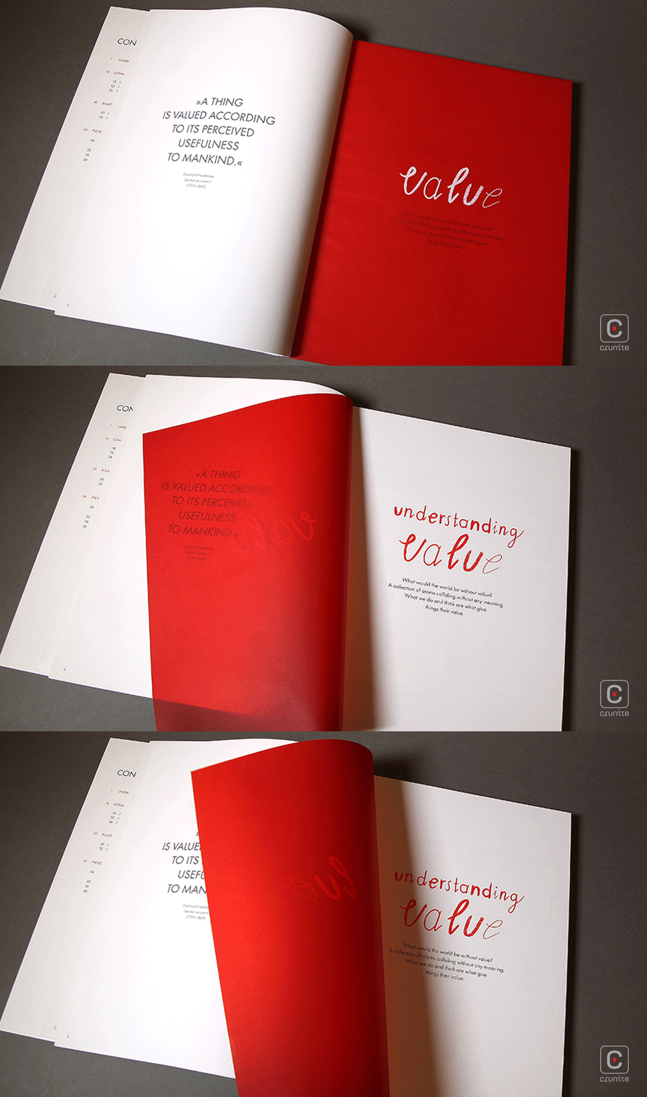
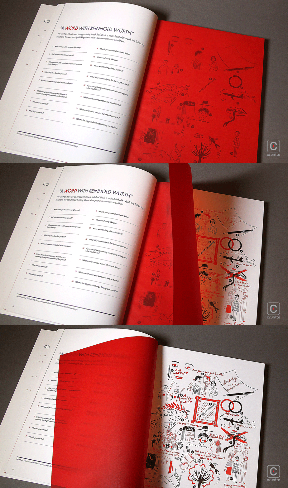
This is another deviation from the norm – a series of questions to the chairman are set out while making the reader to think of his/her own answers for them too. The actual responses are veiled by the translucent paper, through which the illustrative answers are only partially visible. The next page opens to a lively mosaic of art, completing his answers.
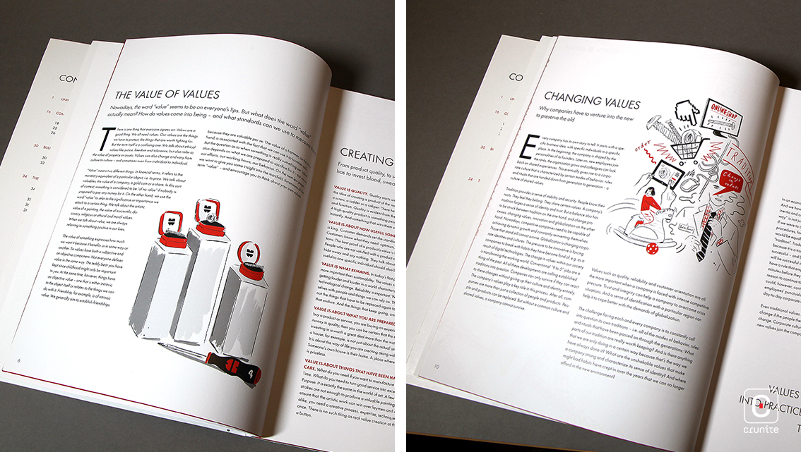
The rest of the report uses photographs and clean text on a white background. The financial data is depicted using black typography with ample use of white space. Red is sparsely used among charts. The overall effect is easy on the eyes. The simplistic choice of designs add an effective balance to the layout of the report.
