Ravensdown is a cooperative run by New Zealand farmers. Its ambit includes agrochemicals, fertilisers and animal health. In recent years Ravensdown has developed an online platform to assist farmers in far-flung locations around the country.
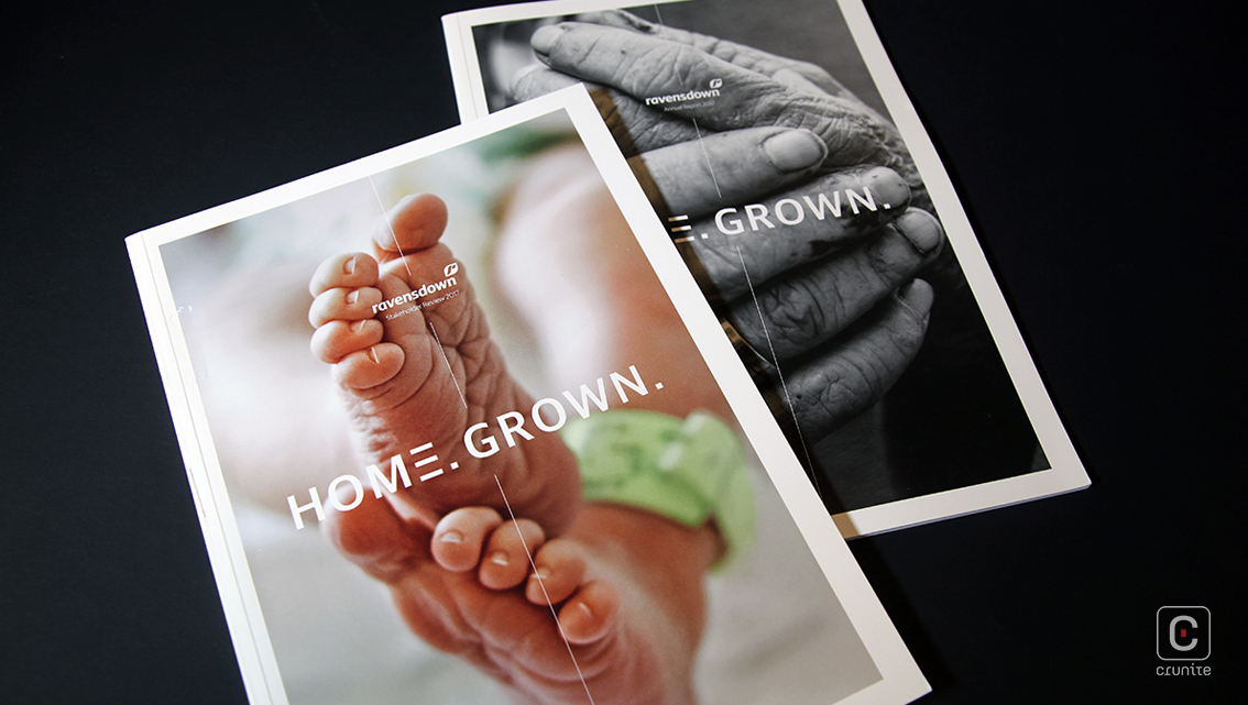
The report is split into two volumes – the stakeholder report and the annual report proper. A certain symmetry is achieved in the repeated but inverted use of cover images across the two books.
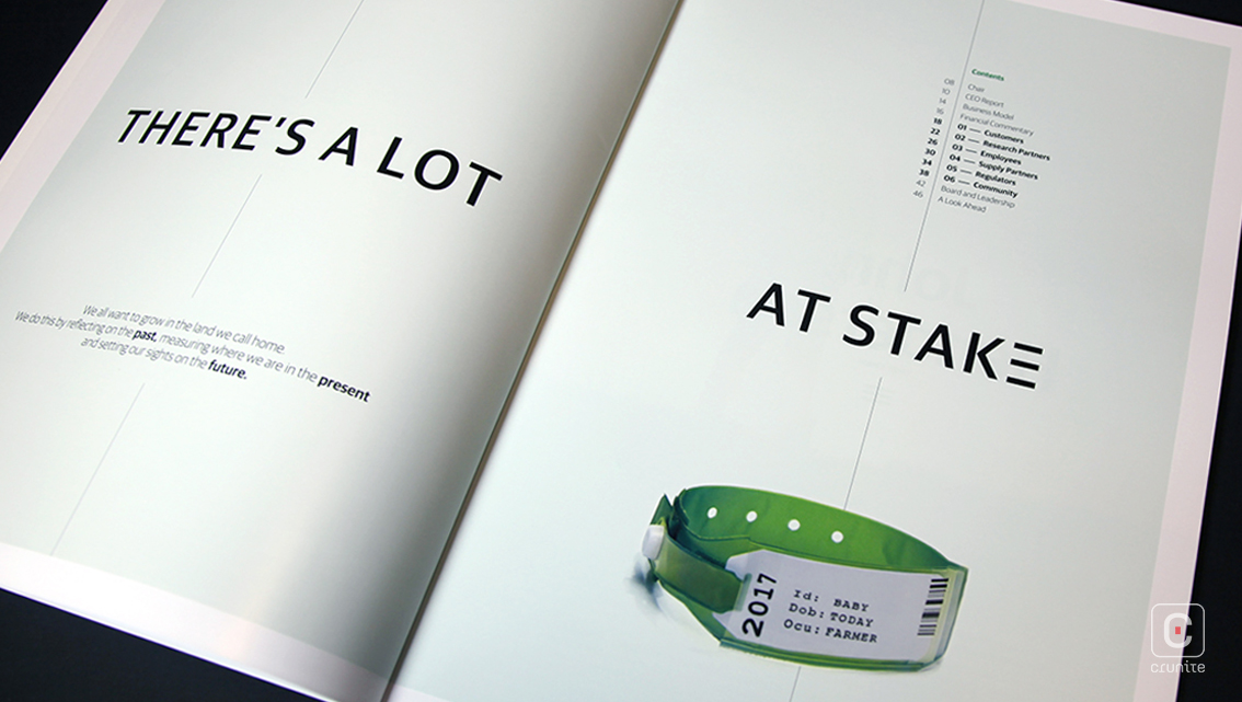
The annual report uses a deep green to suggest very simply that the company is tied to agriculture. Aside from the cover photographs, there is only one other image in the annual report – the black and white board of directors group portrait (shot on farmland, naturally).
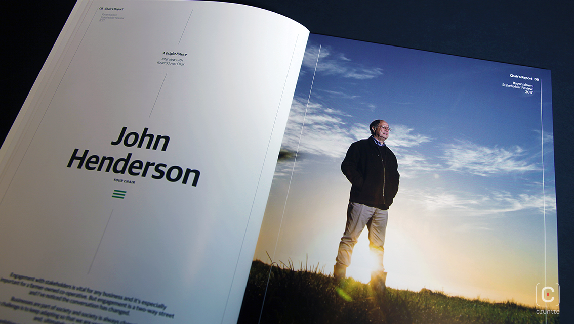
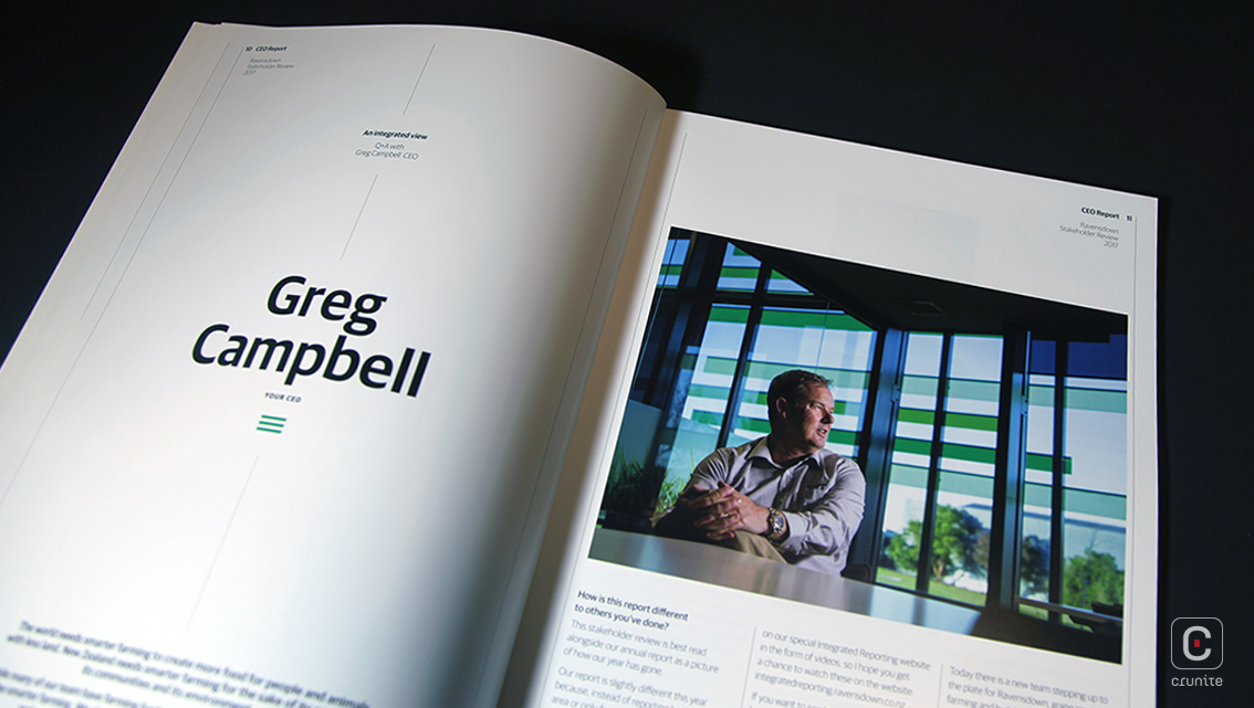
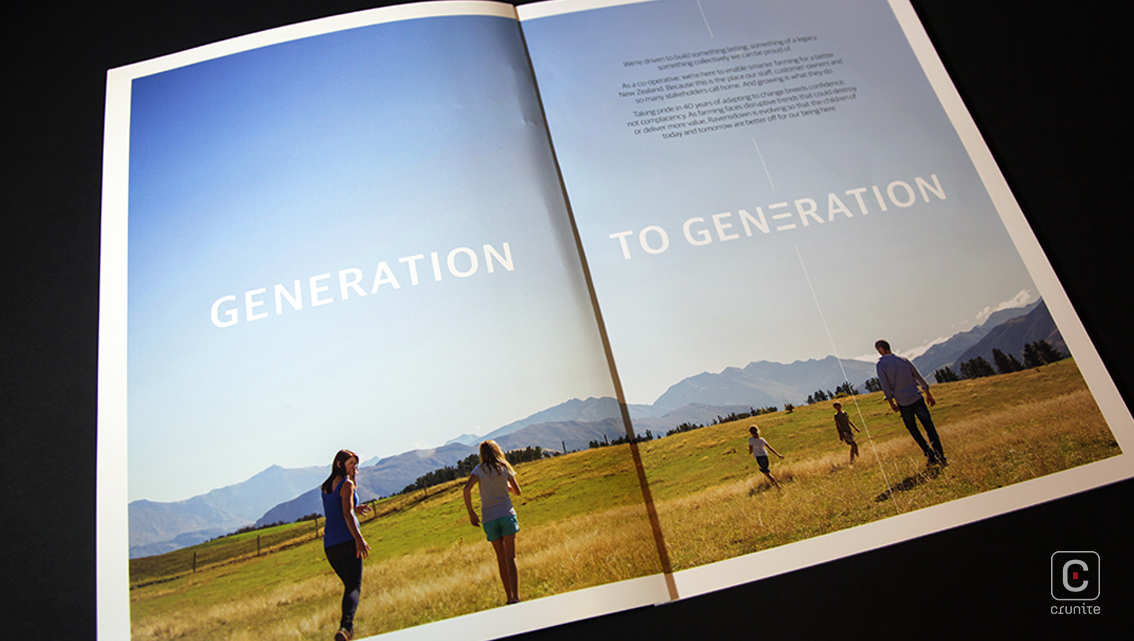
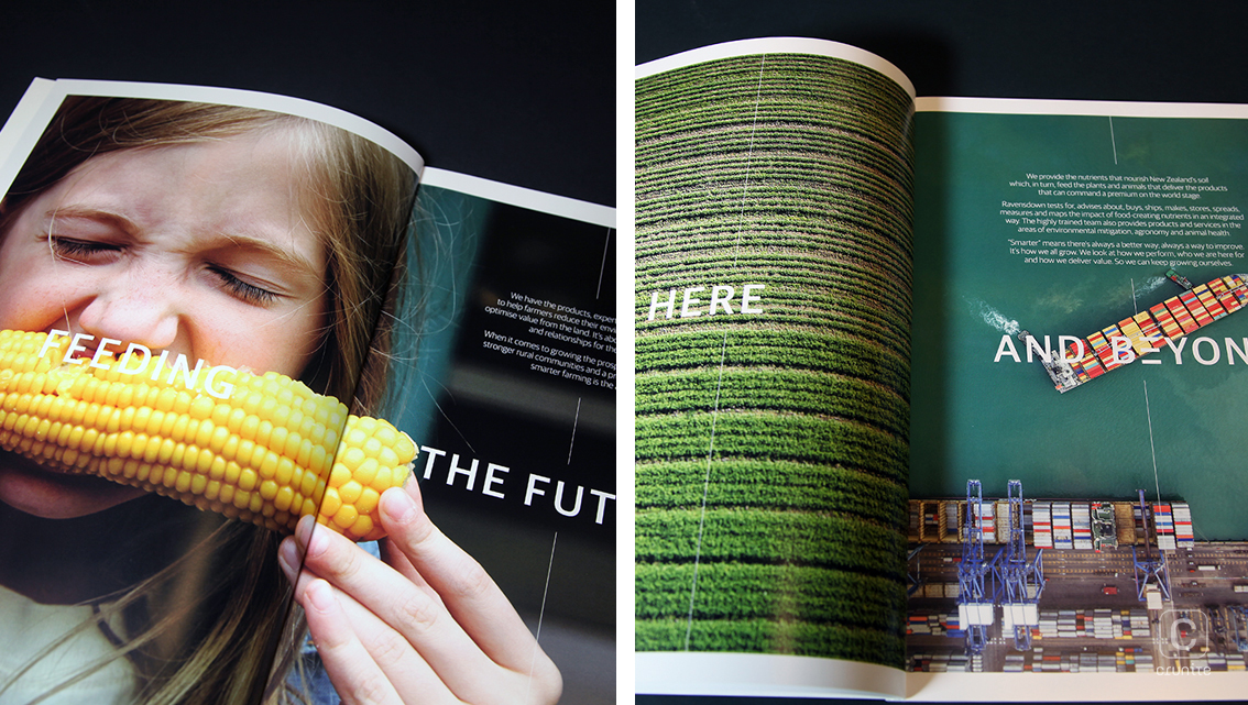
Human subjects are photographed casually – no one wears a tie and there’s hardly a suit to be seen. Captions on the board of directors portrait (this time in colour) use only the person’s first name. These choices go a long way to creating an earthy, friendly atmosphere for the stakeholder review.
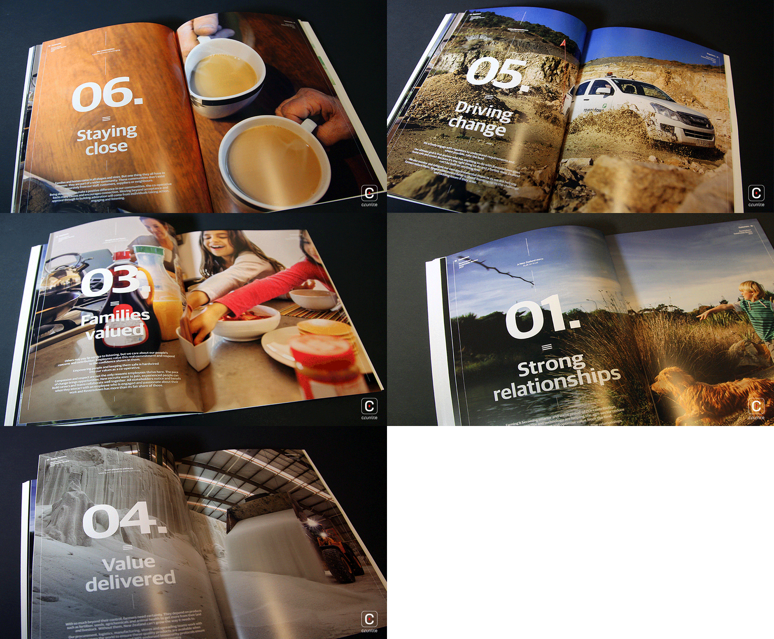
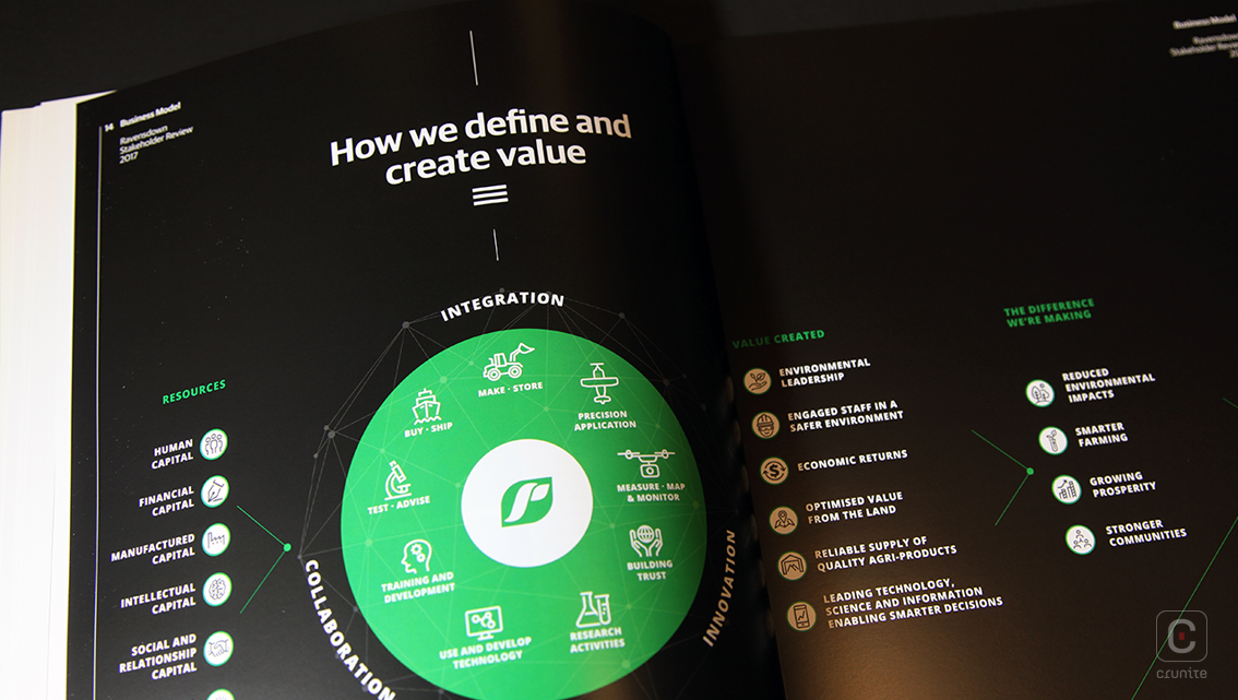
The green palette from the annual report is made use of for infographics and visual highlights, enforcing the link to farming. A three-column grid is effectively used to tuck charts and graphs next to the relevant section of the text, making for a smooth reading experience.
