A New Zealand company formed in the late 80s, Restaurant Brands holds the franchises for a number of American fast food chains, including Pizza Hut, KFC, and Taco Bell. It has since expanded its operations to Hawaii, Guam, and the Northern Mariana Islands.
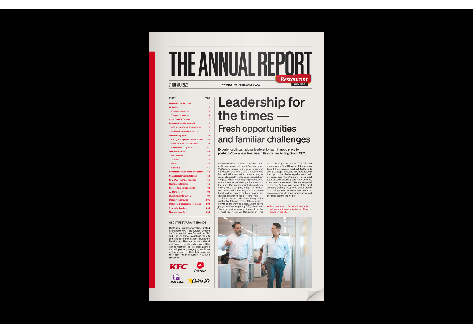
For their 2022 report, Restaurant Brands opts for a design modelled on newspapers, and in particular, the Wall Street Journal, with its long, narrow aspect. Page grids are more forgiving than a traditional newspaper and here we see three columns of force-justified text. While tightly packed for an annual report, these are still easy to read and navigate.
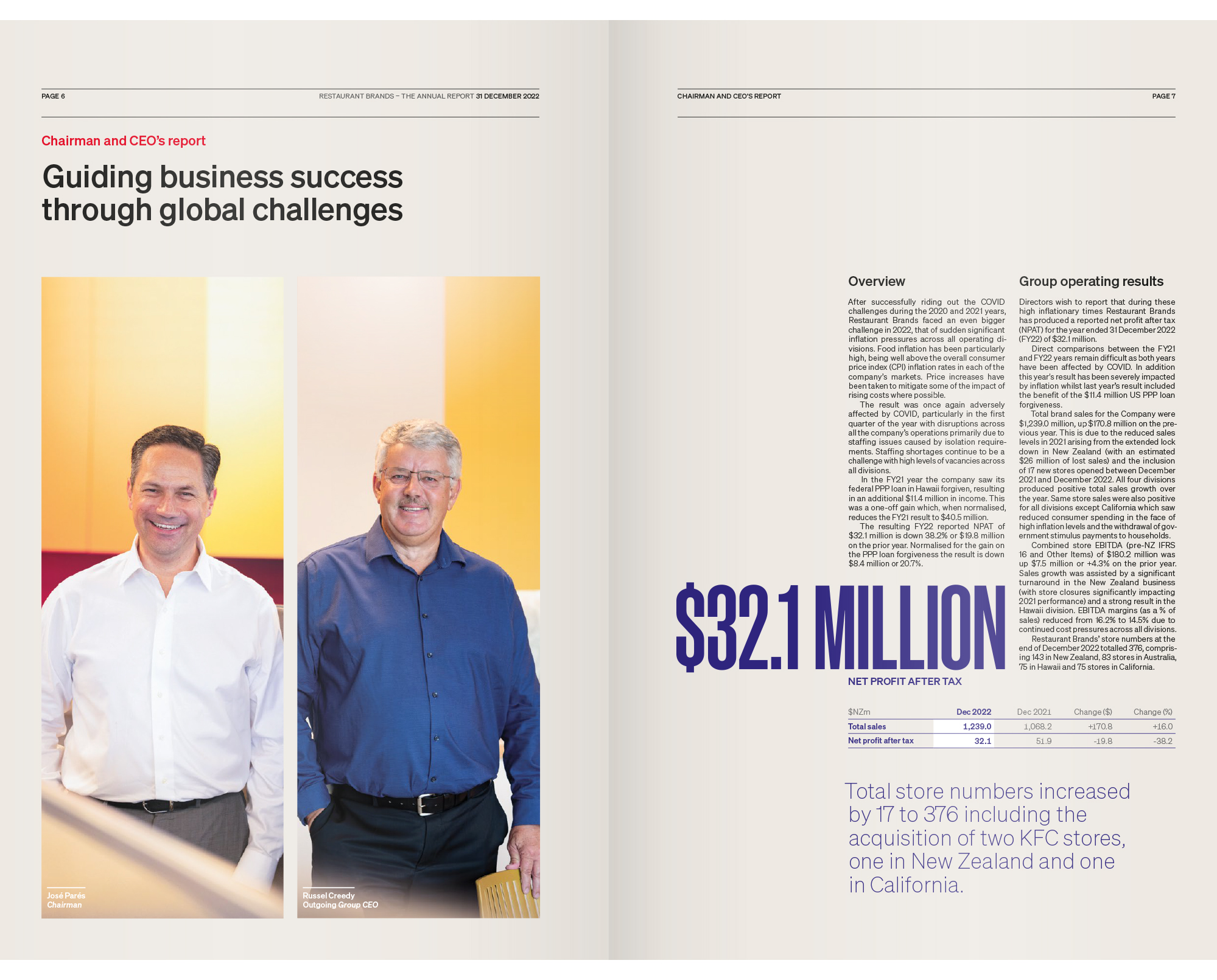
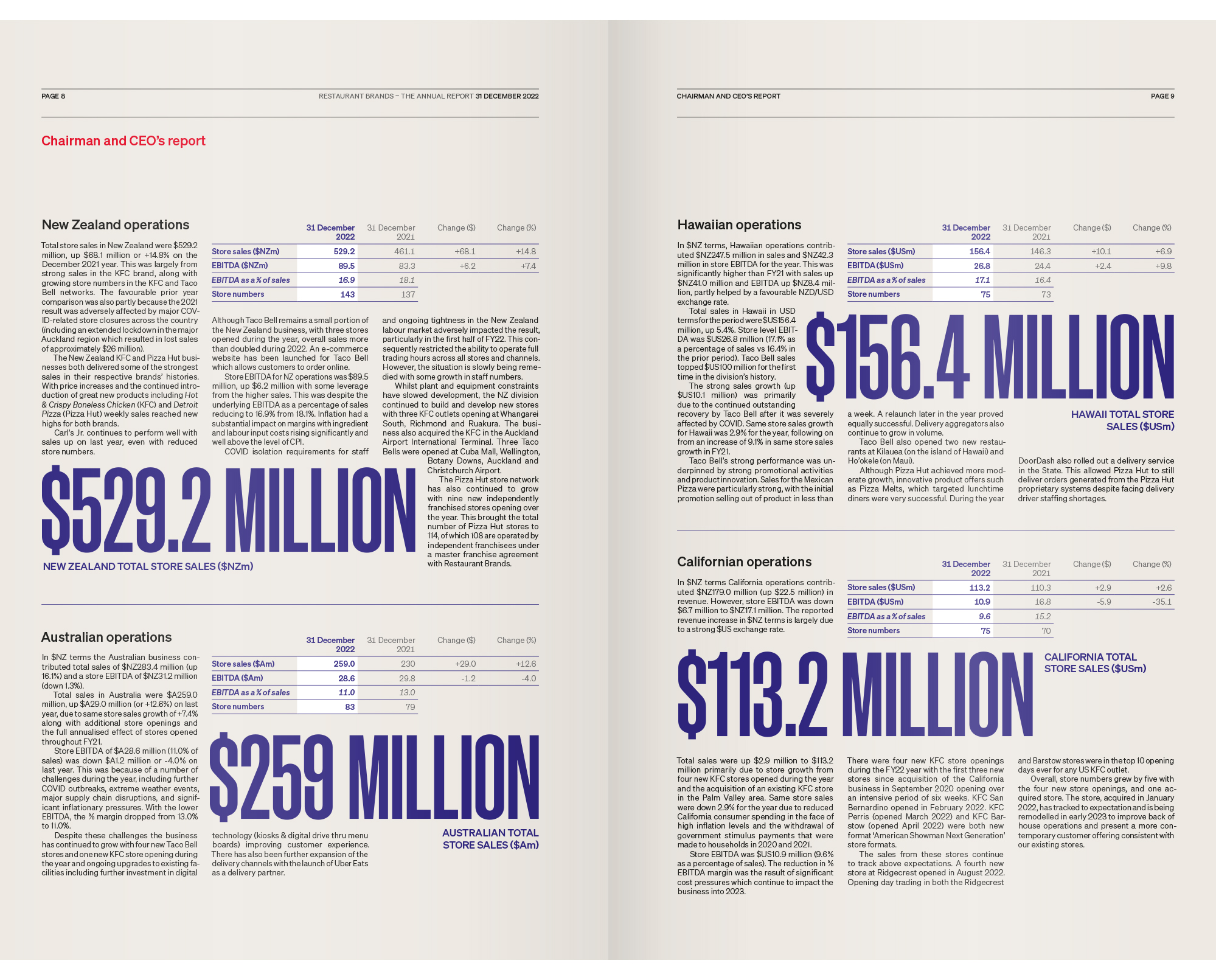
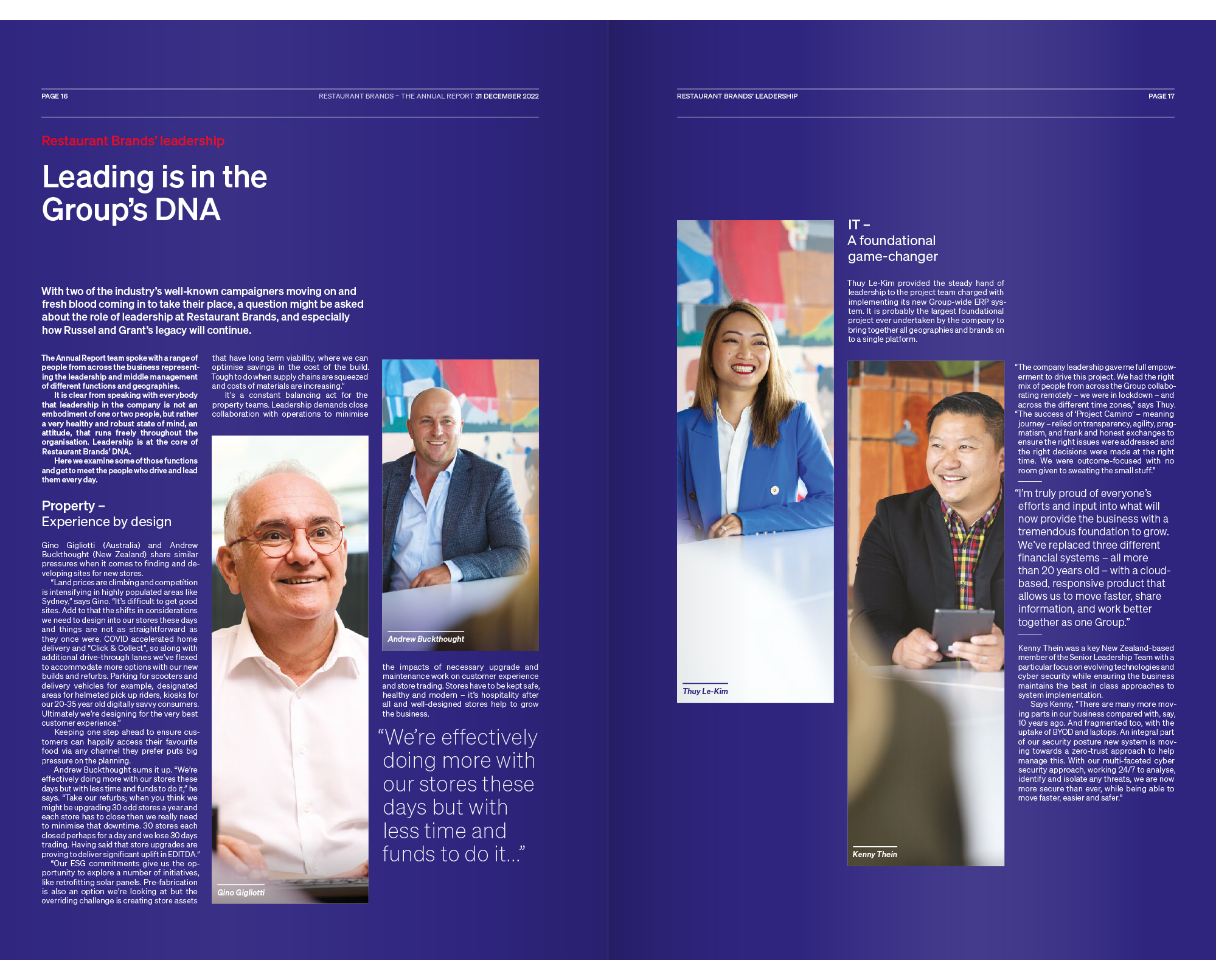
Unlike the WSJ, type treatments here include only sans serifs, although the typeface used for titles does echo the narrow forms of WSJ titles.
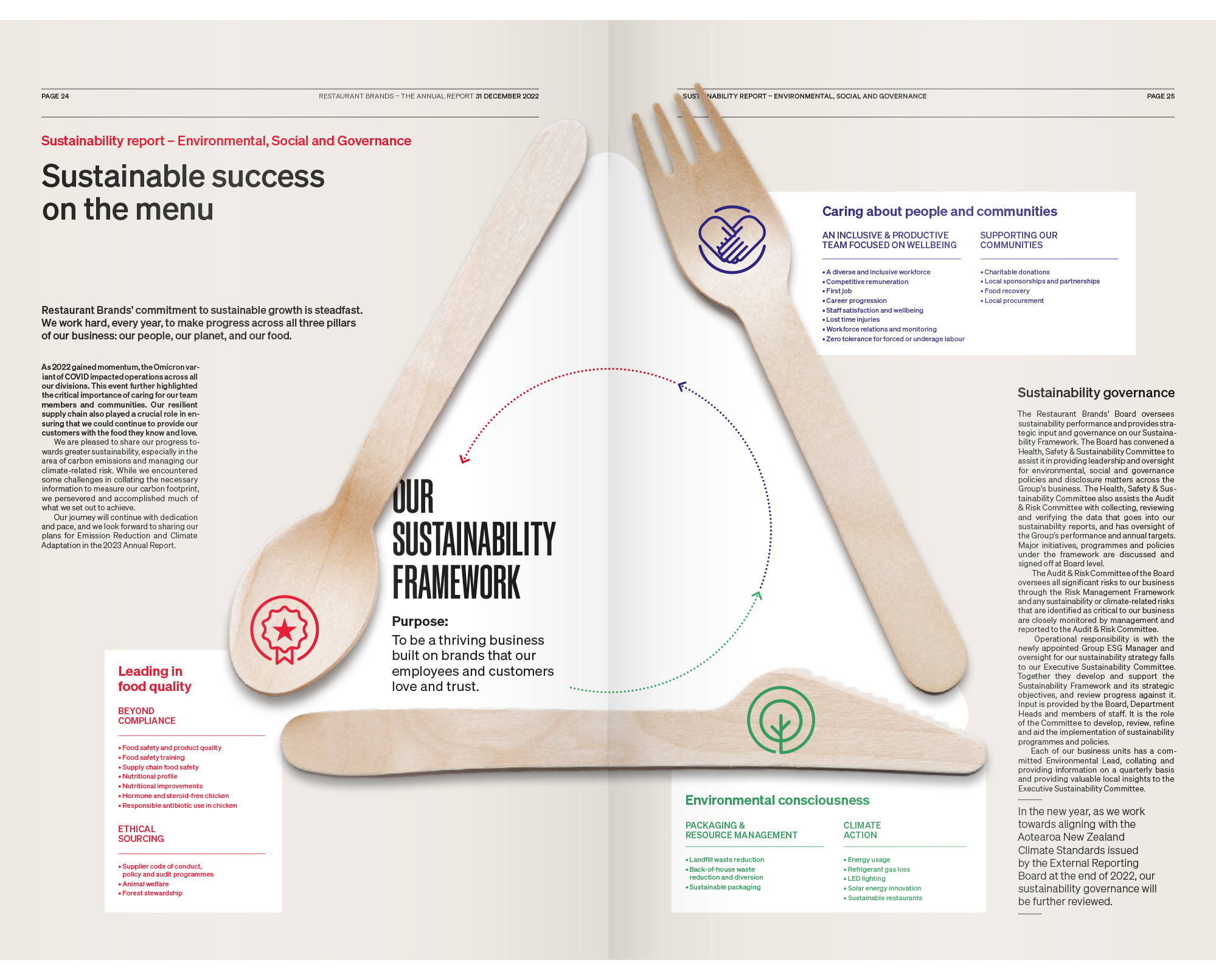
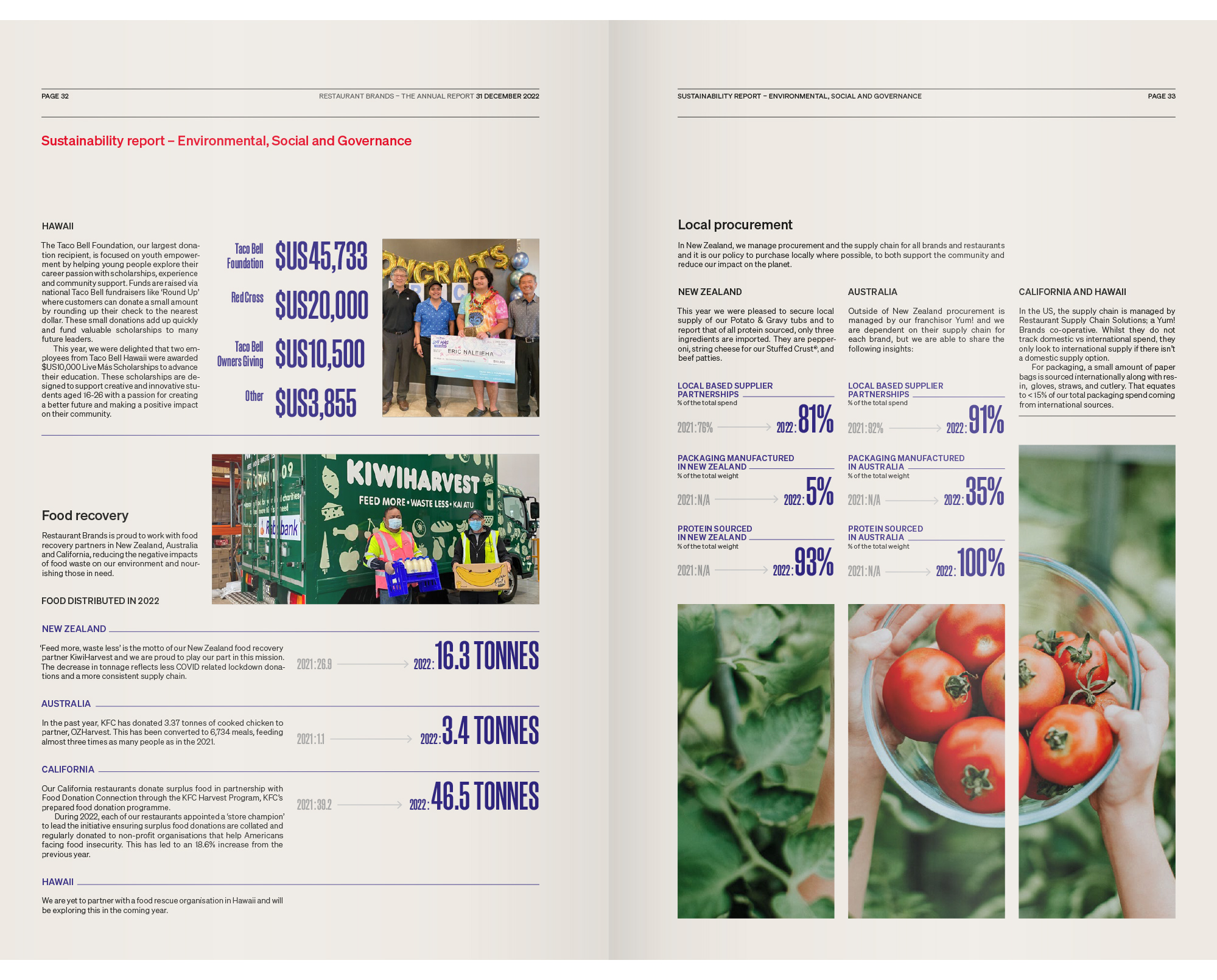
Coloured type is used for navigation and the designers get good mileage from the simple sans serif used for body copy, as it functions effectively at multiple weights.
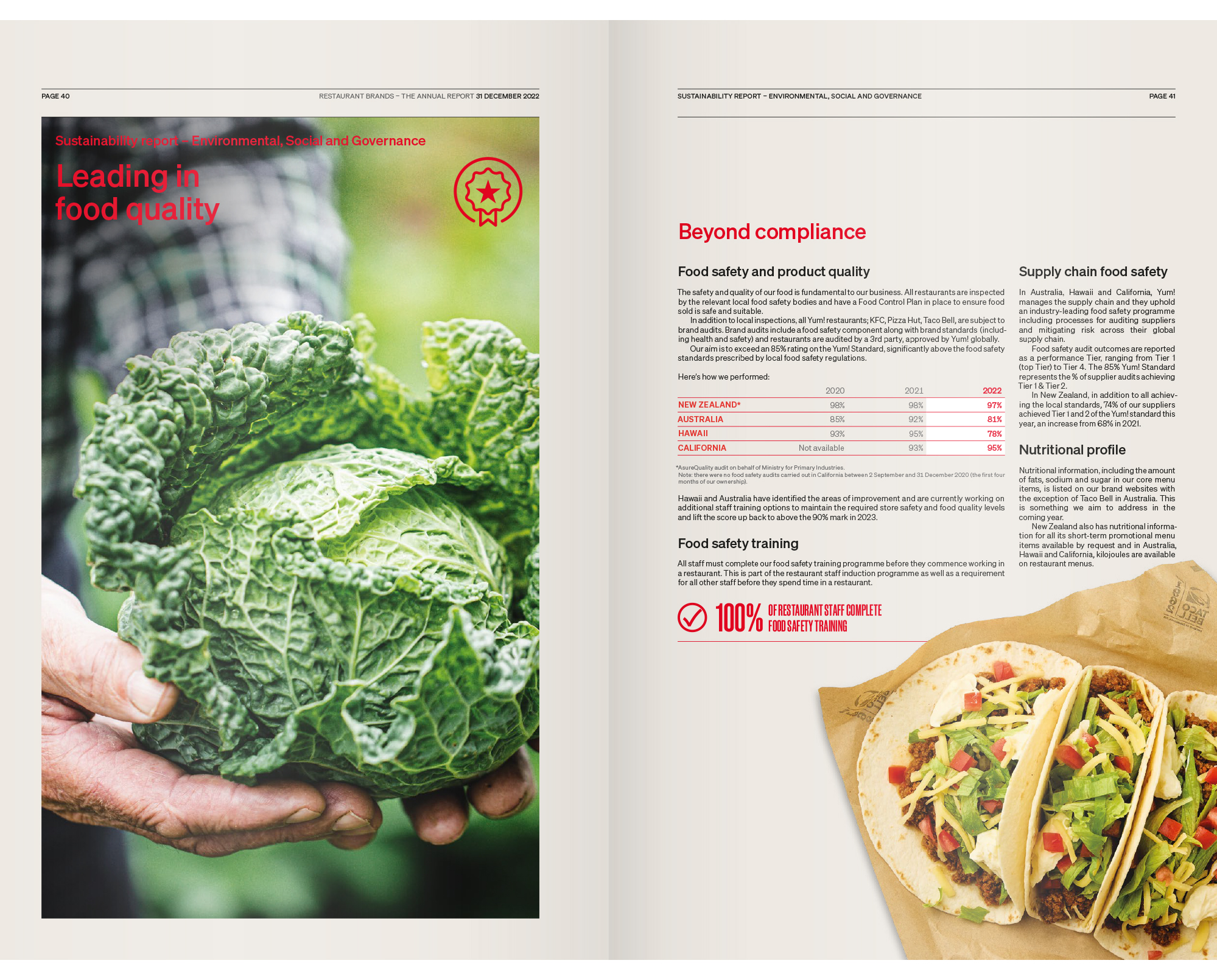
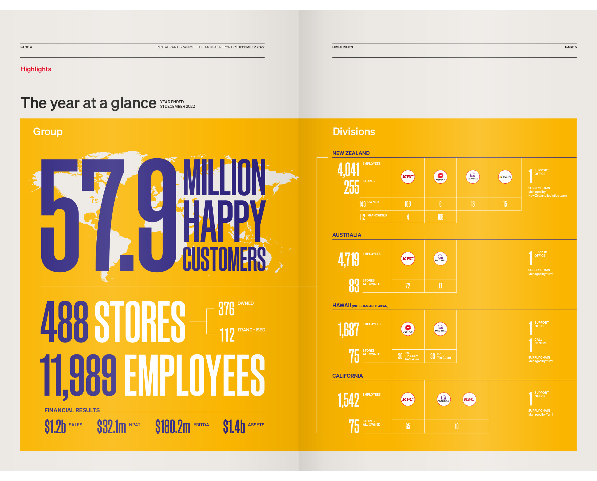
Colour is also used cleverly in charts that appear on pages to which a light background tone has been applied. Here, the white of the paper is allowed to show through on specific items like totals or upward trends in the numbers. This proves to be hugely effective in guiding the eye.
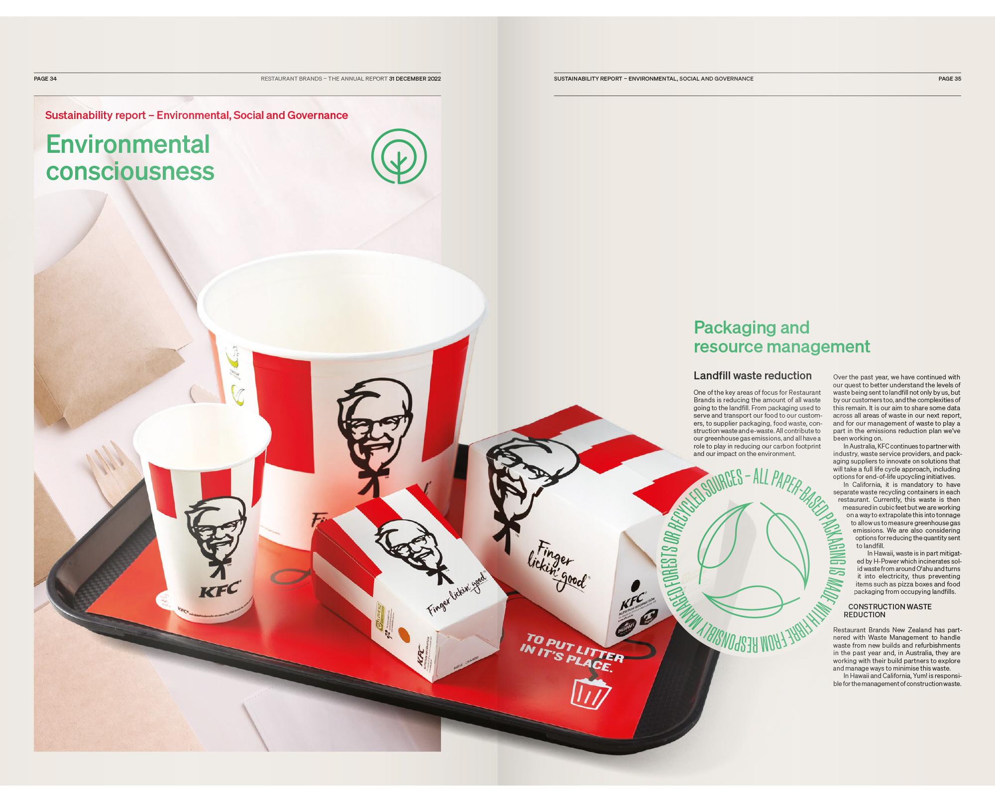
Illustrations are more generous than a newspaper could possibly manage and that works well here. With the visual assets of four major brands to play with, the report is full of colour and images of tempting food.
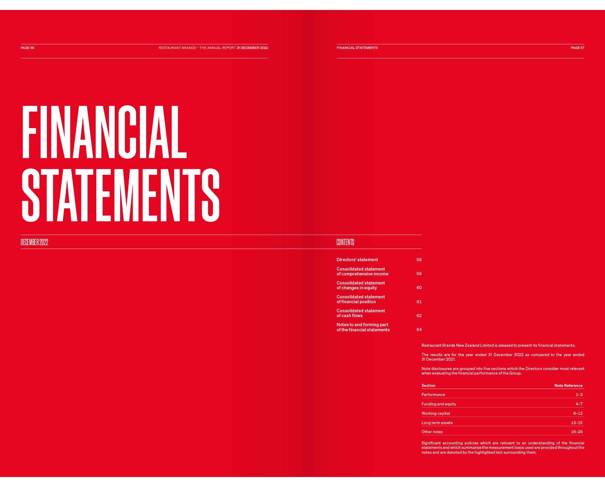
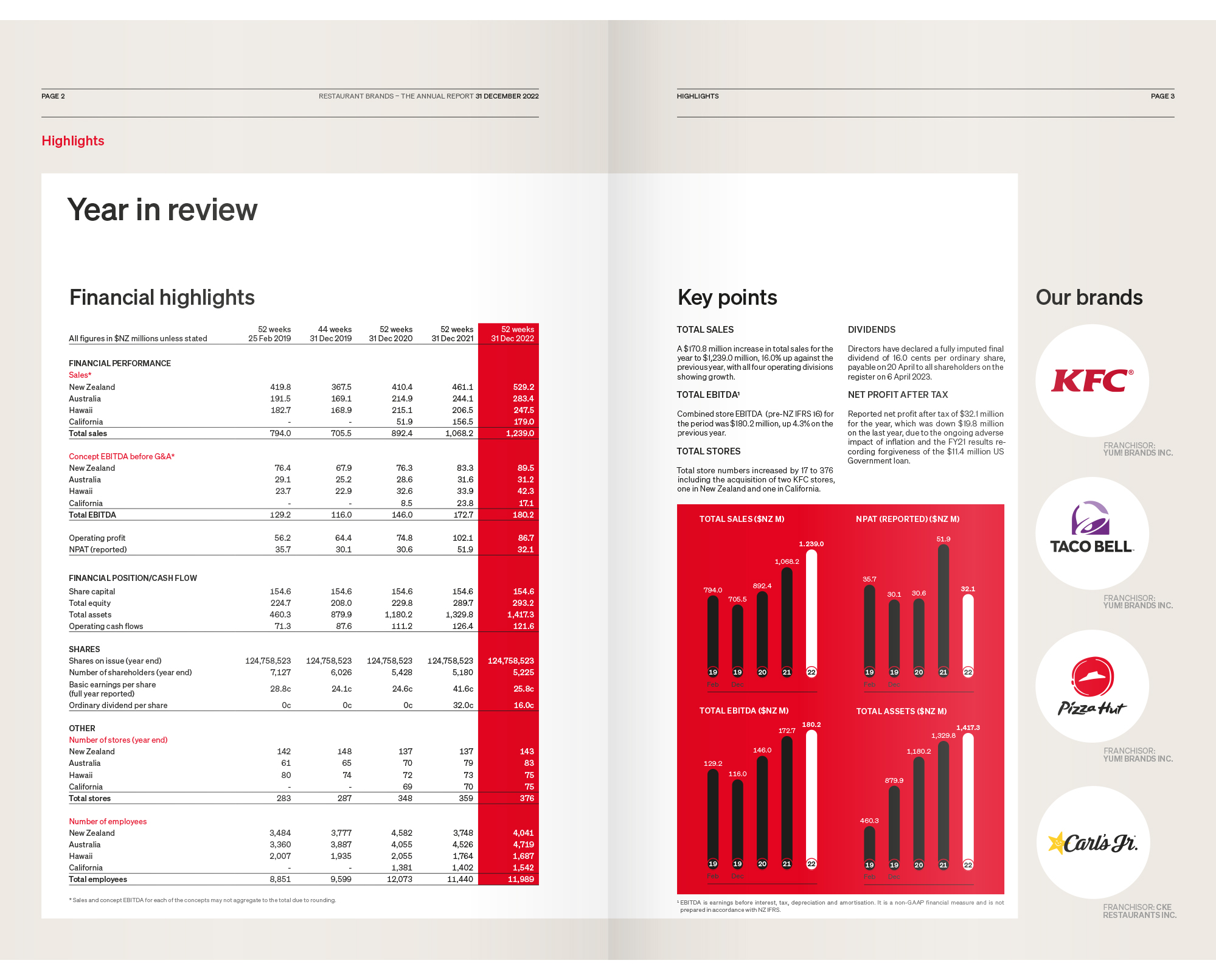
The other palace where following a newspaper’s design ethos does not work is in the financials section, and the designers wisely opt to use a single column here.
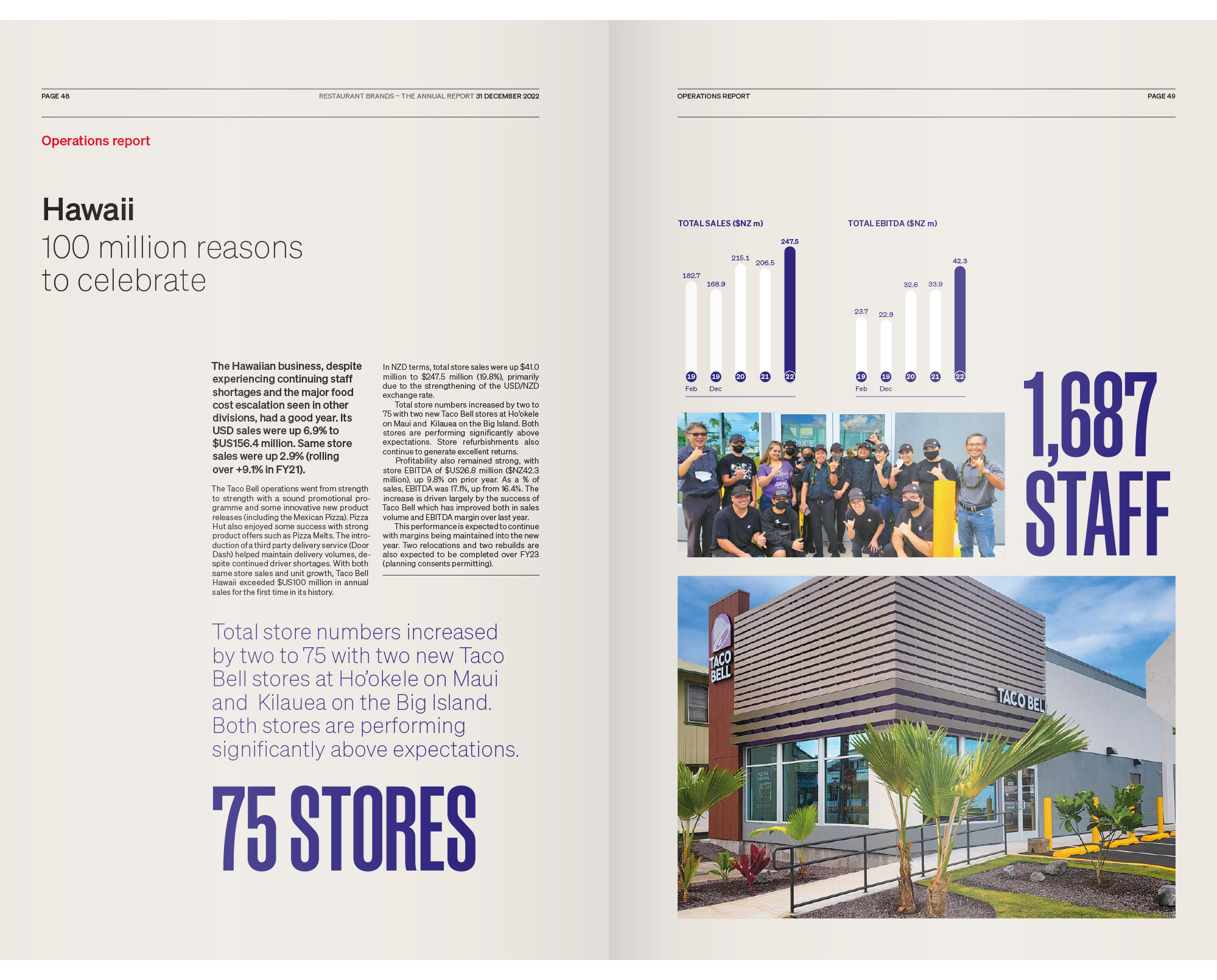
This is a clean, simple report that bends the visual language of newspapers to deliver an effective annual report.
