The multinational Mexican food processing company Grupo Bimbo, S.A.B. de C.V. tends to take a playful approach to its annual reports (see our review of their 2021 annual report here).

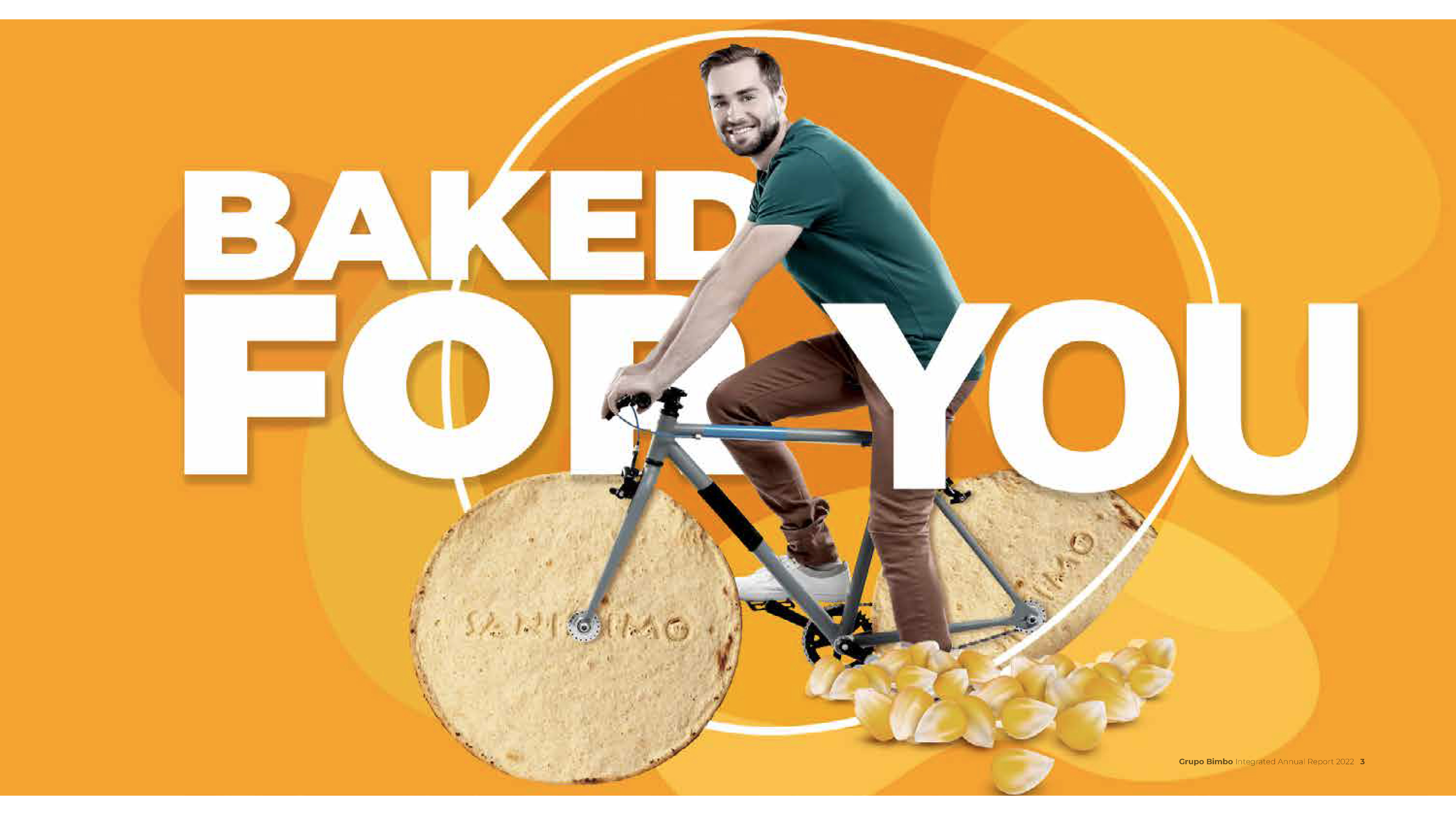
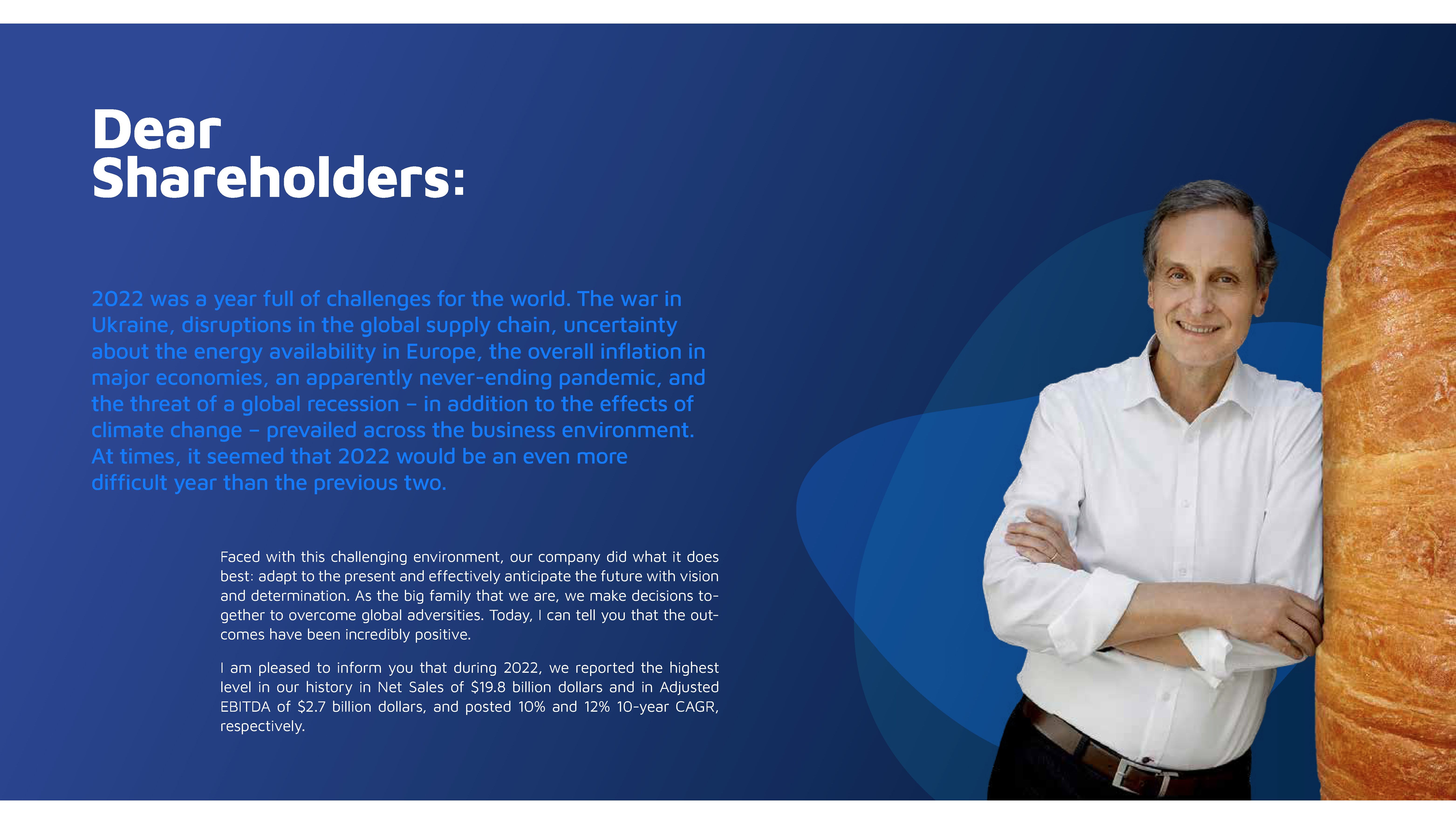

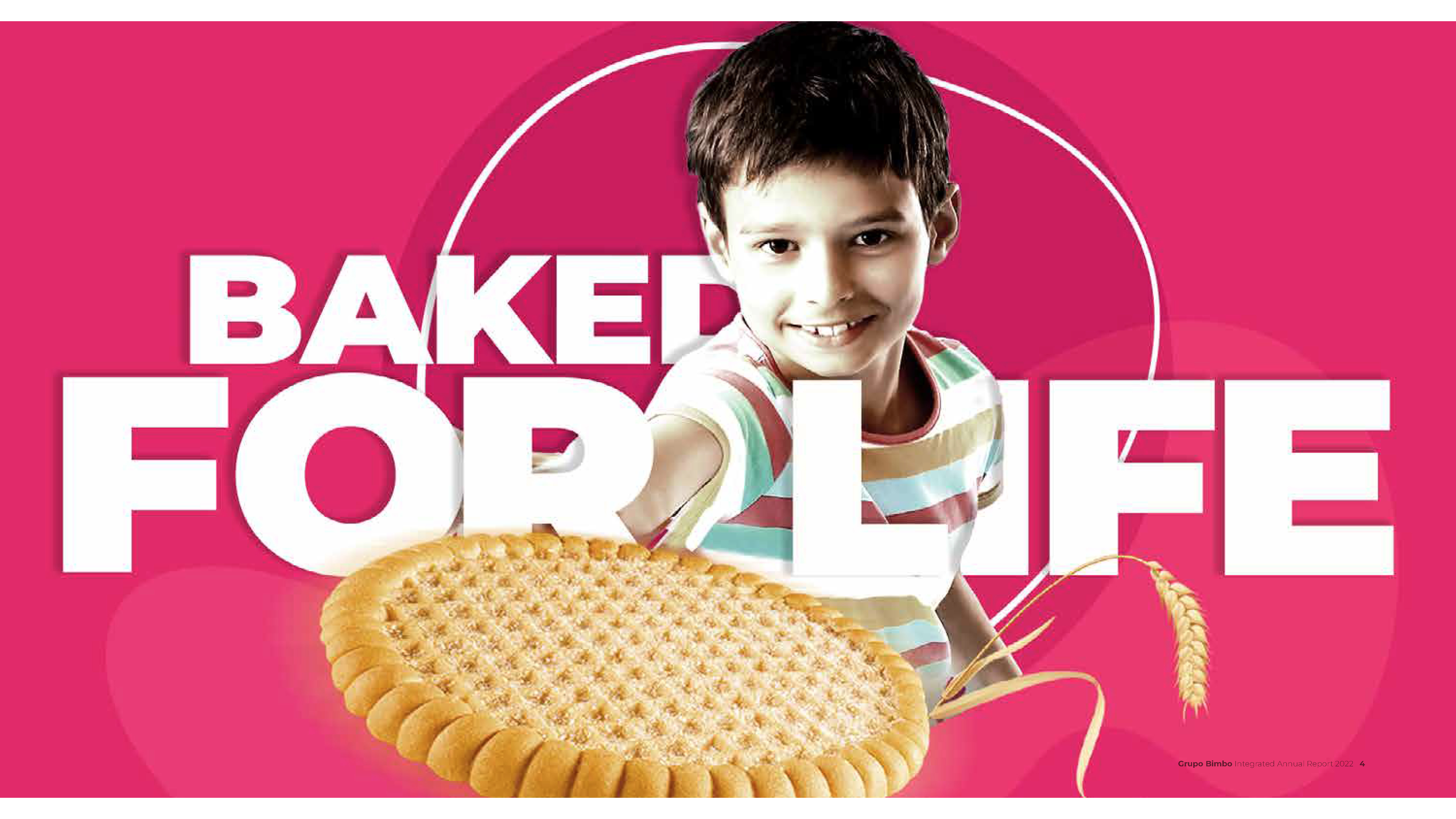
Their 2022 report is no different. Here we see photography, and more specifically, photo-editing, showing the company’s lighter side. Cropped images of Bimbo’s main product lines (bakery goods, for the most part) appear at exaggerated scales: a baguette large enough for the chairman to lean against; a loaf of bread the size of a backpack; a bagel spacious enough to serve as a chair.
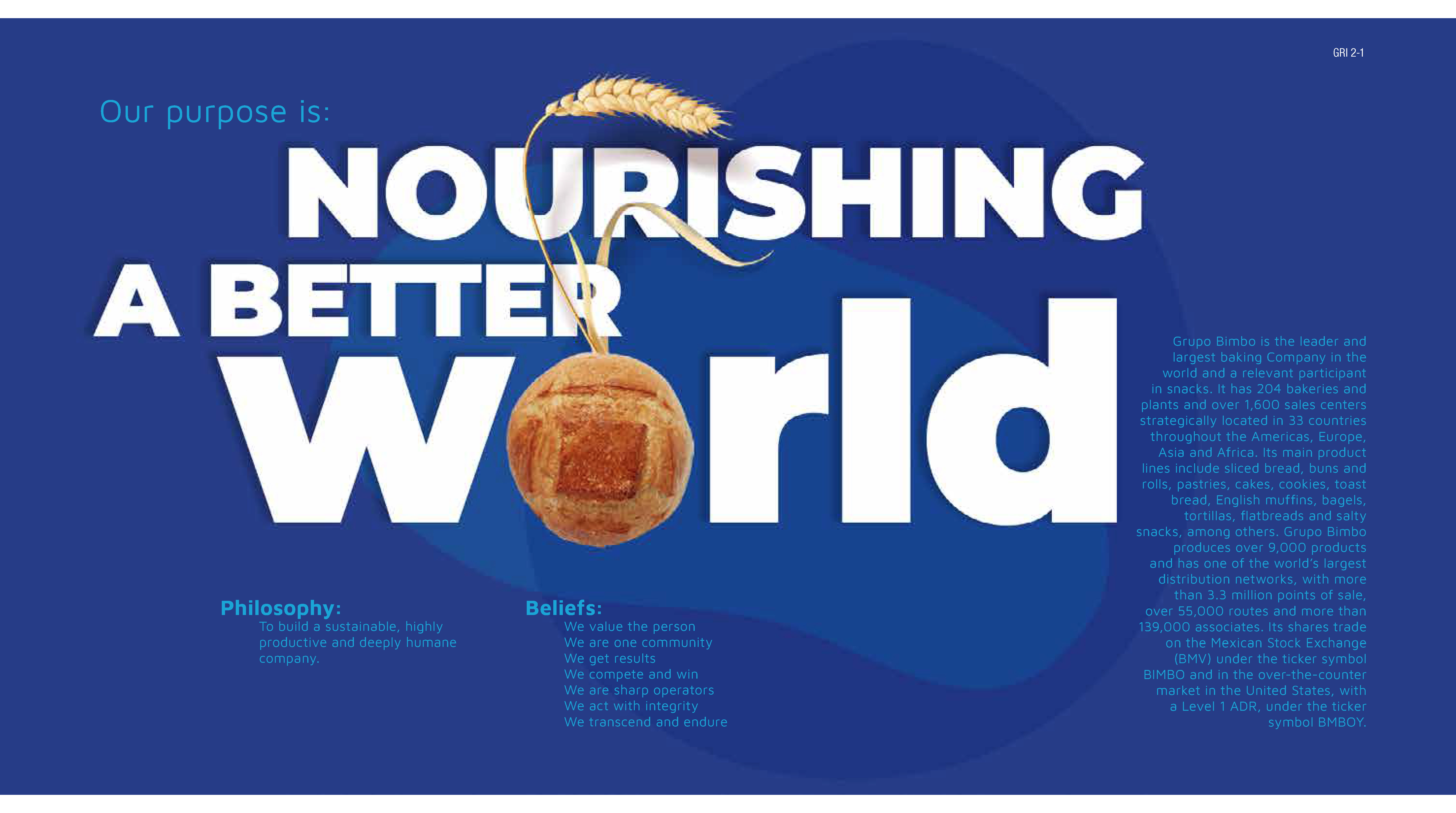
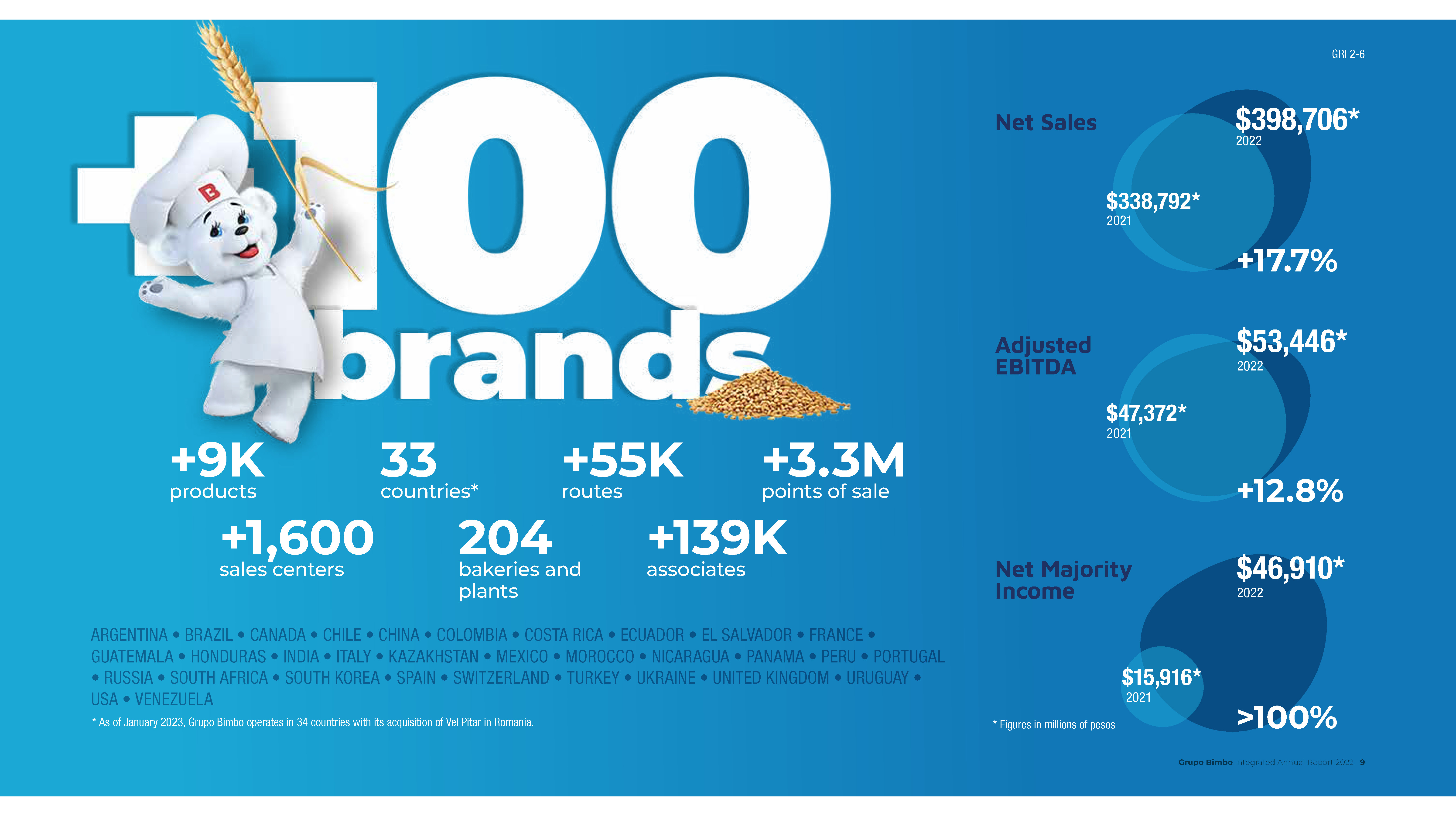
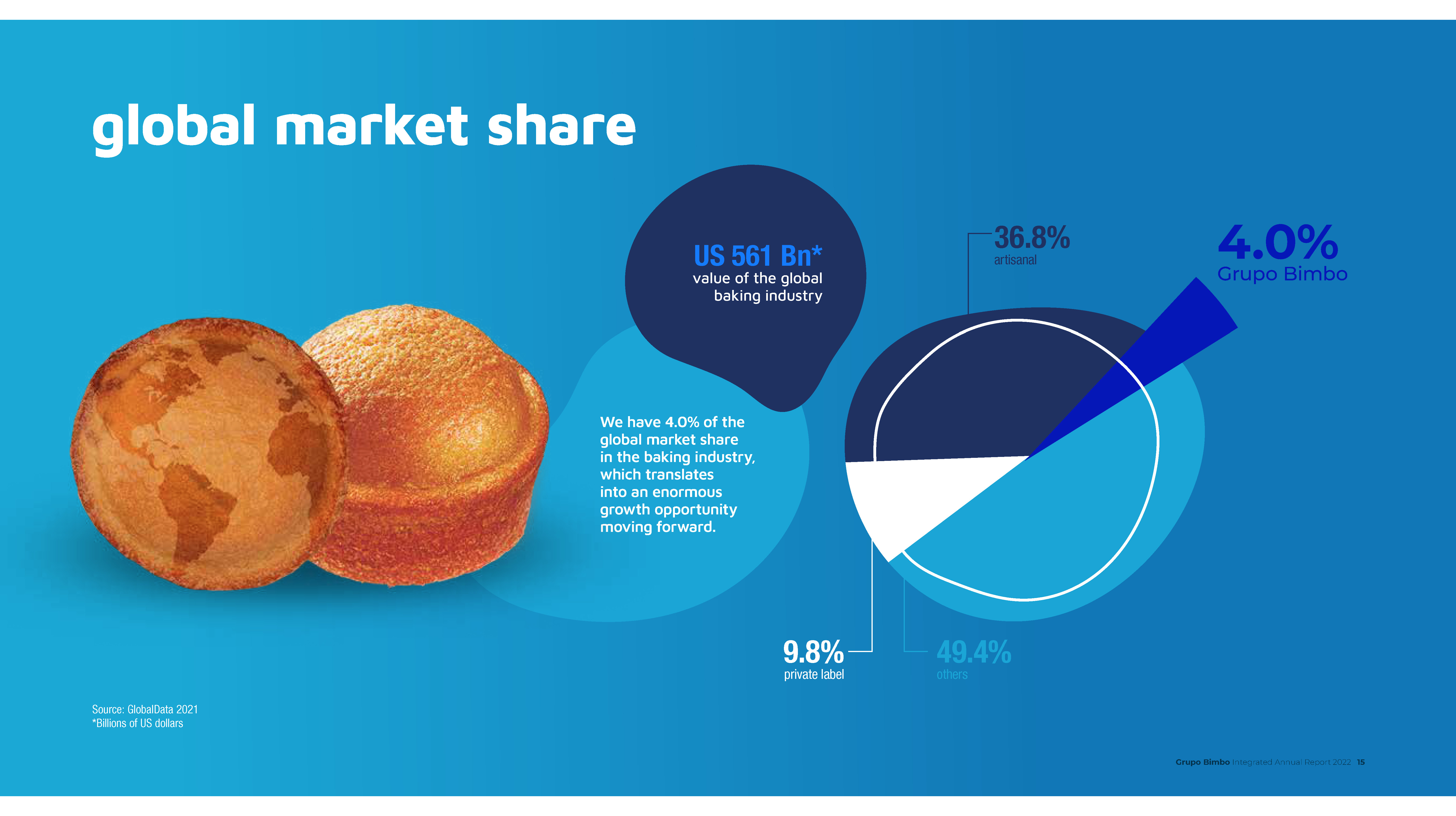
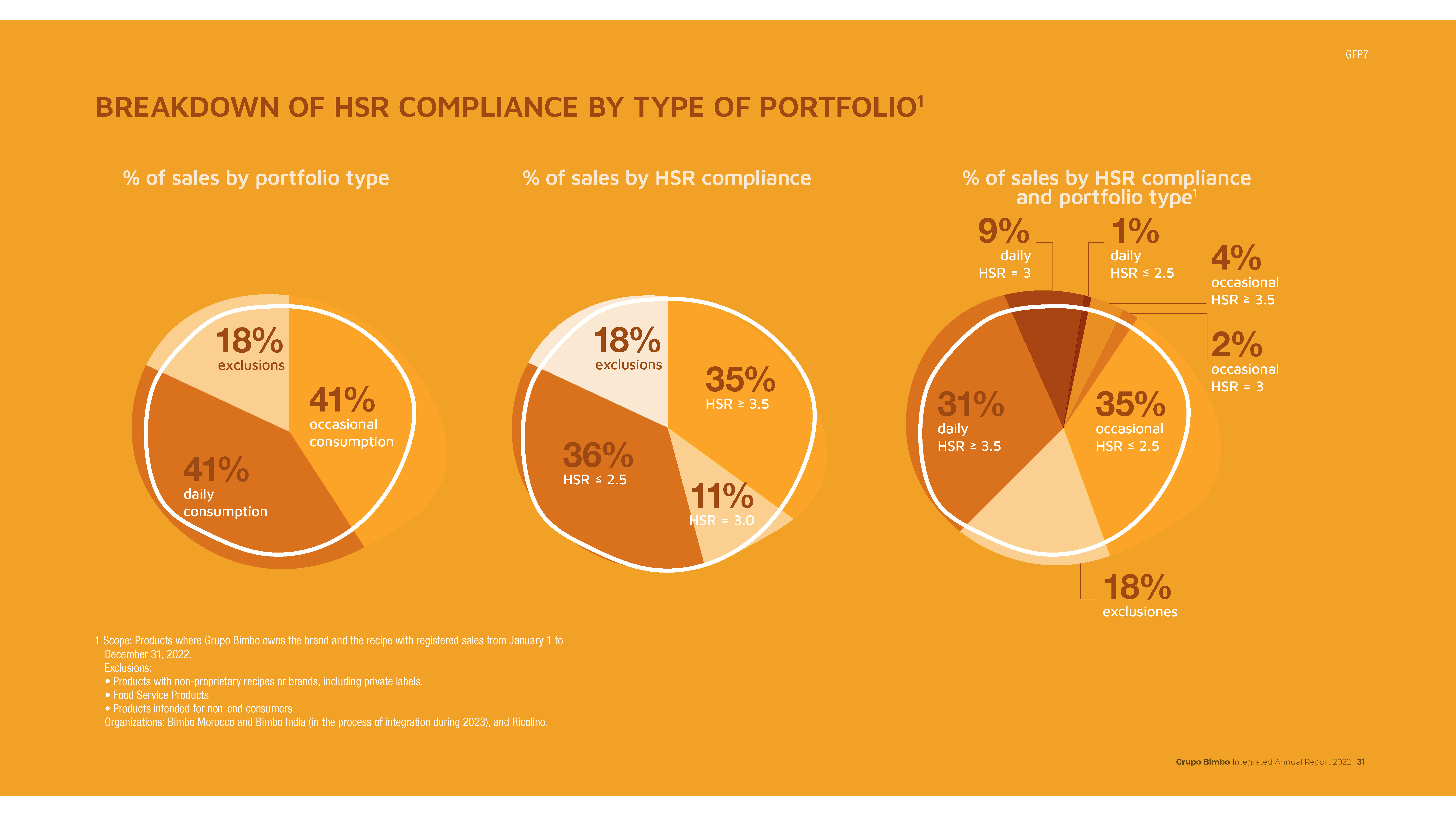
Food is used in other ways, too: a sliced chapati as a pie chart; one world map made of wheat, while another is burned into a piece of toast. These are nice flourishes and maintain a sense of humour through the report.
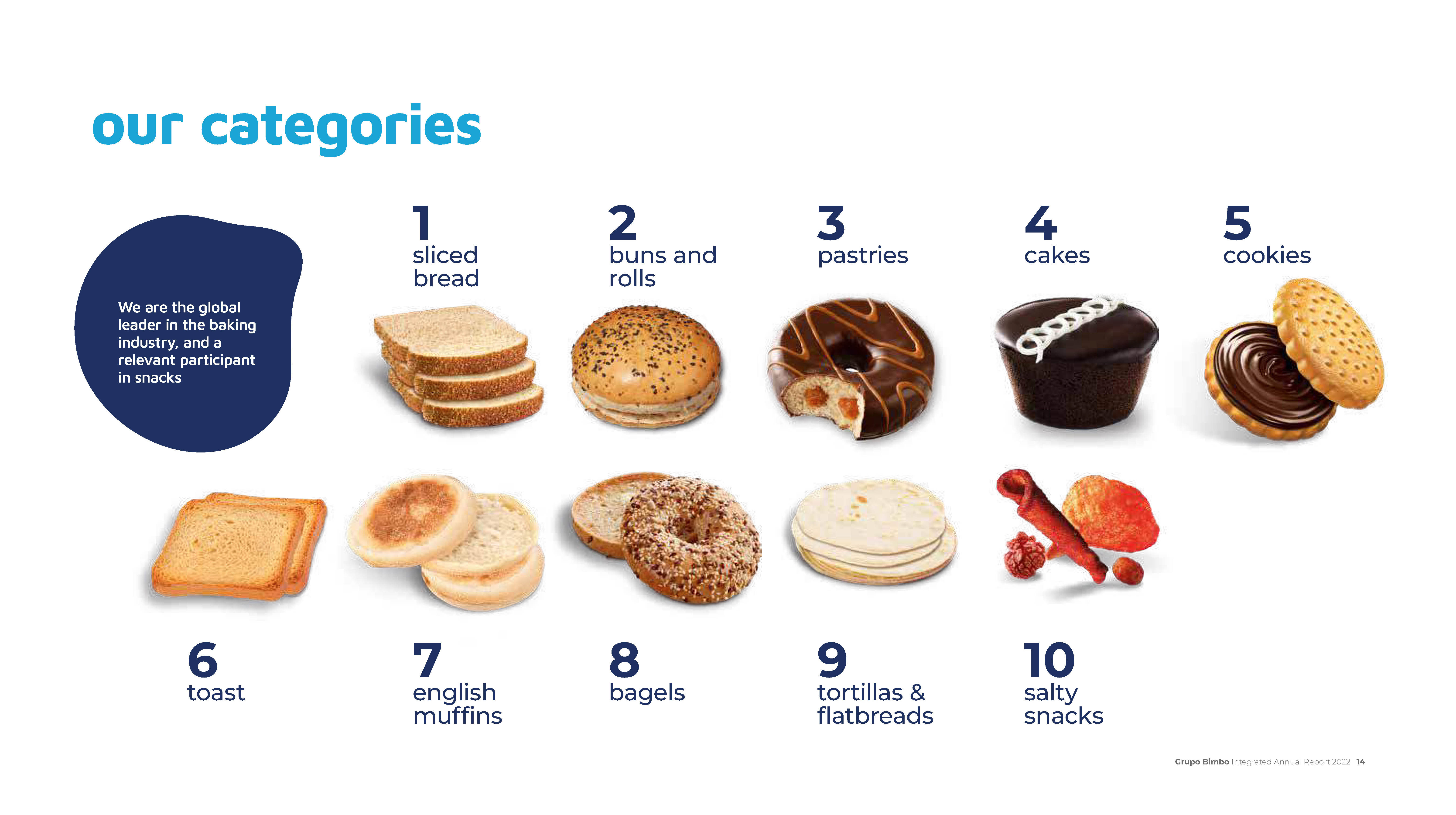

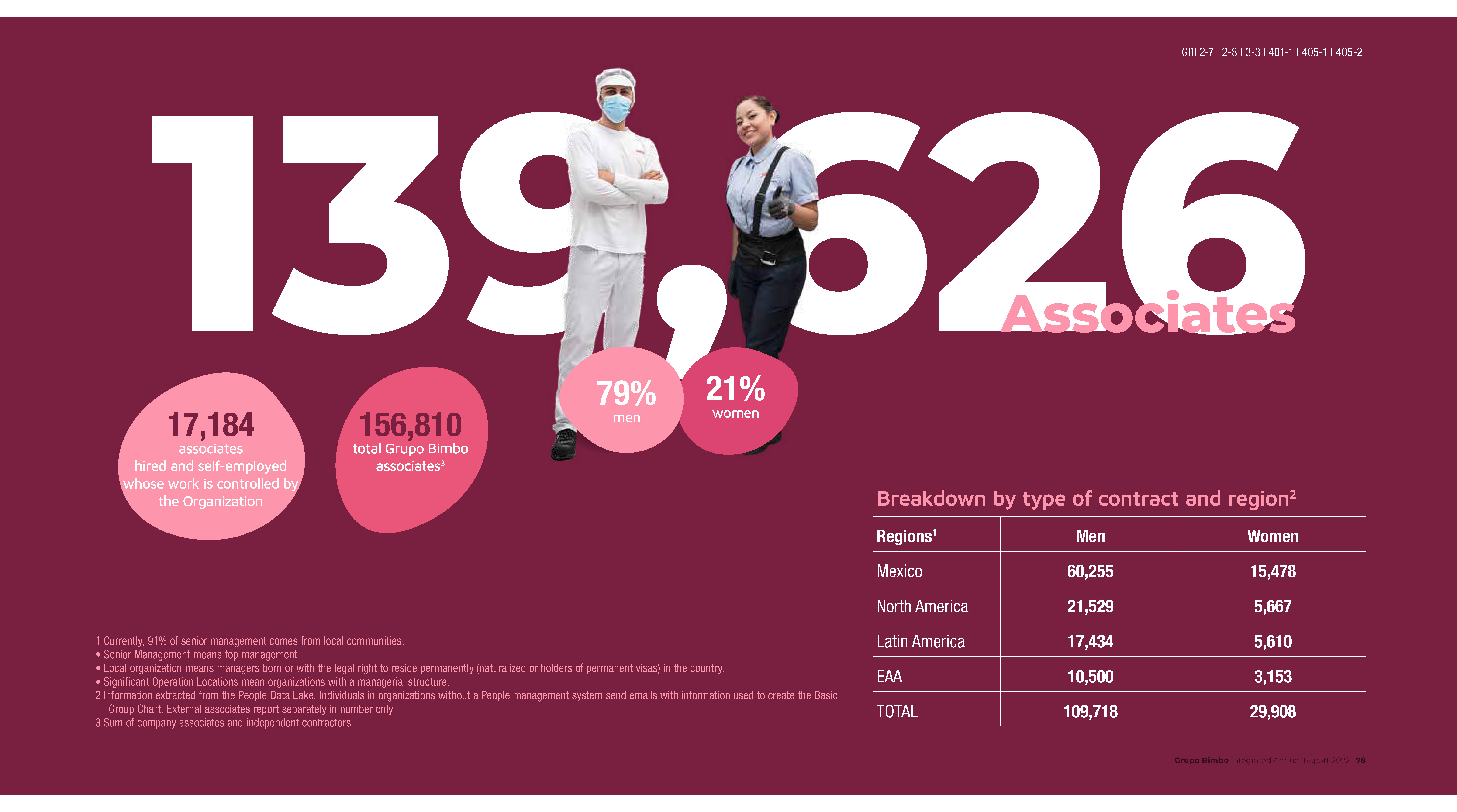
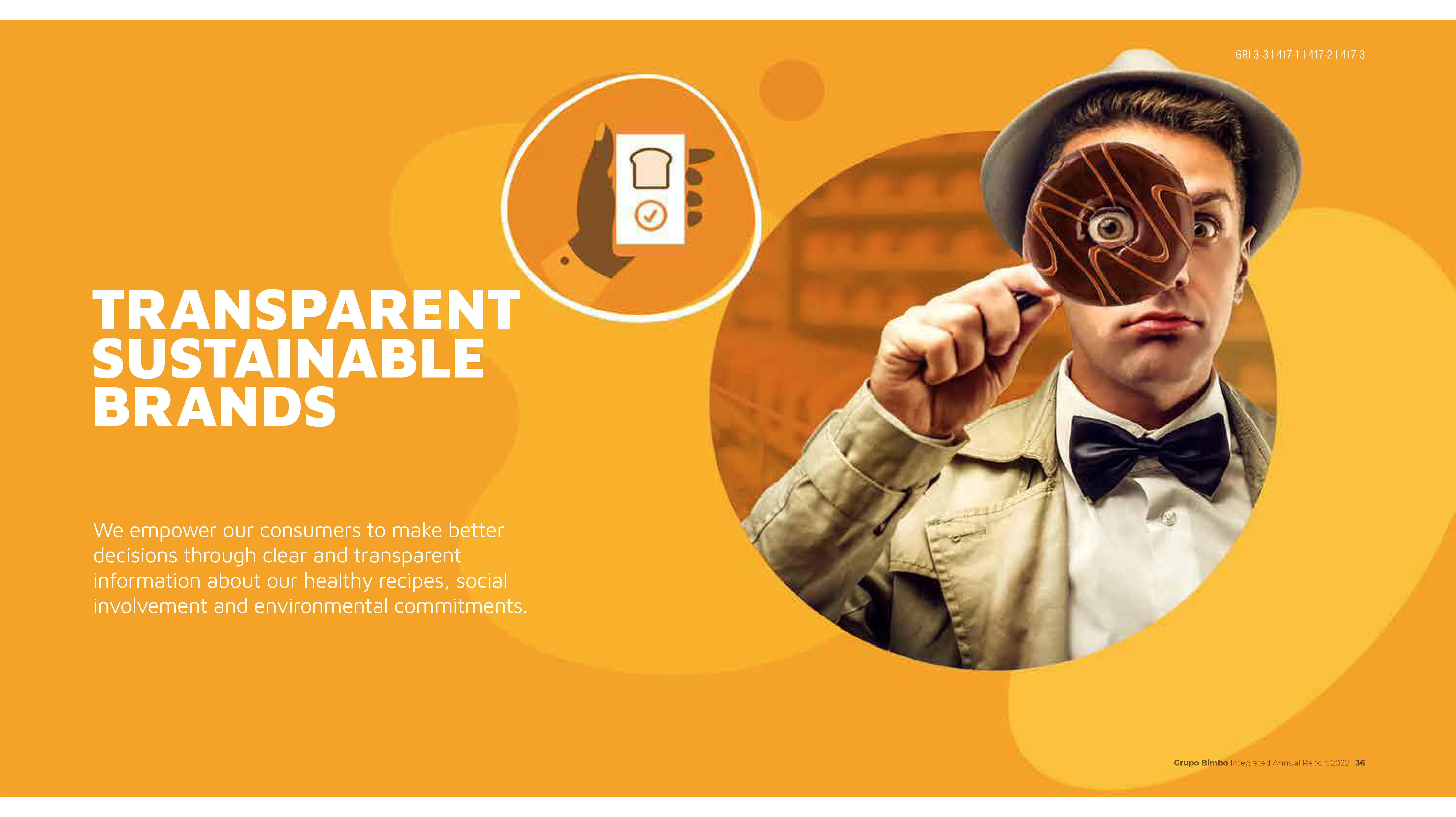
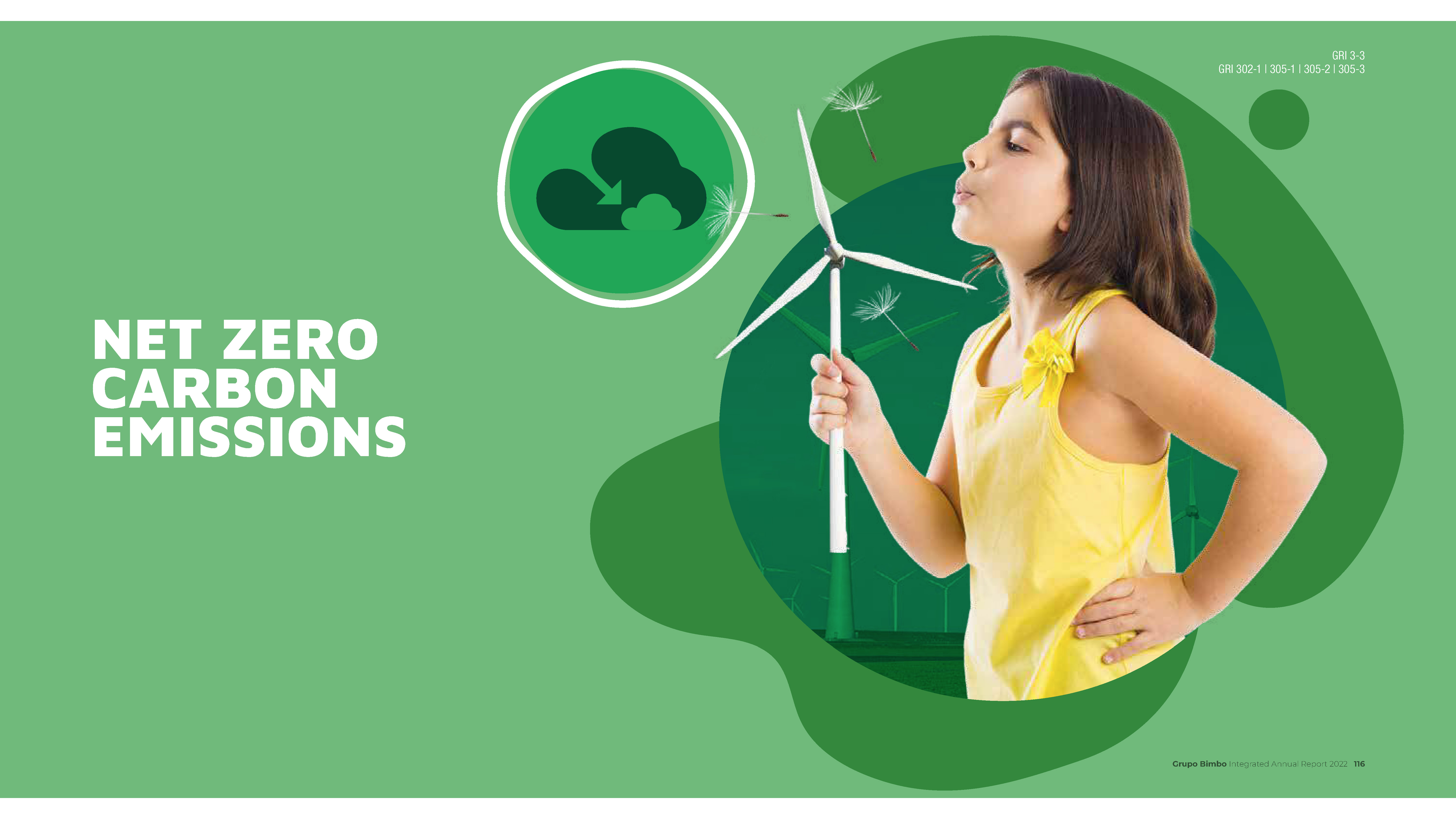
Care has been taken to match lighting and saturation between the baked goods as they are scaled up to match studio portraits of staff and beneficiaries. Sometimes the matching isn’t quite as close as it ought to be but in the main, the whimsical conceit works.
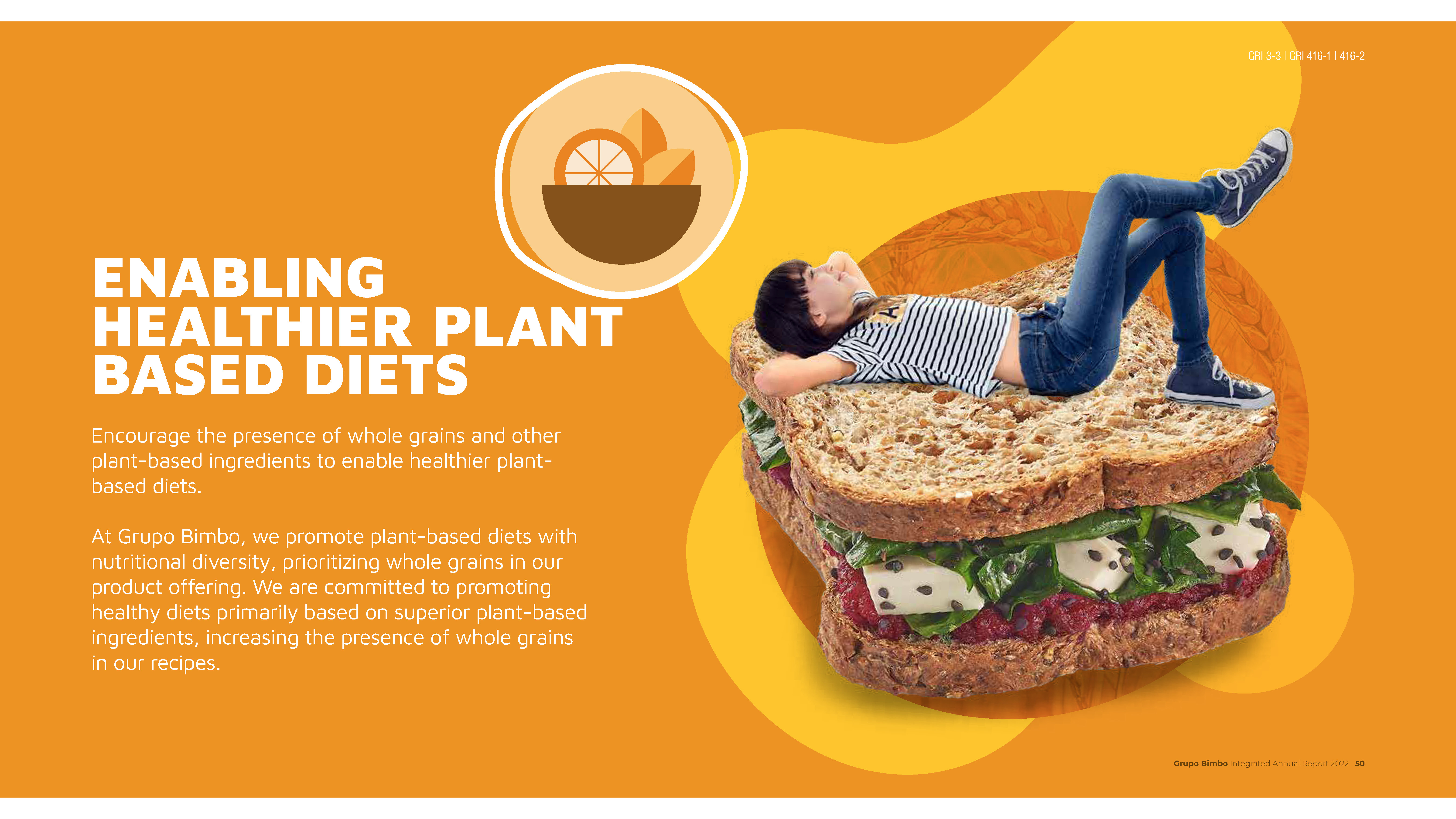
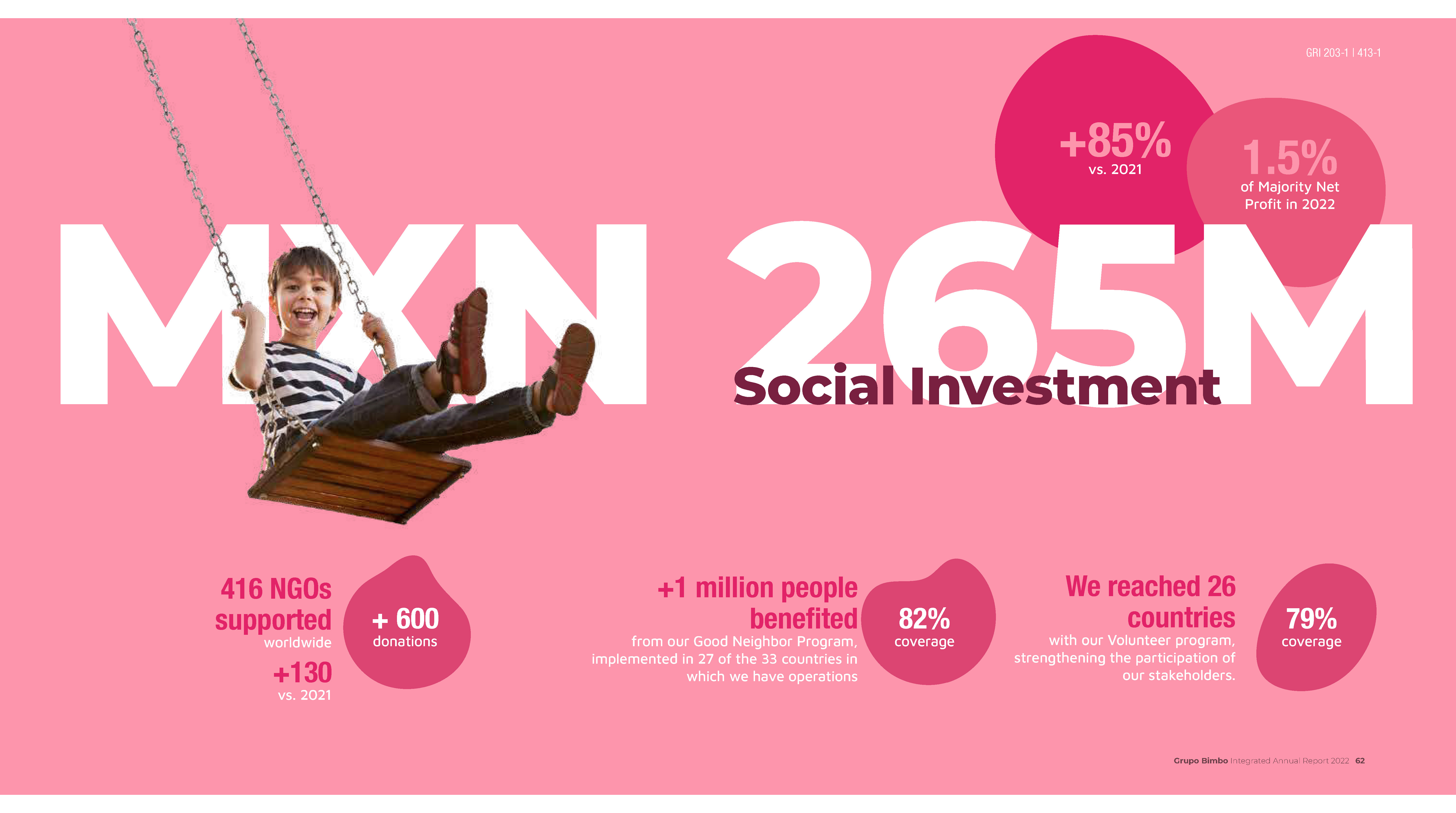
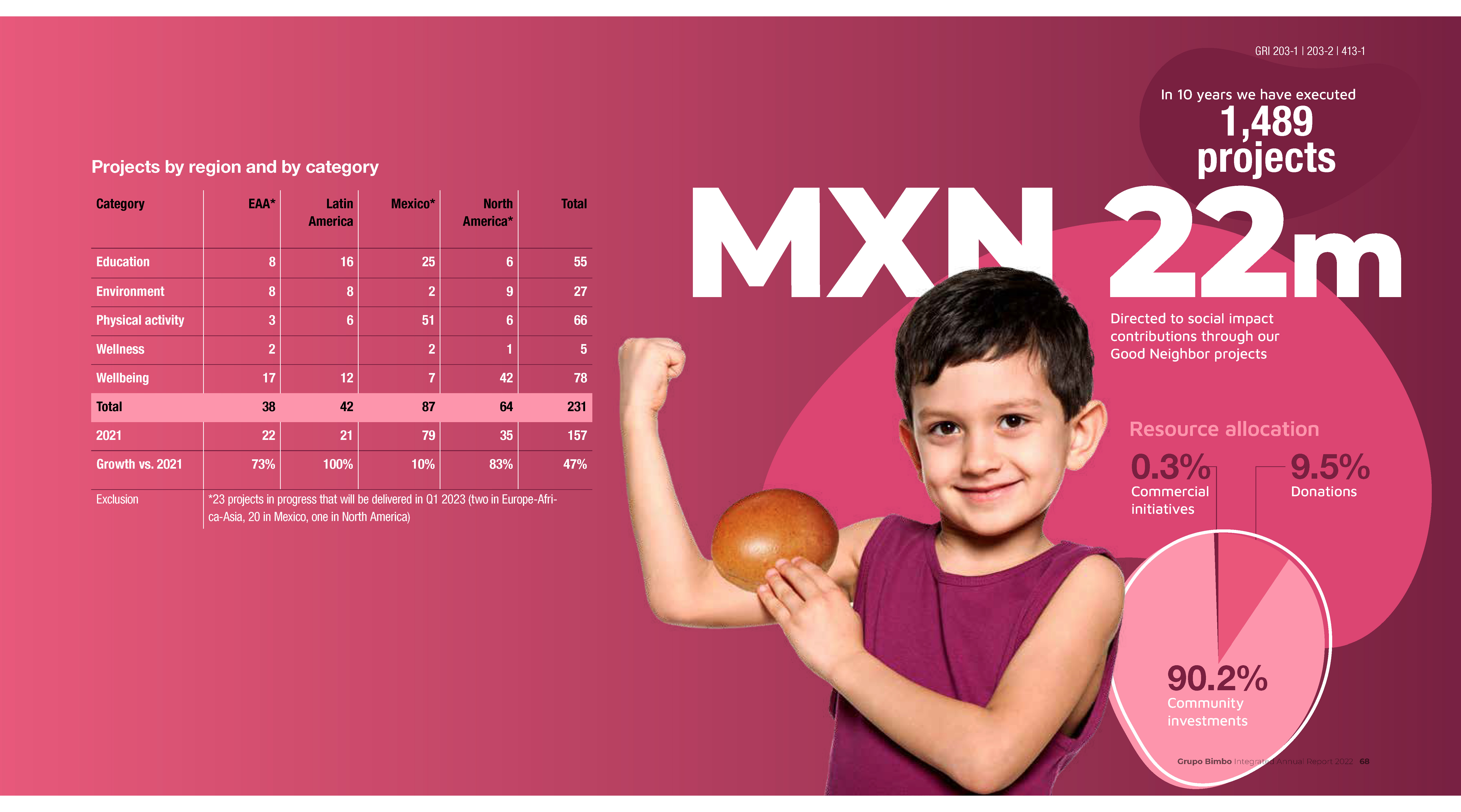
Photography is the key design element in this report and it is instructive to see the sheer number a designer needs to deploy, to make a report as large as this one work. Coming in at 346 pages, without the extensive use of photographs and solid-colour backgrounds, the report could easily have been overwhelming.
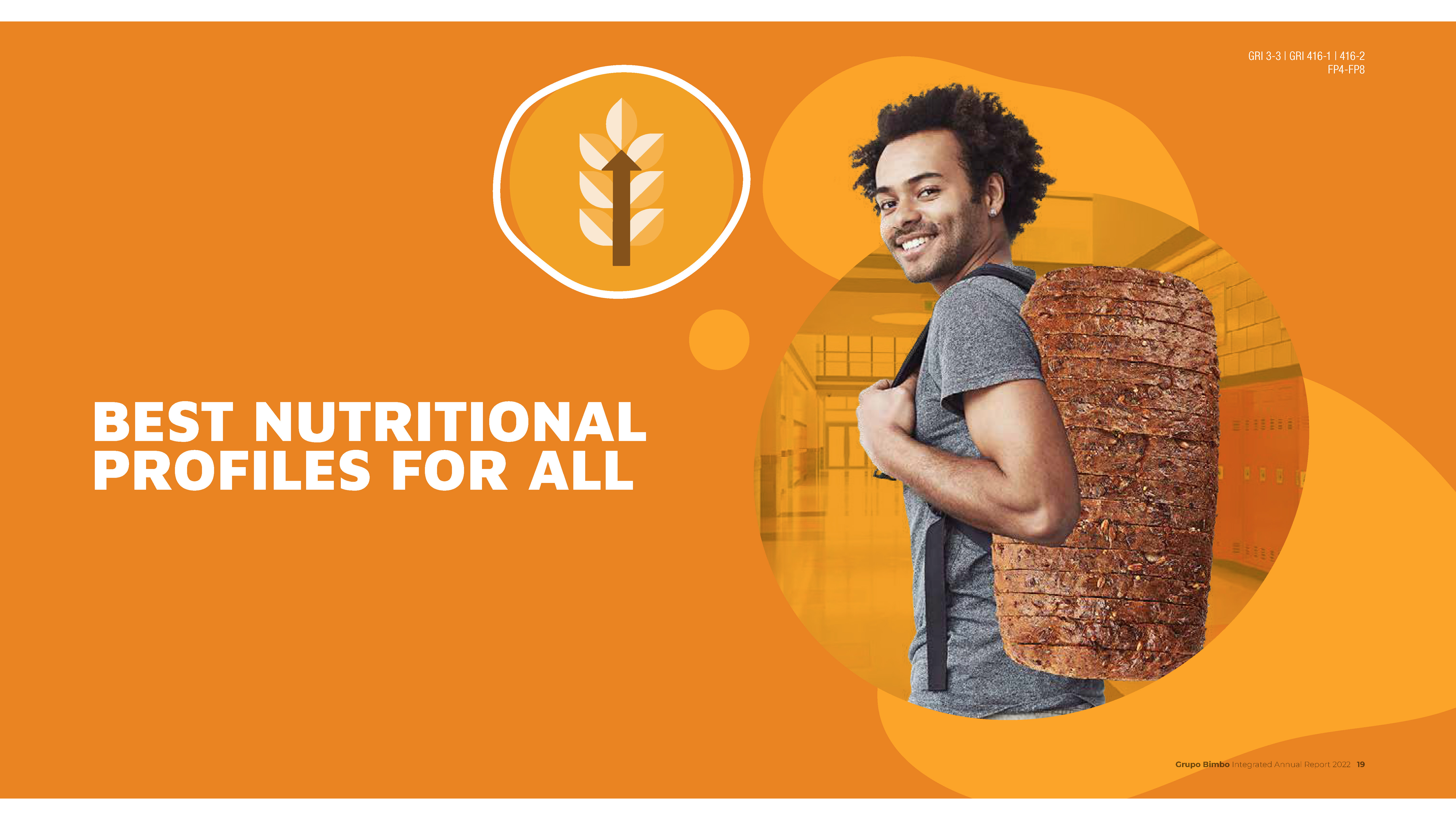
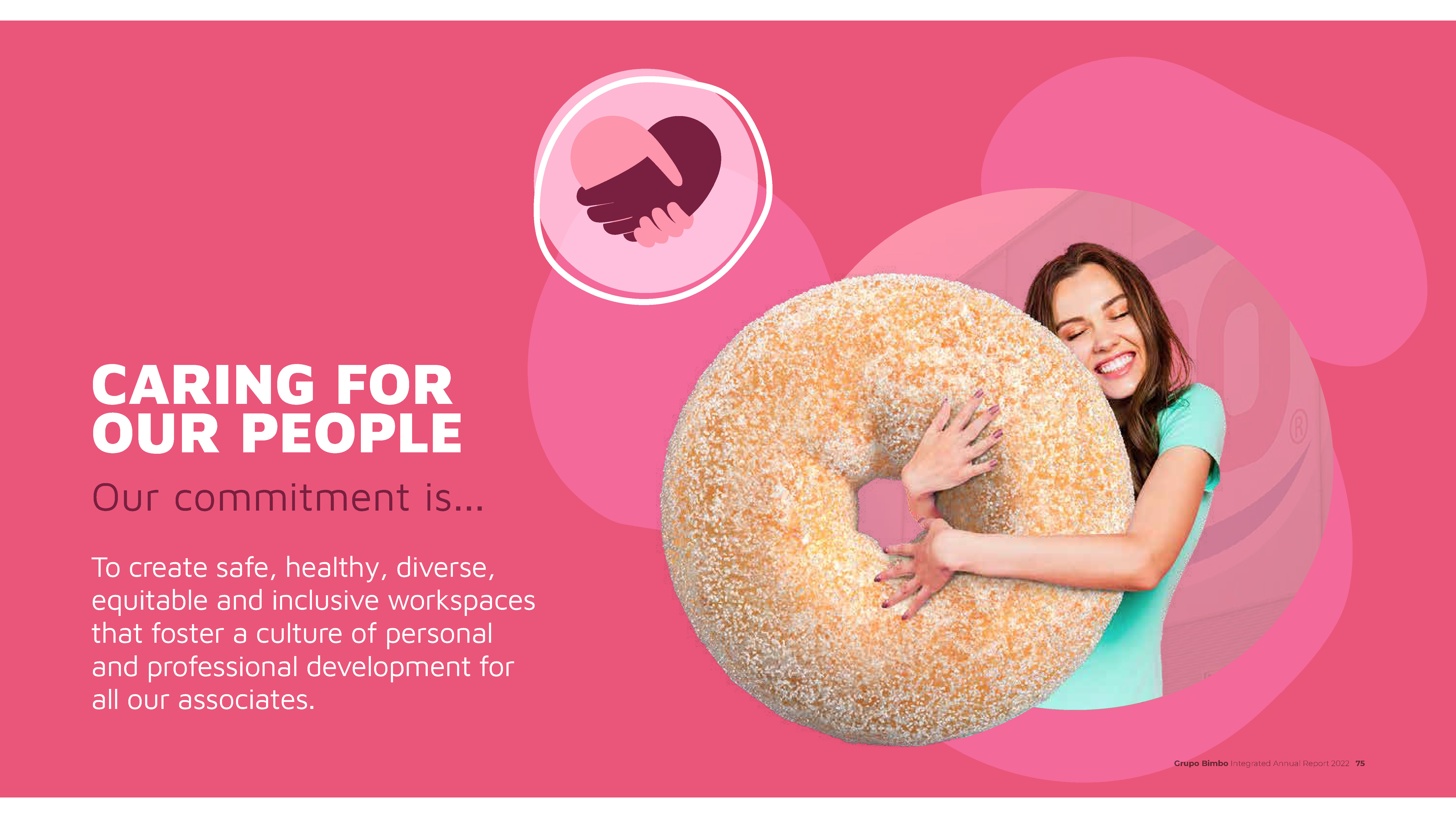
The designers (uncredited) avoid this and the report is a breeze to read, although 346 pages does not make for a fast read. The long horizontal page design also allows for space around the text blocks, helping to make the report feel uncluttered. In a time when much food photography leans toward softly-lit, moody, shadowed images, it’s nice to see the joy in a good biscuit.
