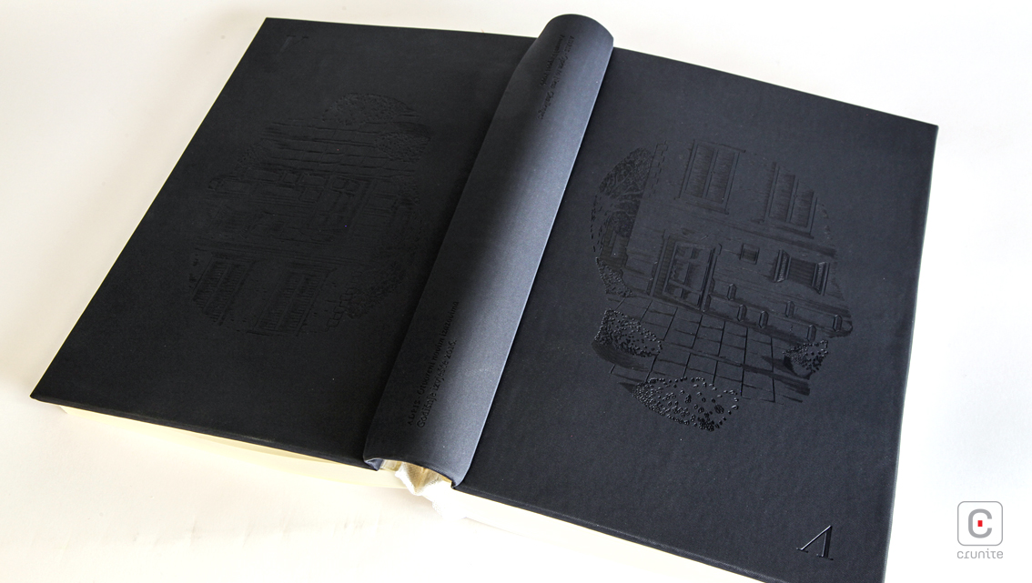
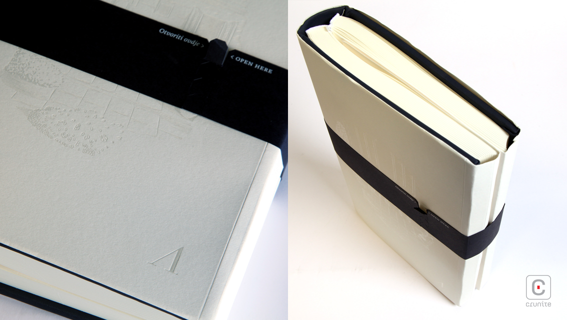
Adris began life as a Croatian cigarette manufacturer over a hundred years ago, became the region’s biggest player, sold off its tobacco interests and then diversified into tourism, food and insurance. There is a great deal of history to contend with as well as the yearly workings of a huge, modern company. Adris uses this to its advantage by presenting its annual report as a weighty, hard cover book, complete with silk bookmarks.
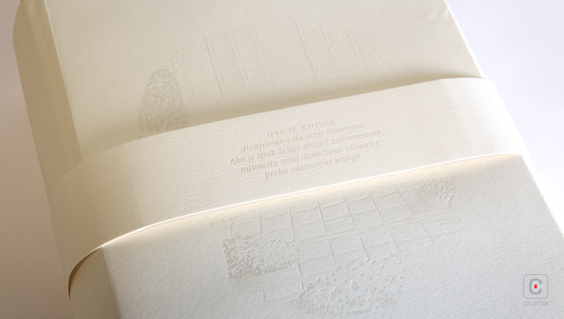
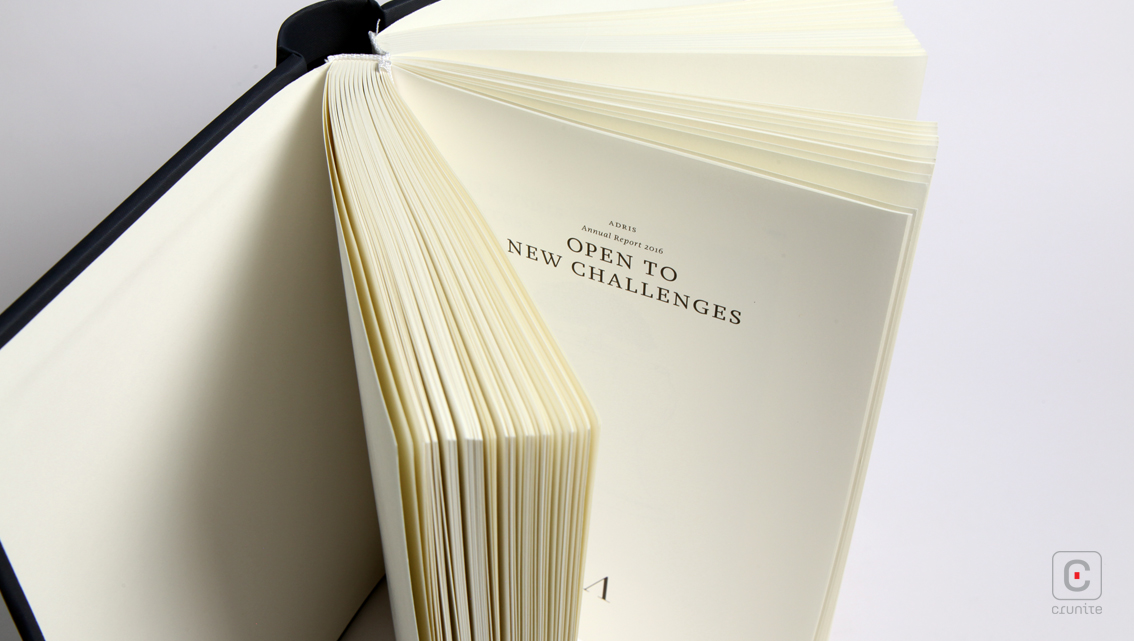
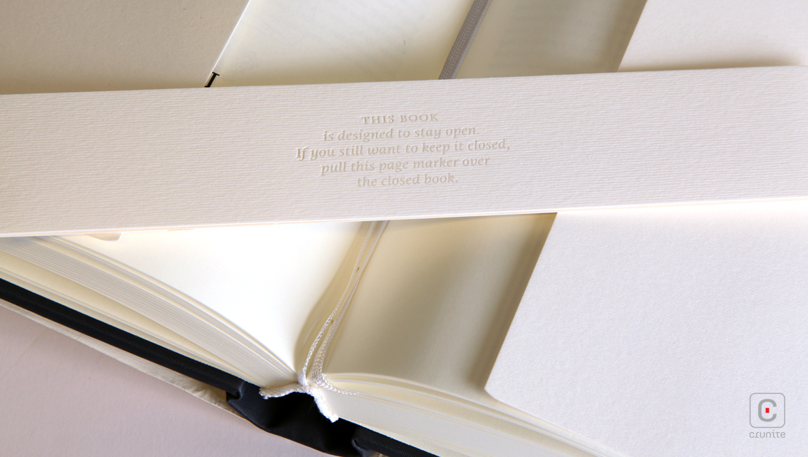
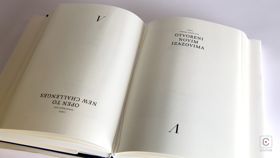
Bound into the cover are three flexible metal bands that force the book open the second you remove the band of paper that wraps the book shut. Once it opens to the middle, on the left the book is produced in Croatian and on the right, upside down, in English. The reader simply rotates the book to read in their preferred language. It’s a remarkable bit of book construction but one that gets tiresome when you want to close the book.
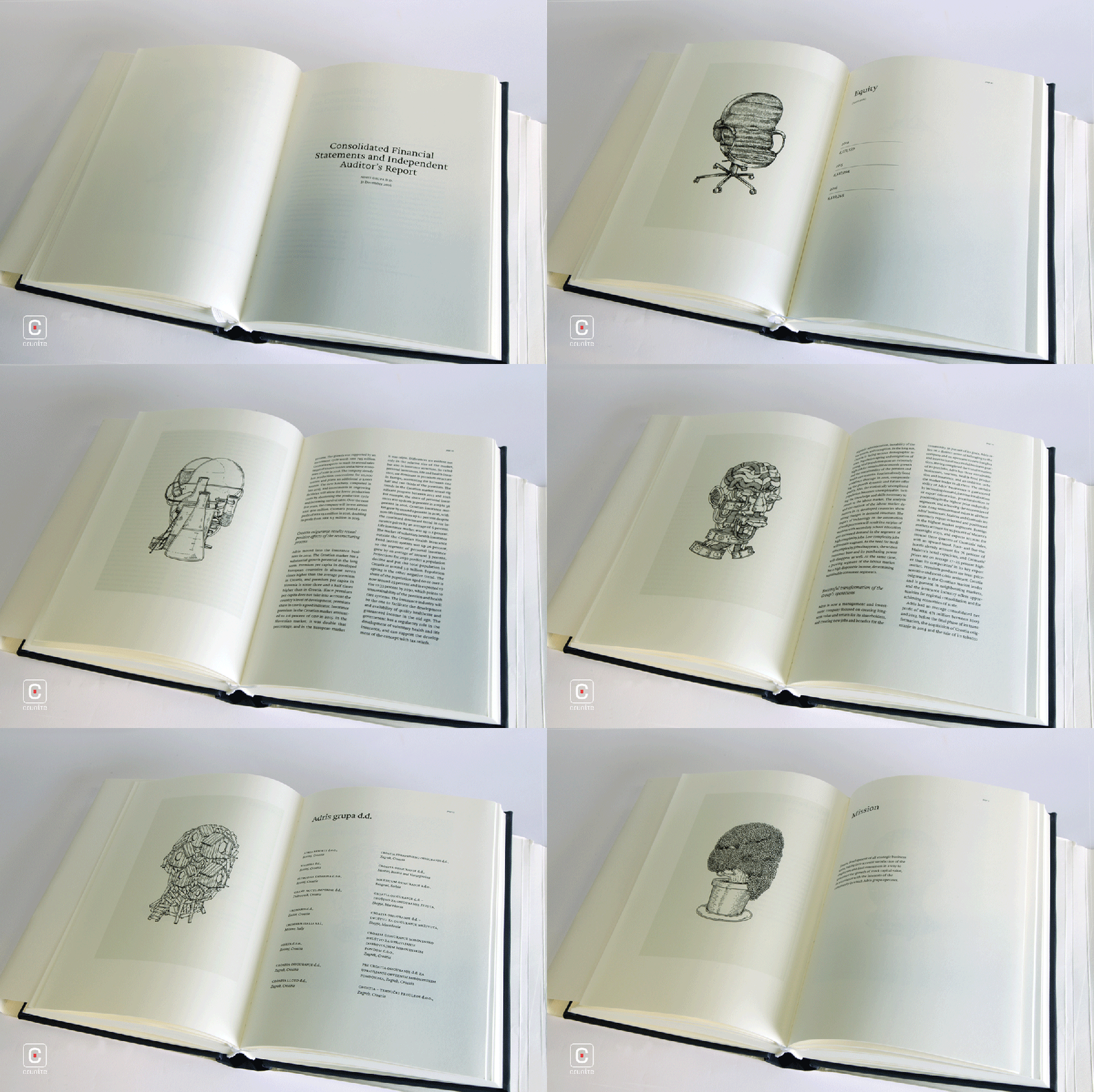
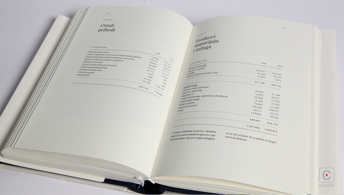
The design of the pages is restrained and orderly. The use of negative space is as generous as an art monograph. A light cream paper, fixed grids and a sturdy sans serif typeface contribute to the image of a serious, thoughtful company. But without Tomislav Šestak’s brilliant illustrations this annual report would have been far less engaging.
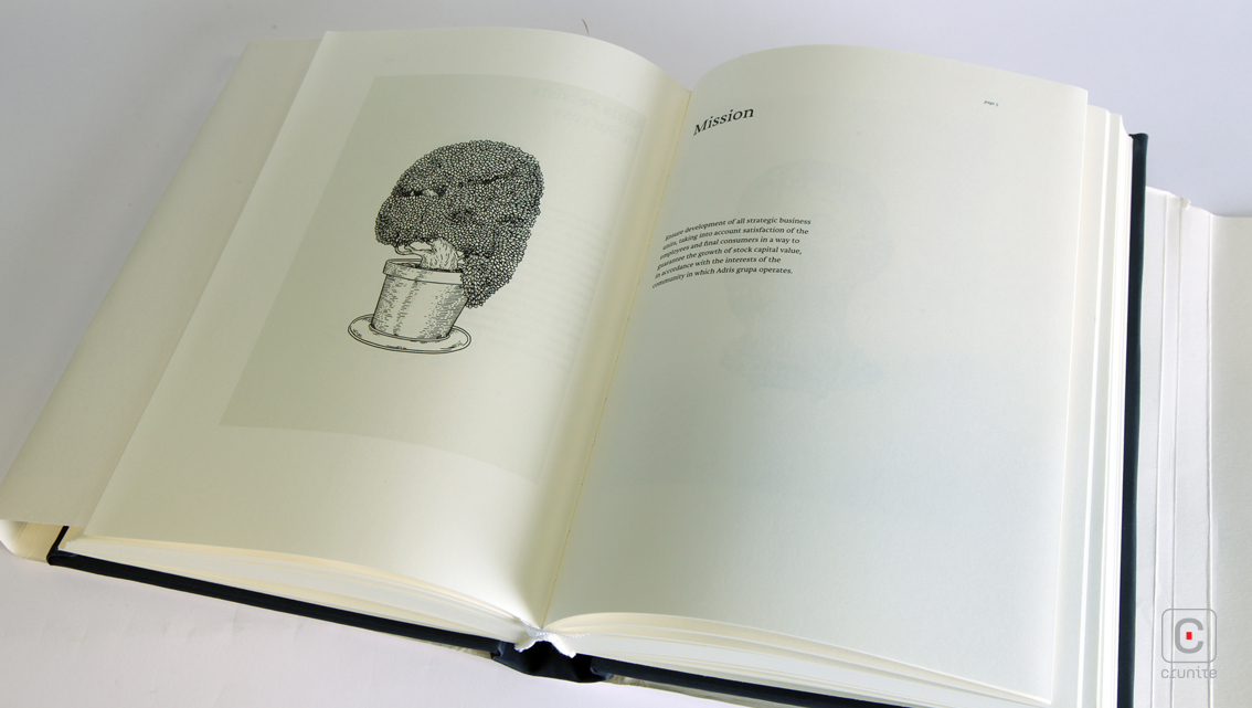
A single image of a human head repeats on the left hand pages of the thematic section of the report. The head undergoes a series of surreal transformations. Sometimes the head is carved from stone and a tree grows out of it, sometimes the head is a chest of drawers and at other times, the head has an angry owl living inside it. The report contains no images of the company’s staff or activities and Šestak’s illustrations carry the entire book. It’s a testament to the creative freedom some companies will offer in the making of an annual report and how a gifted artist can immeasurably increase the value of the resulting work.
