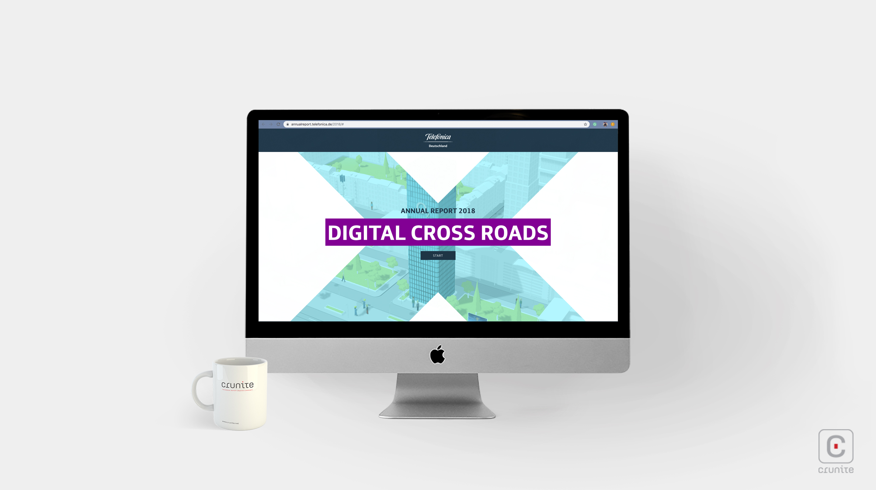
Telefonica is a provider of broadband, landline and mobile telecommunications in Germany. Their 2018 online report is a marvel of design. The main page shows a neatly laid out city in an isometric projection (similar to the view in games like SimCity) around which the reader can navigate. The site offers a guided tour for those in a rush but also allows free roaming for the reader with a little time on their hands.
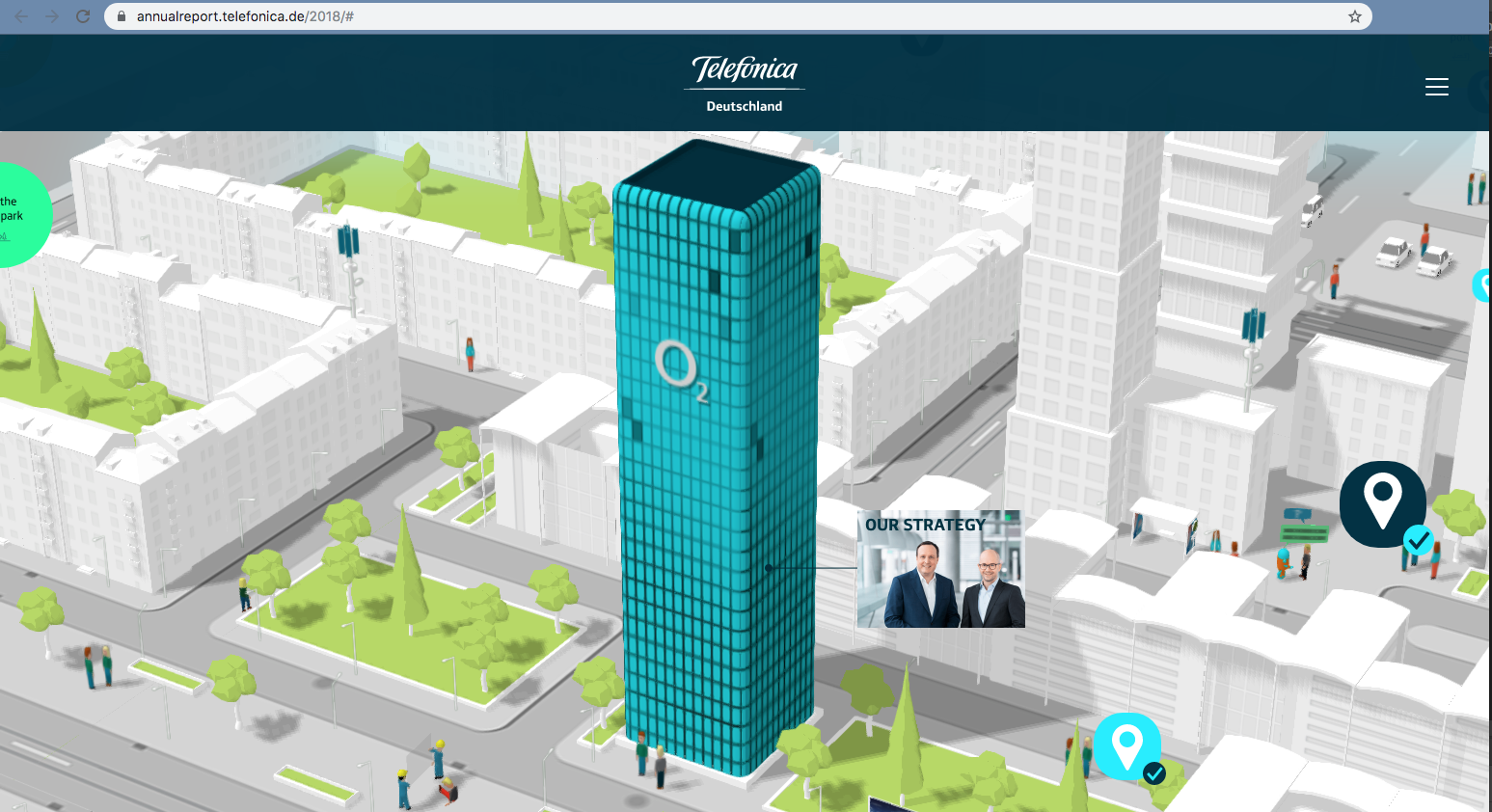
Ports, airports, railways and parks are represented, creating a wonderfully immersive experience. The animation isn’t forceful or overdone – it feels very much like a living city on an average working day.
The judicious use of sound helps to solidify the illusion and the realistic noise of traffic, birds, the occasional ambulance and even the jaunty music of a small parade make the city believable. Cars move along streets, planes take off from the airport and there are little comedic scenes if you look for them – a person bumping into a glass sheet carried by two others, a football bouncing impossibly high out of a sports stadium and so on.
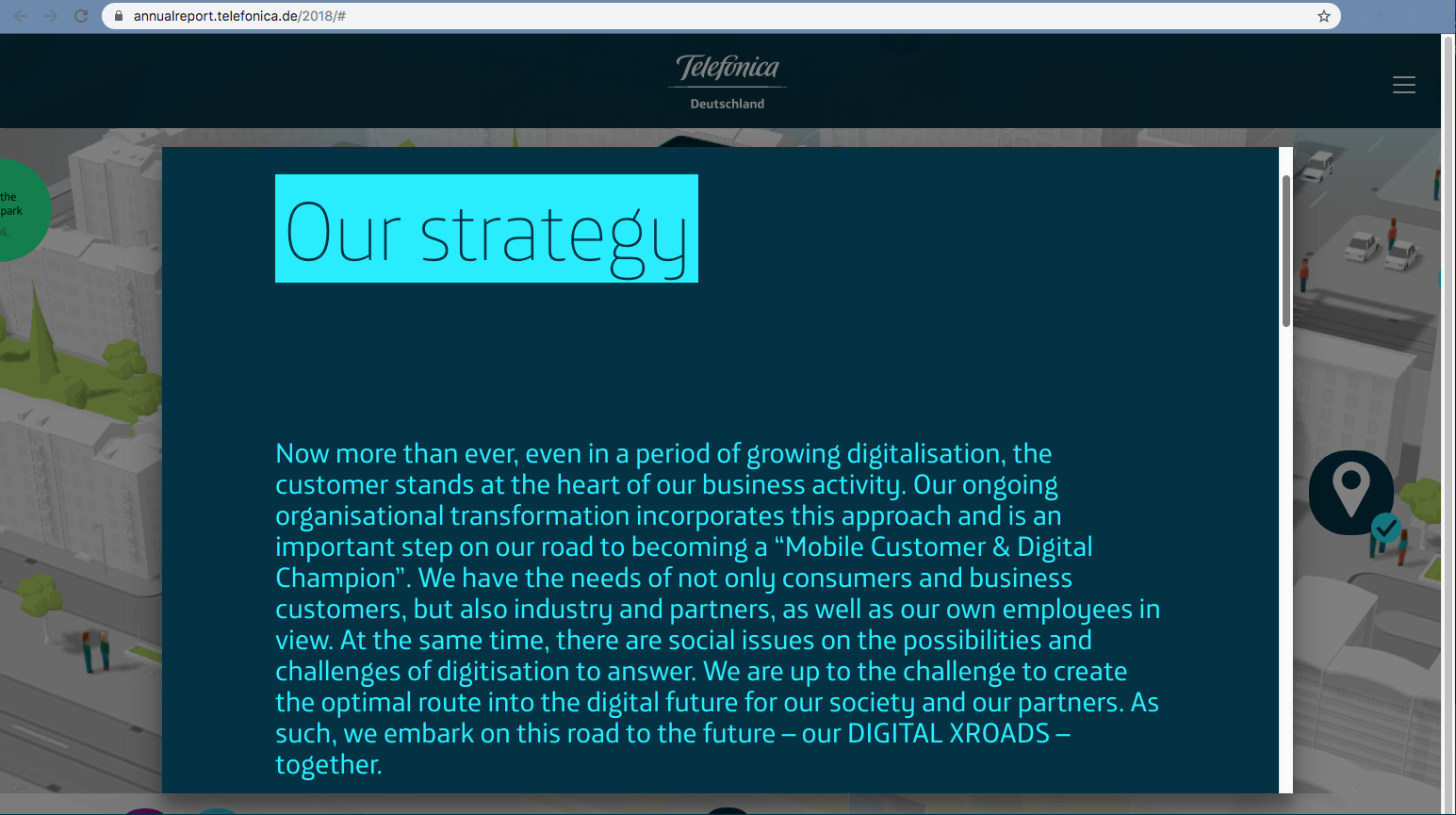
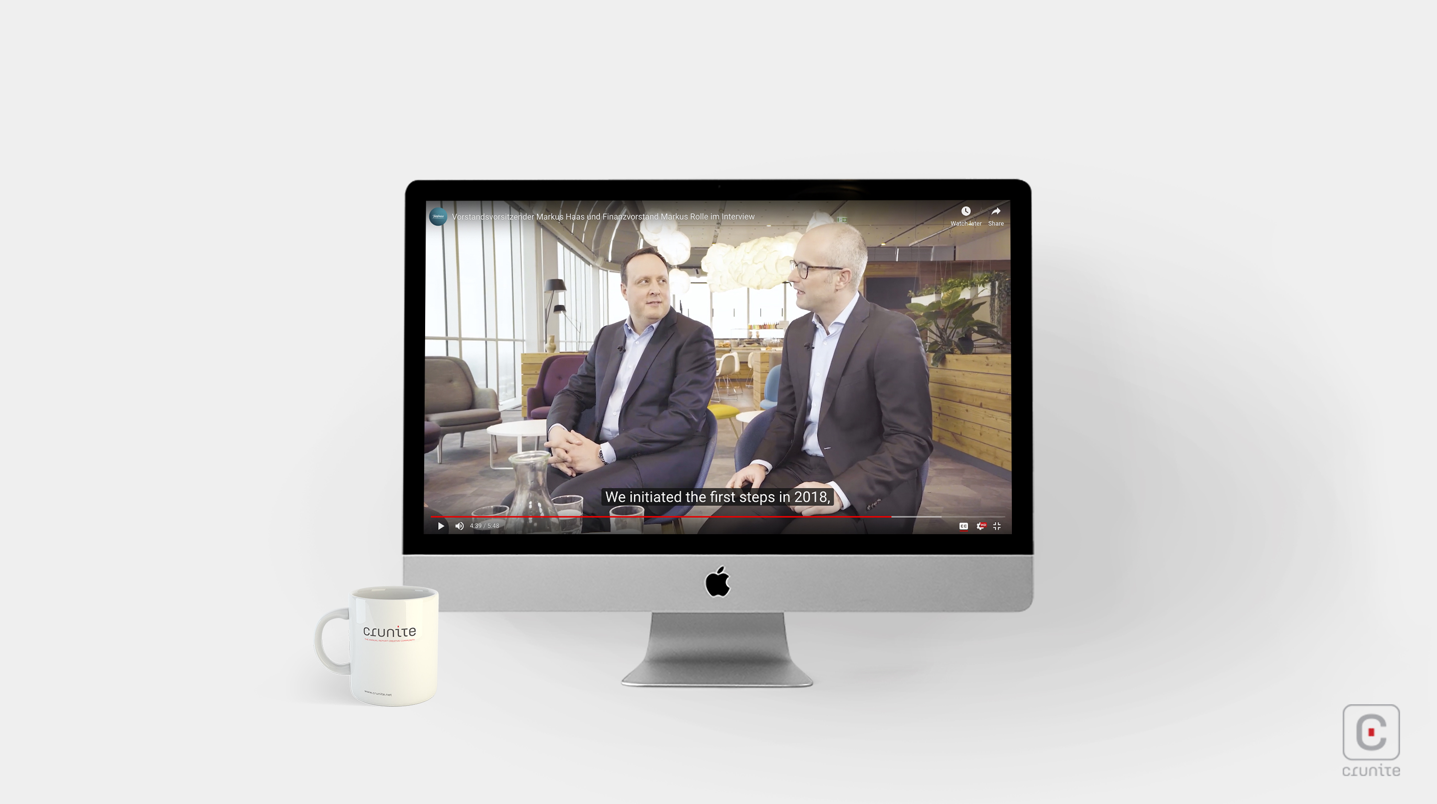
Overlaid on the visuals of the city are icons to direct the reader. Some of these icons when clicked, cause the activation of pop-ups that provide information about the company in the form of text or short videos while others let you jump across town to specific locations.
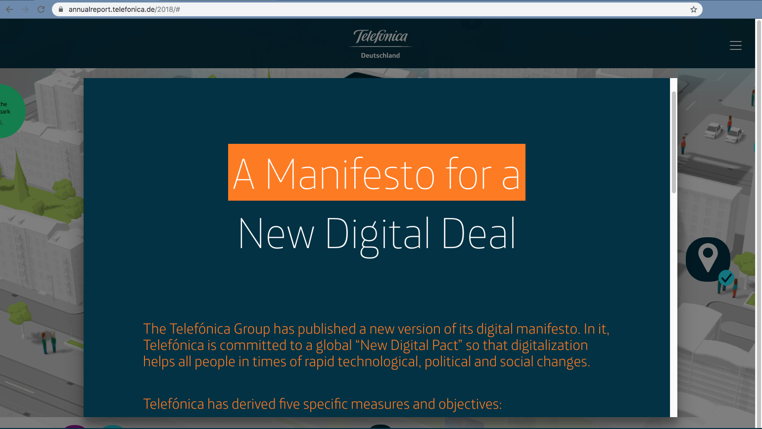
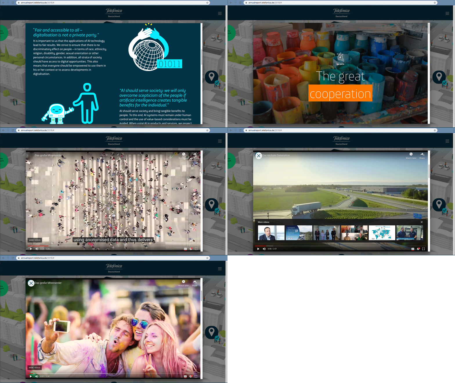
The main page also provides a simple drop-down menu to access all the information in a single place without having to navigate the city. Type treatments and photography are simple and unobtrusive, which makes the city seem all the more inviting as a way of interacting with the information in this remarkable annual report.
