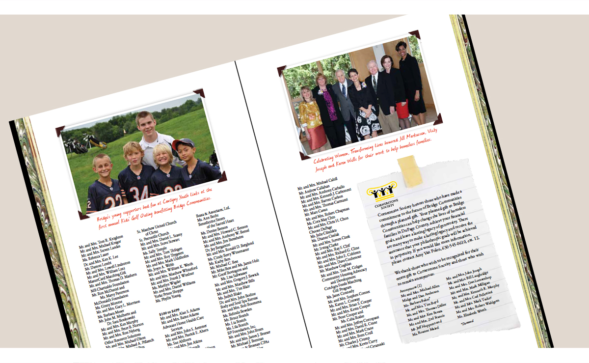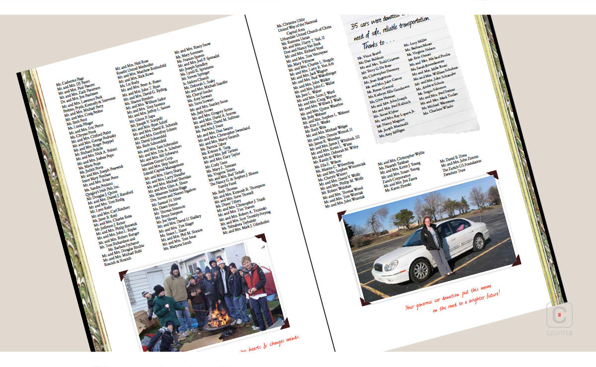
At first glance, the 2011 Bridge Communities annual report comes across as a leather-bound photography album or journal. But there’s much more in store. Using a non-traditional size and approach, this is not your usual annual report. Bridge Communities is a non-profit organization that helps homeless families stand on their own feet by providing mentoring and housing.

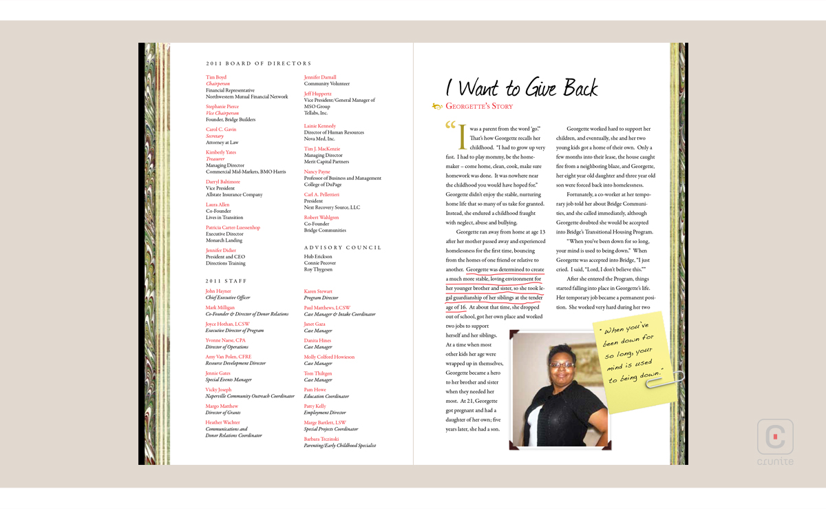
On opening the cover, rather than having a photo of the board of directors, like most report do, there is only a list of names. This says loud and clear that the focus of this report is the people that the organization works with, as the reader will see through pretty much the entire rest of the report.
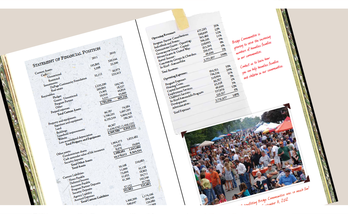

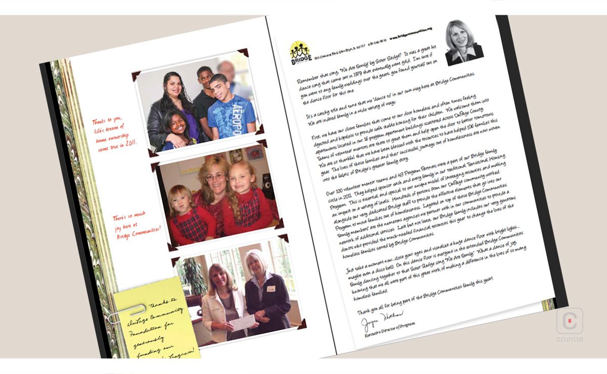
Photographs are presented as simple polaroids; they convey a homely feel, reflecting a tightly knit community and happy stakeholders.
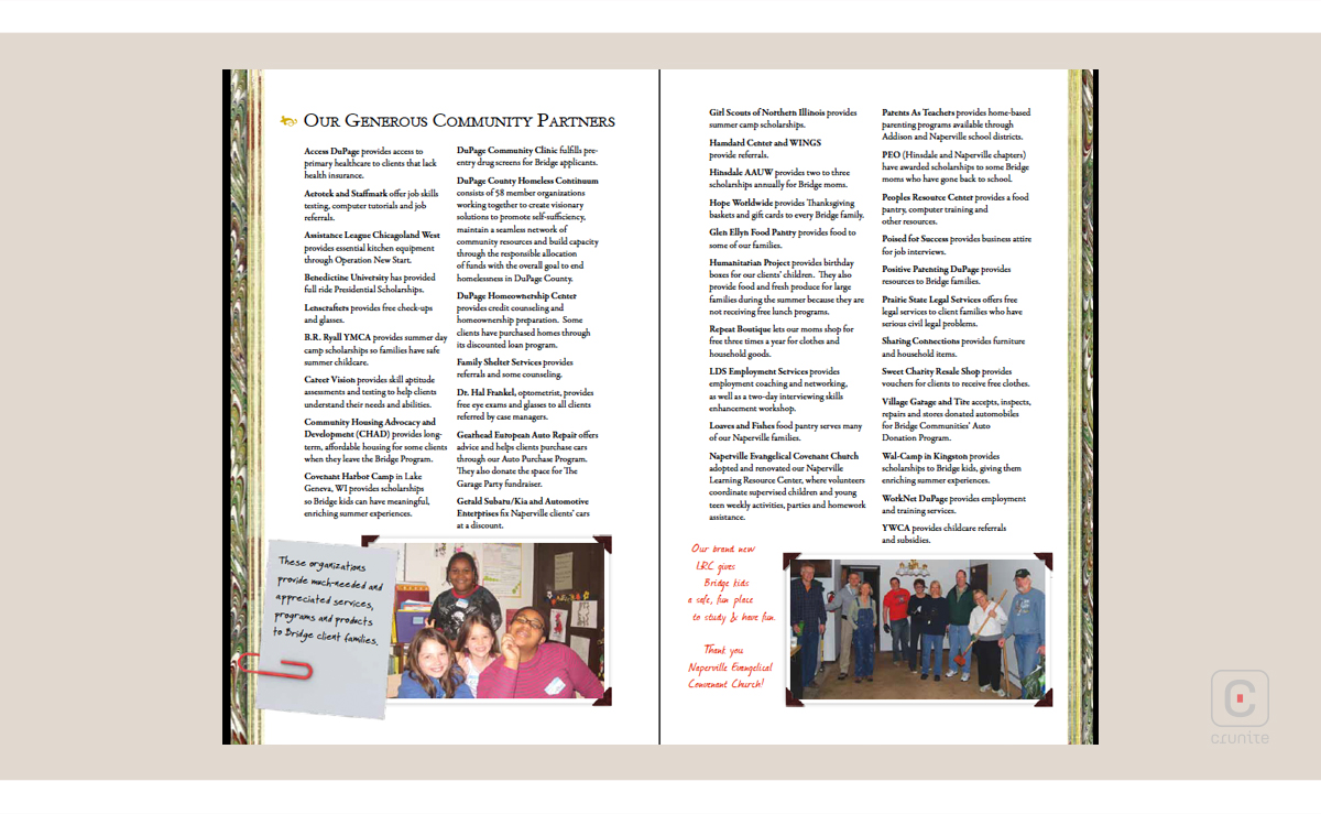
Little ‘handwritten’ notes are ‘attached’ to pages, using paper clips or tape. These are also scattered across the report, adding to the unofficial vibe; each note has its unique style and highlight.
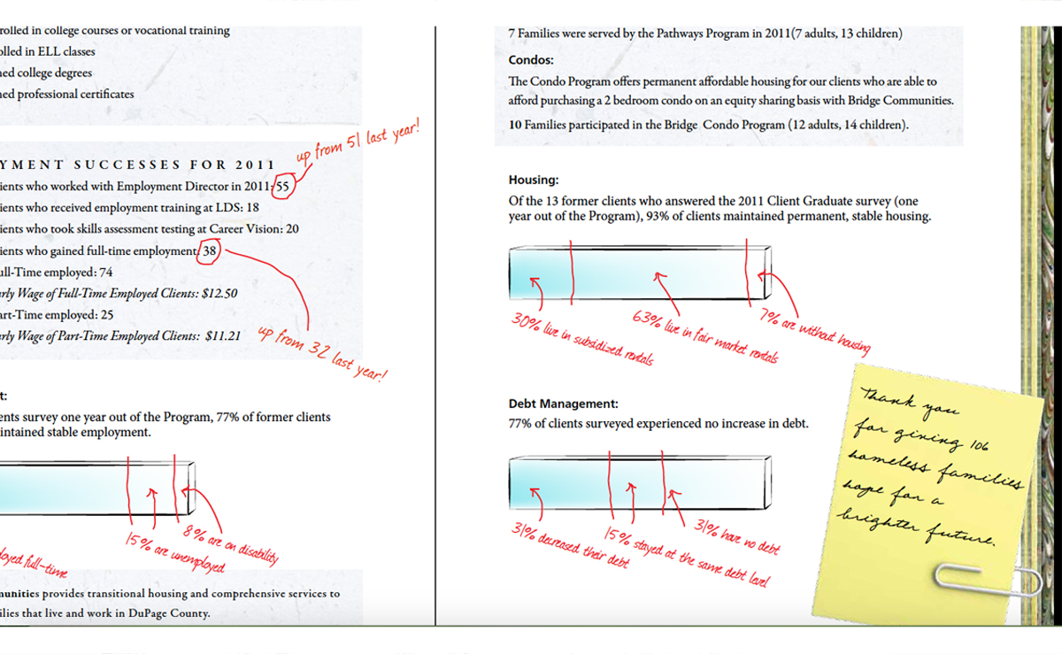
Additionally, red handwriting works to provide snippets of extra information, underlines important segments in a paragraph, and also provides a unique style to graphical information. The executive director’s letter is also ‘handwritten’ and very much in the style of a journal.
Pages 10-11 display a minimalist, pinned map with the different types of housing provided in the community by the organization, along with a colourful legend.

Pages 12-13 could even be considered messy, but since the effect is consistent throughout the report, the little bars convey information successfully in keeping with the red handwriting used on the other pages.
 The report closes with a list of all those who contributed towards the organization along with photographs of the changes those gifts have brought.
